
These visual elements of web design could make your website draw huge attention
Website design is becoming more challenging as new tools and innovative design techniques are making things more complicated. Everyone knows the importance of creating attractive websites that keep viewers glued to them. Websites must be easily distinguishable from the rest because gaining high visibility is the common goal of designers. Since the website’s appearance creates the initial attraction based on which viewers form some opinion about the website that determines the future of engagement, the initial impression of viewers matters the most. Even before viewers know about the content, they evaluate the website primarily based on its design features. Therefore, website design is critically important in determining the acceptance of websites to viewers. The website design is responsible for arousing viewers’ interest to enter the website and even spend a long time discovering it in-depth.
Quick Links
Web designers are aware of the importance of creating outstanding designs that have high aesthetic appeal and high functionalities duly optimized that ensure the best user experience. The website’s user experience must be so satisfying that viewers would keep coming back to the website and increase the engagement rate that generates more leads and results in higher conversions.
Designers must stay tuned to the current trends, which are always evolving and do not take much time to fade away, making the task of those responsible for Egypt web design even more challenging. What kind of web design trend to follow and how to match it with the respective website’s business requirements can sometimes seem quite confusing. To make things easy, we are discussing some current major web design trends that will rule the web design landscape for quite some time.
The storytelling Style
People’s love for stories is timeless and one of the traditional but highly effective forms used in various aesthetic applications, including web design. People love to listen to storytelling, and web designers must take advantage of creating a design scheme that follows some sequential pattern while telling the brand story. The storytelling format of web design has some salient features like a structured visual hierarchy of content and headlines that guide viewers through the content in the desired manner. Among the other hallmarks of storytelling is creating a personal copy that describes the company’s origin and high-impact visuals that uphold the brightest brand image. From navigation to scroll-triggered animations to content, all the other design elements work in unison to support the story that unfolds on the screen.
Retro Style
As time passes, people tend to become nostalgic about the time or era left behind and feel happy to soak in memories of those days. Web designers can capitalize on this psyche of the audience and use some retrospective design styles that stoke fond memories and engage viewers more closely to the website. Falling back on retro style provides relief to viewers who might be tired of clichés of current repetitive trends that seem dull. By taking an old-fashioned approach, brands can make a statement and easily stand out from the crowd and make a place for itself. The retrospective flavor in web design is mostly created by using vintage photos and retro-inspired typography and logos that take viewers back to the days left behind and seem attractive.
However, when choosing the retro style, maintain a balance and avoid the lure of going overboard or doing too much as it can impede the website functionalities and prove counter-productive.
Maximalism
One way to make your design catch the eye is to deviate from the path of the most trending design styles like minimalism and try doing just the opposite by embracing maximalism, which means using bold and bright design elements instead of the subdued and simple ones. The objective of maximalism is to give viewers a jerk by using loud contrasting colors, in-your-face imagery, and jarring layouts. The aggressive style works best for hip brands that are fresh and ready to make bold statements. The style is not for everyone, and understanding the brand and the statement it wants to make is essential to decide about the usefulness of this style.
Bold Typography
A change in typography selection sets a new trend as brands are now experimenting with bold typography, huge text blocks, and outlandish themes instead of small and dignified typography. The approach defines the tradition of adhering to simplicity and instead prefers to take a wilder approach that creates eye-catching, innovative designs by leveraging bold typography. As mentioned earlier, you must act with restraint when trying to break the tradition and avoid doing too much that can affect the website functionality and create more problems rather than doing any good for the website.
Full-screen Video
Video content is the staple choice of web designers these days, but designers are now using full-screen videos on the landing pages and home pages to take the user experience to the next level. Video content is already the most potent weapon in a designer’s arsenal. The high potential of full-screen videos to increase the conversion rate significantly by almost 80% is reason enough to go for it. However, the type of video to use and the manner of displaying it plays a critical role in deciding the impact it will generate. Besides, proper placement of the video’s strategic design elements, like placing the CTA, contributes to its success.
Experiment with Colors
The website’s color scheme is vital for creating attraction and making the website stand out from the crowd. This is especially true for monochromatic color schemes that use a single color as the design motif of a page, excluding the use of black and white. Although there would be other colors on the page, a particular dominant color underlines the design theme that aligns with the brand statement.
Another responsibility of web designers is to make the website mobile-friendly by using responsive design that ensures that a single web design displays across all kinds of devices and screen sizes with equal elegance.
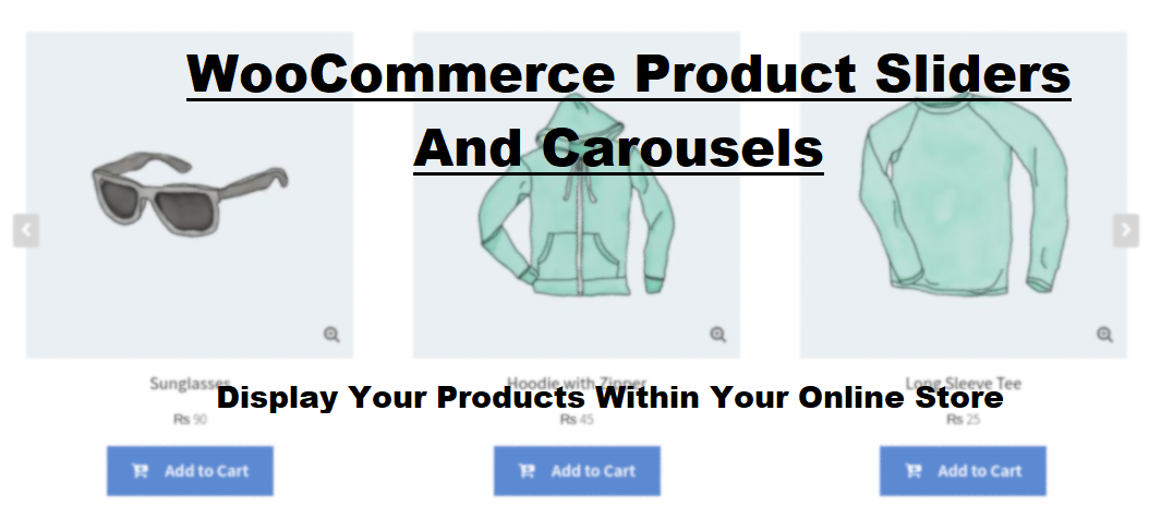
What Is WooCommerce Product Slider and Why Your Store Needs It
Why Do Product Images Matter So Much in Online Stores? When someone visits an online store the…
0 Comments9 Minutes

How to Streamline Your Customers’ Shopping Experience?
The goal for any online store is to make shopping as smooth as possible. When visitors move…
0 Comments8 Minutes

Strengthening Brand-Customer Relationships Through Gamified Loyalty Programs
Creating lasting connections with customers has become increasingly vital as the marketplace grows…
0 Comments6 Minutes

How to Use SEO and SEA Together in Search Engine Marketing
In digital marketing, search engine marketing (SEM) plays a critical role in improving online…
0 Comments10 Minutes
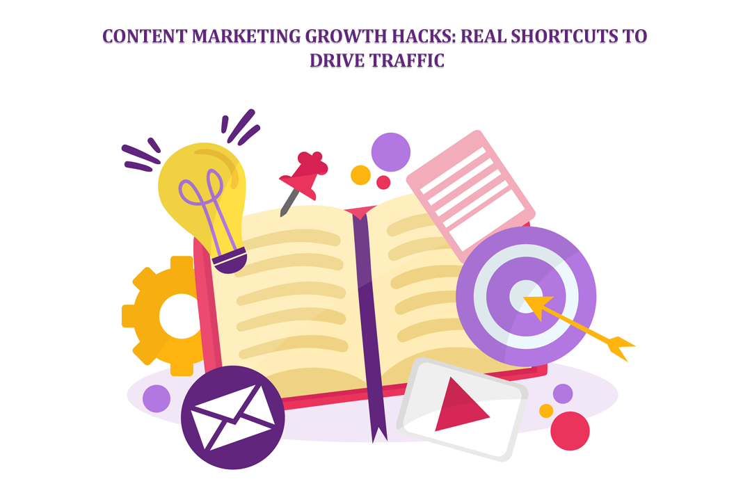
Content Marketing Growth Hacks: Real Shortcuts to Drive Traffic
Are you still lagging in content marketing? Sticking to these old strategies seems…
0 Comments10 Minutes
How to Build a Strong Local Following Using Social Media Marketing
In the days of likes, shares, and stories, local businesses have a golden opportunity to create…
0 Comments9 Minutes

Why WooCommerce is the Best Choice for Your Online Store?
WooCommerce stands out as a top option for anyone looking to build an online store. This platform…
0 Comments8 Minutes

How to Use AI-Powered SEO Tools for WordPress eCommerce
SEO is a critical factor in the success of any e-commerce WordPress store. As competition…
0 Comments11 Minutes