Web Design
For over a 15 years we have designed, developed and delivered hundreds of websites for clients from all around the world. OUR GOAL HAS ALWAYS BEEN REALLY SIMPLE to make a web that quickly adds value and exceeds your expectations and we have learnt a bit on the way!
We design clean, multi-device, responsive solutions using an array of different platforms. We craft corporate websites, eCommerce solutions corporate , database solutions, CRM – you name it we have done it. We have built everything from simple HTML micro sites to complex dynamic sites passing through platforms such as Joomla, WordPress and Prestashop.
What have we found to be the best approach to website design?
Every site we build has the end-user in mind from the very beginning. It is very different to build a website for creative film directors to one for silver haired pensioners. We base our fundamental design decisions on your market sector, best practices and your potential visitor demographics.
The decision to choose a web design agency is not easy. Probably your website will be the gateway to your company for the majority of your potential clients, and you need a team that you can trust with full transparency and a at budget that is realistic for your needs.
Your choice should be based on the total capabilities of the agency not just their beautiful designs. Let’s face it coming up with a photoshop design is easy these days and almost anyone can use a freelancer to create something that is acceptable. However how many of them take into account the usability of the site, knowing what will get visitors to click through tot the important parts of your new web? A web agency may even be able to make a good design and develop the web based upon a platform such as WordPress but unless the design is coded correctly your web will never rank in the search engines and your effort, time and budget will have been wasted.
Our holistic approach takes into account:
- corporate image
- visitor demogrpahics
- usability (based upon that demographic)
- coding cleaniness
- speed of loading
- correct code for Google and the search engines
- ease of use for your team to update
What process is best to design and build a website?
This is the process that we use – it has been refine over the last 15 years.
Conceptualization
Great word, but we take it seriously. This is the great forgotten of web design, think of the who, how and why before thinking about what. Who are we trying to communicate with? Why do we want this web? How do we plan to achieve our goals with this web? Only once all these questions are answered is when we can start to think about the “what”: what design interests us more, what platform, what CMS, etc.
Content Strategy
Based on the conceptualization the content strategy defines what we are going to put in the web. The content strategy will have
- the structure of the web content – what leads to what
- priorities for each element
- the major elements of each of the pages
- the roles and responsibilities for producing the material
- a web style writing guide so that there is consistency across the web
- a layout guide – for example the use of headings/images etc.
- the editorial process – making sure there are no spelling mistakes and that everything hangs together
- a project plan to show what will be delivered and when
Information Architecture

Tying together the overall business ecosystem to the content, the delivery of the content, the navigation and the user interface is the information architecture. In many cases the reality is that this is a Content Management System but many business owners and marketers take the decision about what platform they want before taking into account whether it is the best vehicle for delivering their content to the audience they are trying to reach.
This will define the site structure – the sitemap. After this we will know how to deliver and to where we need to deliver the content. We may actually have different groupings or menus for different personas. A really simple example is the typical real estate web. There are multiple personas – a navigation system needs to be geared specifically to reaching three primary stakeholders: property sellers, property buyers, and financial/lending institutions or other agents interested in working with the agency.
Design
Only after the previous steps do we enter into what would be properly said the world of design. It is about moving all the ideas collected before to a visual distribution that is easy to use and navigate. It is in this step where prototypes and wireframes are created and the design is done in Photoshop.
We talk about the principles of our design below.
Front End & Back End
Never has there been such a conflict potential: “Form follows function” or “Function follows form”
When designing a website, “form follows function” is often means, that in practical terms, the design agency should first harvest the website’s requirements from the client and then figure out the aesthetics and “artistry” of the website based on those “functional” requirements
However, we humans have an attractiveness bias; we regard beautiful things as being better, despite of whether they actually are better. We think that beautiful things are naturally better and will perform or function better. As in nature, function can follow form.
So we have two roles in the design team the Front End and the Back End.
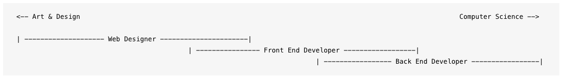
The front end is the step of passing Photoshop designs to HTML5, PHP and CSS3. It is also the step of adding animation to the design with the use of JavaScript.
The back end is the role of ensuring that important elements of the web actually work, such as a search engine, a contact form, a discount coupon etc..
As a Digital Marketing Agency we create empathy amongst the roles to understand what each role is working towards and build a fluid transition from the design to development. It makes the process become more efficient, and solve problems earlier on rather than later when changes could be more time consuming and expensive.
Constant wire framing and a good content strategy are essential for this step.
Quality Assurance
Before launching a website we always ensure that there is a strict quality control. Clearly this involves making sure that the website works! But there is a lot more to it than simply navigating from page to page.
However we make sure there is Quality Assurance – quality assurance during the whole development of the web. Quality assurance is the “voice” of the user and the client. Projects can take on a life of their own and can deviate from plan. We go back and constantly revisit the initial concepts and see if, or how far we have deviated from the concepts and if there is an irrefutable reason for it or whether we are simply drifting based on unsure data. If there has been drift it is our responsibility to keep all concerned true to what the real needs are.
Once we have a web ready we will test it primarily in a browser to ensure that we have functionality and that the design has been respected. We then move onto multi-browser testing and full responsiveness on mobile devices.
What is UX and how do you check it?
UX is User eXperience – it is how your users feel about the website and how easy they find to use it. The UX needs to take int account the user demographics of the site and the forecast general technical capabilities of your audience.
Typical questions we ask during this phase are:
- Are there too many or too few tasks or calls to action on the page?
- Are the necessary elements of functionality on the page. Is what is on the page, clear and concise. Is there a possibility to get more information easily about an element?
- Does the system remember data from other parts of the web such a language or user details?
- Does the page have a pre-loading or at least does it show that it is loading while bringing in outside data?
- Is social media present? Can the person make a comment or rate the page if the page is designed to do so?
- Does the page give the user and idea of how popular it is?
- Are the elements that a user can click clear enough?
- Is it clear where the user is in the process or website? Is there duplicate navigation? Does choosing different routes result in different results?
- Are there adequate error messages? Can something be deleted by accident? Are there warnings?
- Is there consistency in the layout and the use of buttons and colour?
- Is the readability consistent between pages and with the requirements of the audience?
- Is everything translated correctly?
- Is there an FAQ that cover the most common questions and problems?
- Is there a visual hierarchy?
- Is the corporate image followed correctly?
- Is the legibility correct on all devices?
- Is the use of colour correct? What happens if someone is colourblind?
We then carry out User Acceptance Testing – initially user third parties but also key stakeholders in our client’s organisation.
Only then is a website ready for migration and launch.
What are the Design Principles for today’s website?
Clean and clear design
The simpler and cleaner a web design, the easier it will be to retain visitors to the site. The motto of the web design: ‘Less is more’. It has been proven that the clearer and cleaner a web design is more attractive and retains more visitors for longer. The Google User Experience group in Zurich summed it up in jargon:
“Designs that contradict what users typically expect of a website may trigger a suboptimal first impression and impair users’ expectations. …. This may lead to a disadvantageous negative downward spiral that should be avoided.”
…which loosely translated means: Keep it simple (stupid)!
Structure that facilitates navigation
The web design always has to make navigation – well – easy. You must give the user the correct visual clues to be able to easily visit the pages that we want them to visit. There needs to be a preordained flow. The use of double navigational clues is really useful.
If the navigation is not intuitive and leads the visitor on a path that does not follow why they visited the site in the first place, the result will be a high bounce rate (they come, they look, they leave) as they can not easily move on.
Alignment with the corporate image
The website has become the visible face of the company. In the case of a web only business the web is the company. There must be a strong concordance between the web design and the corporate image of the company, i.e. colours, fonts, images. The website should faithfully reflect what the company does, what it is as well as some feeling for its values.
Good visual communication
A picture is worth a thousand words and a video is worth a thousand images. The most visual part of a web page is as important as the content it offers. Clearly it is fundamental that the logo of the company is shown clearly and correctly along with a proportional size for the screen visualising the web.
However images are more important than simply a logo (sorry graphic designers!):
- more than half the population process information easier if it is an image rather than in text – we need to support both
- images conjure up emotions – we can use those emotions to our own benefit
- by showing real people we are helping the user identify with the brand
- background images create atmosphere and ambience – we are setting the scene for our brand
- product images lean to the rational appeal – they are informing
- infographics are abused but can be useful in certain circumstances certainly explaining a complicated technical issue will be best supported by a diagram of some sort
- the right image can visually guide the user to the right place in the page
Flat design
Everything that leads to minimalism is a trend within any type of graphic design. It is not just a passing trend or a fashion as it actually arises in response to a need for functionality that is to adapt to responsive design, being useful in both large devices and small mobile screens.
It is characterised by:
- Clean and simple layout
- 2D as apposed to 3D two tone buttons
- A good use of space allowing air to breathe between items
- Bright colours
- User-friendly, with buttons large enough and separated for mobile use
- Use of icons as opposed to realistic graphics.
Page load speeds are increased with smaller files sizes and rendering of text is clearer especially on mobile devices.
Colour is one of the most powerful elements available to communicate emotions on a website. Most of these emotions are perceived in a subtle and unconscious way.
The layout varies from web to web and from page to page. There is no need to have total homogeneity between different pages, however page types (blog, product presentation) should have a uniform layout so the user does not have to look to far. Obviously the layout needs to be suitable for responsive design which lends itself to blocks of information in columns.
Fixed menus that can be seen from anywhere on the page are also a good idea – it allows the user to navigate easily between pages especially where we are using long form content.
More Scroll and Less Click
Ever since Facebook implemented the infinite scroll in its timeline in September 2011 people have become increasingly to scrolling. The reason Facebook implemented it is easy: to make navigating easier and more comfortable.
The use of the one page website for mini sites is a good example of scrolling with navigation. Here the menu simply takes you to an anchor in the page. Navigation is apparently at lightning speed and with changing design features in the page, the user gets the impression that they have actually clicked to a new page. However from a SEO point of view we need to have pages that have distinct URLs and Title tags to rank for different terms.
The use of long form content obviously requires the user to scroll down the page to continue reading. We can use this to our advantage in a blog scenario by using the side columns as advertising opportunities – not necessarily commercial banners but more banners to other elements or related elements to our own website.
Scrolling to the very bottom of a page is frankly unlikely for many. However we can understand this better by place Google Analytics Event Tags at certain points in the page and thus know the number of visitors that have got to distinct points in the text. Having a mini navigation in the page itself can help users get to specific sections of the page.
Wallpapers + Videos + Screenshots
Full-screen images or Hero images have become a trend as they perfectly match the graphically capture the expression of the brand. Generally used on homepage they can easily be used in specific inner pages as well. That Medium uses the as an option is of note.
Using Video as a background in these circumstance can also be an exciting opportunity. Take a look at Production Service Networks site where they randomly shows a full width Vimeo video on their home page. Others are embedded videos that simply loop.
In both cases the image or the video needs to capture the essence of the website – it needs to visually express the content. Although the video of traffic crossing the Bay Bridge in SF may be visually attractive if your business is not in SF, don’t even consider it.
Great and Correct Typography
Another trend in web design that we will see more and more frequently is the expressive use of typography. It will be used as a form and not as a medium to communicate, or put another way, the web will become illustrated with letters. The use of external fonts has allowed the designer a larger choice than the 6 web safe fonts of just a few years ago.
Nonetheless we need to make a trade off between importing fonts from such places as Google or loading them in locally as sometimes they can dramatically increase the loading time of the page. This means limiting yourself to just the fonts you need for the website.
What is Responsive Design?
Responsive or adaptive web design is a web design technique that seeks the correct visualization of the same page in different devices – from desktops to tablets and mobiles.
It is about resizing and placing the elements of the web so that they adapt to the width of each device allowing a correct visualisation and a better user experience. It is characterised by the fact that the layouts (contents) and images are fluid and it uses CSS3 media queries code.
Responsive design allows us to reduce the development time, avoid duplicate contents, and increases the virality of the contents since it allows to share them in a much faster and more natural way.
In April 2015 Google actually stated “We’re boosting the ranking of mobile-friendly pages on mobile search results. ” and in March 2016 “Today we’re announcing that beginning in May, we’ll start rolling out an update to mobile search results that increases the effect of the ranking signal to help our users find even more pages that are relevant and mobile-friendly.” Google doesn’t send out stronger signals than that!
We can’t emphasise enough that responsiveness is a major factor.
“Obligations”
It is also necessary to include the legal requirements of the country of origin of the website. These can include:
- privacy policies
- cookie policies
- terms and conditions of use of the website
- e-commerce or payment and delivery terms
If the web has a system of registration, payment, services it is imperative that there are terms and conditions in the platform. We do not recommend using boilerplate legal terms as businesses are different and we suggest a consult with a good internet lawyer.
In September 2016 Google stated:
Beginning in January 2017 (Chrome 56), we’ll mark HTTP pages that collect passwords or credit cards as non-secure, as part of a long-term plan to mark all HTTP sites as non-secure.
As a result where e-commerce is concerned “https” is a requirement and frankly any website that has a form should have an SSL certificate and consequently an unmixed https site.
Programming
When we build website we obviously the code of the page will already be done with SEO as a primordial element – all the code would already be optimised for Google and social networks including:
- Titles, H1, H2 meta tags etc. ..
- Og tags for Facebook
- Twitter Tag
- Friendly URLs that are better for both Google and human users
- Google rich snippets – information that Google uses to display data in searches