Creating Effective Website Mockups: A Step-by-Step Guide
In today's digital age, designing a visually appealing and user-friendly website is crucial for businesses and individuals alike. Before diving into the complex world of coding and development, it's essential to start with a solid plan. This is where website mockups come into play. A website mockup is a visual representation of a website's layout, structure, and design elements. In this article, we'll provide a comprehensive step-by-step guide on creating effective website mockups that set the foundation for a successful online presence.
Step 1: Define Your Objectives
Before you start designing your website mockup, it's important to clearly define your objectives. What is the purpose of your website? Who is your target audience? What key features and functionalities do you want to incorporate? Understanding these aspects will help guide your design choices and ensure that your mockup aligns with your overall goals.
Step 2: Research and Inspiration
Begin by researching websites in your industry or niche to gather inspiration. Look for design trends, color palettes, typography choices, and layout ideas that resonate with your brand and audience. Take notes on elements you like and consider how you can incorporate them into your own mockup.
Step 3: Choose the Right Tools
There are various tools available for creating website mockups, ranging from simple drag-and-drop interfaces to more advanced design software. Some popular choices include Adobe XD, Sketch, Figma, and Balsamiq. Select a tool that suits your skill level and design preferences.
Step 4: Wireframing
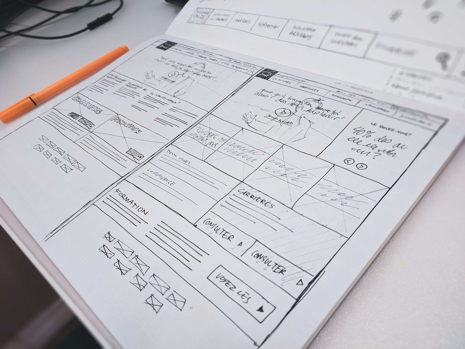
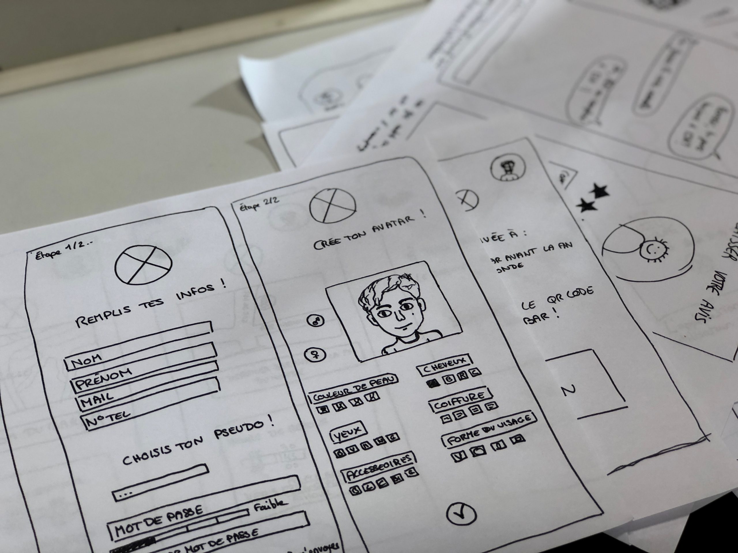
Start the mockup process by creating wireframes. Wireframes are basic, low-fidelity representations of your website's layout and structure. Focus on arranging elements such as headers, navigation menus, content sections, and footers. This stage is about establishing the overall flow of your website's user experience.
Step 5: Layout and Design
Once you have a solid wireframe, it's time to flesh out the design. Pay attention to visual hierarchy, ensuring that important elements stand out while maintaining a consistent design language. Choose a color scheme that aligns with your brand and evokes the desired emotions in your audience. Incorporate typography that is easy to read and complements your overall design.
Step 6: Content Placement
Place realistic content into your mockup to get a sense of how the final website will look and feel. Use placeholder text and images or, if available, actual content. This step helps you visualize how your design accommodates various types of content and ensures a balanced layout.
Step 7: Interaction and User Experience
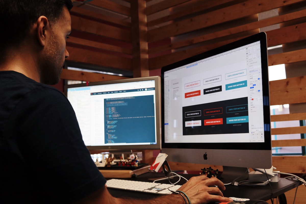
Modern websites are all about user interaction. Enhance your mockup by adding interactive elements such as buttons, links, dropdown menus, and hover effects. Consider how users will navigate through the site and interact with different features. This step will give you a clearer understanding of the user experience your design provides.
Step 8: Feedback and Iteration
Once your initial mockup is complete, seek feedback from colleagues, stakeholders, or potential users. Constructive criticism can help identify areas for improvement that you might have overlooked. Use the feedback to iterate and refine your design further.
Step 9: Responsiveness
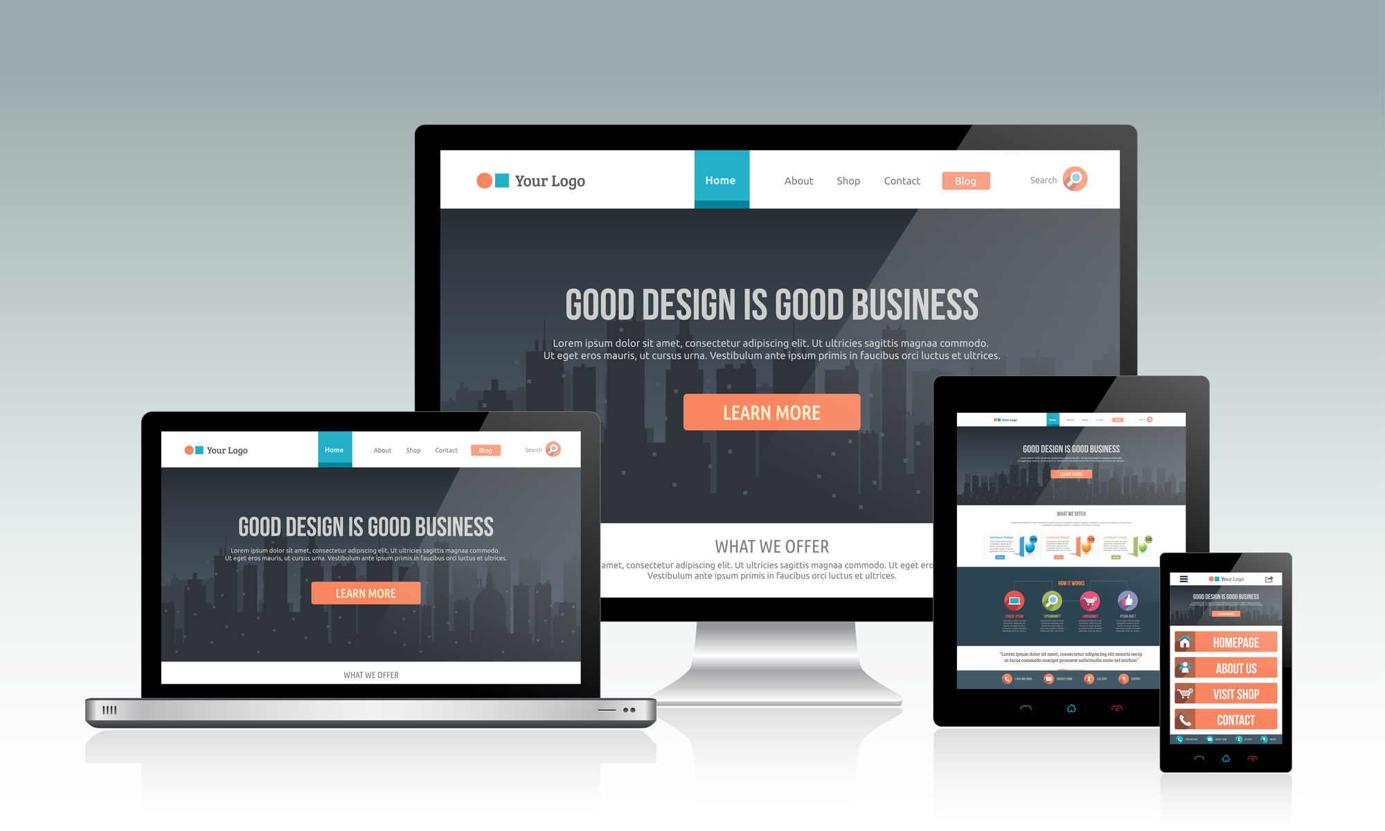
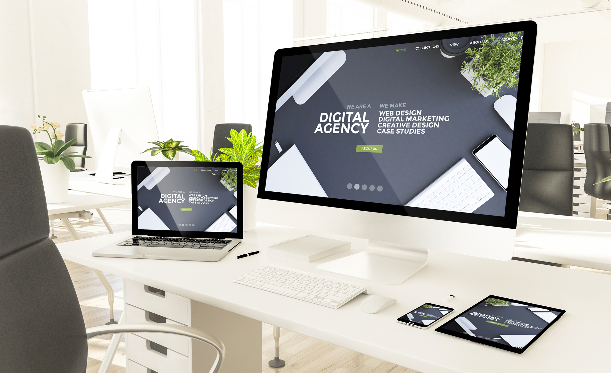
In today's mobile-dominated landscape, responsive design is a must. Ensure that your website mockup is adaptable to different screen sizes, including desktops, tablets, and smartphones. Test how your design elements rearrange and scale to provide an optimal user experience across devices.
Step 10: Finalize and Present
After incorporating feedback and making necessary adjustments, finalize your website mockup. Create a presentation that showcases the different pages, interactions, and design elements. This presentation will serve as a guide for developers during the coding phase.
Conclusion
Creating effective website mockups is a vital step in the web design process. It allows you to visualize your ideas, test user interactions, and ensure a cohesive design before moving on to the development phase. By following this step-by-step guide, you'll be well-equipped to design mockups that captivate your audience and lay the foundation for a successful online presence. Embrace creativity, user-centered design principles, and the ever-evolving landscape of web design trends to create mockups that truly stand out in the digital realm.
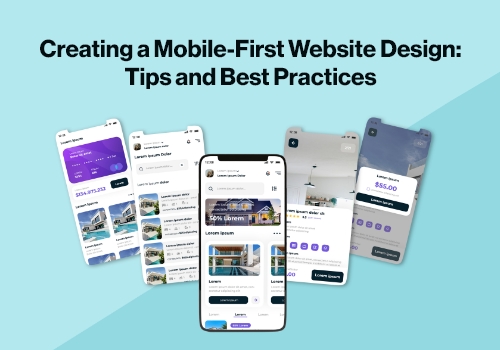
Creating a Mobile-First Website Design: Tips and Best Practices
Ever since computers and the internet revolutionized our world, it has been on a rapid course to digital modernization. Nowadays, smartphones are everywhere, and creating a website optimized for mobile devices is no longer an option - it's essential!
With the power of mobile devices, a plethora of tasks can be done without hassle. That's why it is so important for businesses wanting to increase their customer base and raise brand awareness to design with mobiles in mind. This ensures that all users get access to the relevant information quickly and easily from any device they choose - creating an effortless digital experience!
This article will provide you with the ultimate tips for creating a mobile-first website design that ensures optimum performance regardless of the device used to access it. Get ready to maximize your site's potential and elevate its user experience, continue reading…
Mobile-First Design - What is it?
Before delving into the hard facts and helpful guidelines, let us first gain an understanding of what mobile-first design is. Put simply, it refers to a technique that web designers apply when designing products for handheld devices as their initial priority. It follows then that one should preferably start with the smallest screen size conceivable in order to make certain success for your business venture. Designers usually commence this process by sketching out or prototyping before gradually building from thereon after.
Designing for mobile devices is an intricate task that requires designers to focus on essential content and make it prominent. This way, users can access the crucial components of a website promptly and without effort. When designing small screens, it's vital to exercise anything that isn't necessary; achieving this will ensure smooth design flow and navigational ease.
Recently, many Drupal developers have come out to urge their clients to adopt mobile-first Drupal web designs. This is because the market has seen tremendous growth in this trend and it's only going up. It goes without saying that using a reliable Drupal development service will be essential to achieving success.
How Mobile-First Design Promotes Accessibility: An In-depth Analysis
Mobile responsive design:
A responsive mobile-first design encourages developers to create digital products that are more visible and accessible on smaller screens, so people with impaired vision can use them as well. This inclusive approach is a win for everyone! When you make your designs more accommodating, you empower those with visual impairments - along with any other users who may need assistance accessing your product. In the end, it's true what they say: when the tide rises all ships benefit from its increase.
Order of information:
Mobile-first design indicates that the most important content and assets should be presented first when users land on your page. This means prioritizing elements for people to view, hear or interact with. If you employ a Drupal development service provider, they can easily take care of this task for you.
Tips and Best Practices for The Mobile-First Approach
Understanding what mobile-first design means is the first step, but now let's delve into tips and techniques to optimize your website for a better user experience on a mobile device:
Keep The Design Simple and Elegant
To ensure successful mobile-first design, it is paramount to keep your idea uncomplicated when implementing it. This can be accomplished by adhering to key design principles and creating a user-friendly experience. When developing for small screens, prioritize simplicity - reduce excess clutter while incorporating adequate spacing between elements that will warrant an enjoyable reading experience.
Prioritize Page Content
When designing a website for the mobile-first market, content is paramount and should never be sacrificed. With limited space on small screens, web designers must prioritize elements to emphasize those that are most useful and necessary for users. By doing so, they can ensure an optimal viewing experience with easy accessibility of desired information.
Provide Intuitive Navigation
A neat and enjoyable user experience on mobile devices should be the top priority for web designers. Features such as Hamburger menus, or navigation drawers, offer users an easy way to find what they need from your website in no time. This is essential if you want visitors to stay longer on your page, potentially turning them into customers!
No To Disruptive Pop-ups
It's no mystery that mobile devices are limited when it comes to space, so we must avoid overwhelming users with intrusive pop-ups and ads. As website owners, our focus should be on providing the user exactly what they need rapidly and effortlessly.
Test It Out on Actual Devices in Real-Life Situations
Guaranteeing perfect website experiences on any device requires actual device testing. This aids creators in verifying that their websites display correctly when viewed on mobile, laptop, or desktop computers. For the most reliable results, work with a Drupal Development Company to access over 2000 real devices and browsers for instantaneous screening under genuine user scenarios - so you can be sure your site will run flawlessly!
Conclusion
Drupal web developers are quickly turning to mobile-first design as the ideal way to build websites that work for all kinds of devices. In this article, we highlighted some helpful tips and techniques to ensure a successful mobile-first website is created by Drupal designers. Additionally, it's evident from our discussion here how more and more Drupal developers are embracing mobile-first designs in their client projects.
Adopting a mobile-first approach to web design is the efficient way forward. Not only does it quicken up the process, but its final product offers visitors an almost unparalleled user experience across all devices. If you haven't yet implemented this method for your website or project, now's definitely when you should consider making that move!
----------------------------------------------------------------
Author Bio
Immanuel is a knowledgeable and experienced Drupal CMS senior writer with an impressive background working on different projects. He works at the forefront of Drupal Development Company, providing customers with websites that are kept up-to-date to function optimally across all platforms.
WordPress Themes—6 Great Ways To Get Unique And Powerful Ones For Your Blog
If you’re planning to start a blog, one of the first things you’ll want to do is find a WordPress theme that is unique and powerful. Here are 6 great ways to get unique and powerful WordPress Themes for your blog:
1. Buy a premium theme.
There are a lot of great reasons to buy a premium WordPress theme. If you're looking for something that's going to look very polished and professional, then you'll probably want to go with a premium theme.
The main reason for this is that the best premium themes are designed by professional designers, who know how to create something that will look great and work well on any device.
While there are some free themes that can do this, they're usually not as good as the ones you can buy. Also, if you're going to spend time and money on building your blog up, then it seems silly not to spend a little bit more money on getting the right tools for the job.
2. Download a free theme.
The best free themes are usually only available for premium users, but there are some good ones out there. If you have a little bit of time and knowledge about coding, then it's possible to find some great free themes online.
If you're not tech-savvy, then try searching for "free WordPress templates" on Google. You'll find a ton of great websites that offer free themes or have tutorials on how to create your own.
The benefit of using this method is that you'll get an excellent theme that has been tested by other users and proven to work well with your website. The downside is that you'll have to do some coding yourself (or pay someone to do it).
3. Get a theme from your hosting company.
If you're using a hosting company, then it's likely that they offer free WordPress templates. Most hosts will have at least one or two available for their customers to use. If not, then you can contact them and see if they'll let you use one of theirs as well. The benefit of this method is that you won't need to do any coding. The downside is that the theme may not be exactly what you want, and it'll probably come with some limitations as well.
4. Use a WordPress Theme framework.
You can use frameworks to create unique themes for your WordPress blog without having to understand how they work. Frameworks are built on existing templates, so they will save you time when building your site because they already contain many of the features that you need such as drop-down menus, sliders, and other page elements. This is a great option if you have some knowledge of HTML and CSS, but it can be difficult to use if you're an absolute beginner.
5. Have a customized WordPress theme developed for you.
This is probably the best option for those who want to build their own website from scratch. If you have the technical knowledge and know-how, then this can be a great option for you. You can also choose if you want your website to be completely white or black in color.
6. Create the theme yourself.
This is the most difficult option, but if you have the time and patience to learn how to do it, then it's definitely a viable option. You can find free tutorials online that will teach you all about CSS and HTML so that you can begin building your website from scratch.
It may be a good idea to start out with something simple like a basic blog theme or landing page before moving on to something more complex like a full-on website. You'll also want to make sure you have the right tools for creating your own site. Some of these include:
- A code editor (I recommend Sublime Text)
- A browser (Chrome or Firefox)
- An FTP client of some sort (FileZilla)
Takeaway
Hopefully, this will give you an idea of what is out there and what is worth your time. And please keep in mind the importance of doing your research before spending any money on a theme. Go get your themes, and start blogging!
Equipment Rental Website Builders for Aspiring Entrepreneurs
Although the rental industry is booming practically in every sector, the equipment rental market has observed the greatest growth.
According to a survey by PRNewswire, the market for renting construction equipment was valued at $90.9 billion in 2019 and is projected to grow to $106.4 billion by 2027. This implies that there are numerous opportunities for individuals who want to start an equipment rental company.
As there are a variety of ready-made rental software available in the market for launching an equipment rental marketplace, this blog covers the best equipment rental website builders for aspiring entrepreneurs.
5 Best Equipment Rental Marketplace Solutions
1. Yo!Rent - Equipment Rental Website Builder
Yo!Rent is a robust equipment rental website builder software that is created by FATbit Technologies. Entrepreneurs who are planning to launch eCommerce rental platforms in areas including heavy machinery, clothing, cars, etc. are offered two versions of Yo!Rent - multi-vendor and single-vendor. The built-in modules in Yo!Rent can be tailored as per the requirements of rental businesses to establish adaptability and scalability with respect to market competition. Also, the rental platforms created using Yo!Rent are capable of renting as well as selling products.
Further, Yo!Rent has catered to a global clientele by building a spectrum of trust and reliability in the equipment rental market. FAINDaMAQ, RentBubba, Upabuild, & GearFlow are a few rental websites powered by Yo!Rent.
Moreover, Yo!Rent comes at a one-time cost, offers free tech support for a year, and you can also get a personalized demo at zero cost.
Key Features of Yo!Rent
- Supports B2B operations
- Rental booking calendar
- Rental security management
- Late cancellation/return charges
- Product inspection
- Document verification
- Agreement management and eSign
2. EZRentOut
EZrentout is another software solution to build rental marketplaces in multiple domains including sports, event planning, and construction. The software gives marketplace owners flexible data management that keeps them informed of orders, sales, payments, and so on. Users with little to no technical skills can easily sign up for the site because of its straightforward UI. Since EZRentout is totally cloud-based, marketplace owners may expect free regular updates.
Key Features OF EZRentOut
- B2B customer management
- Invoice designer
- Data Backups
- Custom reports
- API integration
3. Rentman
Audio-visual and event equipment rental businesses can use Rentman's online rental software. Its user-friendly interface makes it simple for entrepreneurs to run their rental businesses in a streamlined manner. The software is completely cloud-based and helps rental businesses manage their operations through its dedicated functionalities such as equipment scheduling, quoting, invoicing, and many more. All these dedicated functionalities can be availed as a complete platform or business owners can also request a custom plan for their rental business operations.
Key Features of Rentman
- Flexible price calculation
- Manage transportation
- Agreement management
- RFQ management
4. Booqable
Booqable is a rental software for small and medium-sized enterprises that helps them manage their rental business more intelligently and effectively across all industries. The platform's user interface is automated in a way to prevent confusions while managing the orders. Booqable offers a 14-day free trial for new users where they can test the functionalities of the platform as per their business requirements.
Key Features of Booqable
- Easy order management
- RFQ management
- Invoicing autopilot
- Performance reports
5. HireHop
HireHop equipment rental software offers modules and features at an affordable price to new and existing equipment rental companies. The software is available in two versions including a free package for single users and a paid package for multiple users. However, the free version of the application comes with only 250MB of storage and has limited functionalities. But the subscription package comes with enough storage and functionalities to run an equipment rental business at any level.
HireHop also provides free product demonstration to its potential clients free of cost. Additionally, the software comes with detailed documentation and how-to videos to ease the rental operations with a learning curve.
Key Features of HireHop
- Hire/Sales Stock Management
- Documents Management
- Dedicated CRM
- Resource Management
Conclusion
Choosing the right equipment rental software for your equipment rental business can be critical. However, most of the rental software solutions available in the market come at monthly subscription charges and have additional costs depending on the number of functionalities they offer. This can add up to the overhead costs for any online business during its initial days.
Hence, you should select a rental solution that comes at a one-time cost like Yo!Rent, offers a lifetime license, is customizable, and has free tech support to troubleshoot technical issues, if any.
Author Bio:

Saurabh Thakur is an ecommerce analyst & blogger, he has been active in the ecommerce industry for the past 7 years. He is passionate about technology and always looking for new opportunities. He helps startups to establish their business online. He also has a good knowledge of branding & reputation management. He has successfully delivered more than 200+ reputation projects in the past. Connect via LinkedIn @Saurabh
The Dos and Don'ts of Selecting a Website Hero Image that Boosts Conversions
You don't have to be a genius to know that a successful business depends on, among other things, a beautifully designed website.
Not only has it been proven that consumers prefer to see aesthetically pleasing content, but it also turns out that they have very little patience for poor design choices. That's right – a well-made website must impress at first sight.
According to a research paper published in 2011, it takes 50 milliseconds for web visitors to create a first impression of a website. And, should that impression happen to be poor, you're already falling behind the competition. With that in mind, you'll want to think carefully about what your potential customers will see first when landing on your site. In most cases, that's bound to be your website hero image.
So, if you're ready to choose a header that will boost conversions, here are the dos and don'ts you need to keep in mind.
Do: Choose a Stunning Visual
Perhaps the best piece of advice we can give for selecting a website hero image is that you need to choose something with a wow effect. It doesn't necessarily have to be a contextual visual or a product photo. It can be almost anything, as long as it tells web visitors something about your brand and your offer.
For example, check out the hero image used on the Naty website. Showing a baby surrounded by greenery, it's the absolute perfect way for the brand to communicate what it is about: natural baby products.

Source: naty.com
Now, compare that beautiful visual with the one used by one of Naty's competitors, GroVia. The best way to describe this hero image is to say that it's a missed opportunity. Not only does the visual overwhelm with too many colors, but the typography is hard to read.
Furthermore, the value proposition is unclear. And, worst of all, clicking on the CTA leads to a poorly optimized landing page that leaves potential customers confused about what they're supposed to do to win the $200 gift card.

Source: grovia.com
Don't: Be Afraid of Simplicity
You might think that the only way to grab your audience's attention is to pull out the big guns. And sure, a striking image could be the way to go. But, remember that it's not your only option.
Sometimes, a solid background can work just as well for your website's hero section. Especially if your copy says enough.
For inspiration, you can look at the ISL Online homepage. Although it does use an animated website hero image, it relies on a solid color background that allows its unique value proposition to shine. And the solution works far better than any generic visual ever could.

Source: islonline.com
Don't: Ignore the Basics of Great Web Design
Unfortunately, web design mistakes aren't too difficult to make. In fact, they're more common than you'd think. So, if you're looking for ways to ensure the success of your business, it's not a bad idea to consult the ground rules of good web design.
- Choose a color palette that fits in with your brand's identity.
While you don't have to choose color palettes based on culturally conditioned rules, it's still essential that you don't pick the wrong colors for your website. For example, if you're running an insurance business, you probably won't want to go with a combination of bright yellow and hot pink. Yes, these hues do communicate a carefree approach to life. But they're hardly synonymous with security and safety.
- Pay attention to contrast.
Another easy way to harm conversions on your website is to pick a hero image without considering how it will look combined with your copy. Sure, this product photo from FantasyJocks does look good. But the fact is, the white letters simply don't stand out enough. A much better solution would have been to use a smaller product image. Alternatively, they could have used a solid color background and let the copy (which works great) speak for itself.

Source: fantasyjocks.com
- Use sufficient negative space.
When trying to boost conversions on your website, you must remember that your most valuable elements have to stand out. And while you can choose the right image and typography and write exceptional copy, it will all amount to nothing if these elements are too crowded to be noticed. For this reason, utilize white space in a way that'll allow your hero section to do its magic. In this example from Growave, you can see how effective it can be to separate the hero image from the value proposition and CTA on your site. This lets the user's eyes land on the most valuable part of the hero section while still providing a contextual product photo that drives the message home.

Source: growave.io
Do: Include a CTA
This should go without saying, but you must remember that a hero image won't be able to boost conversions without a well-designed (and well-placed) CTA button to go with it.
So don't expect a beautiful picture to do all the work. Instead of letting potential customers slip through your fingers because you haven't provided them with clear instructions on what to do once they've landed on your site, ensure that you present a logical course of action from the moment they've arrived.
If you check out this landing page for Armadillo x House of Grey, you'll quickly realize that it's one of the most visually (and auditorily) stunning pages on the web. However, it still manages to make a huge mistake. Not only is the main CTA ("Shop Collection") small, but it's also overshadowed by a button that invites visitors to "Begin Journey." This button, unfortunately, doesn't turn them into customers – it just leads them through a series of beautiful visuals that do nothing to encourage conversions.

Source: rythmofnature.armadillo-co.com
Don't: Forget to Track Performance
The last piece of advice for taking your website to the next level using hero images is to track conversion rates. How well you match up to the benchmark CRs in your industry can be a great indicator of whether there's anything you need to do to improve your web design.
Moreover, don't hesitate to use techniques such as A/B or split testing. These aren't just methods for choosing one of two visuals. They're also a great way to find out what works best with your target audience, giving you data you can use to make decisions regarding all other digital marketing strategies.
Final Thoughts
There you have it, the main dos and don'ts of choosing website hero images to boost conversions.
As you can see, there aren't any strict rules on what type of visual you need to pick. In fact, the only person who can tell you what you need to do is you. No one knows your brand and your audience better.
Nonetheless, don't be afraid to experiment. If you're still looking for the perfect hero-section look for your brand, the best course of action will always be to follow the data. Try a few options and pick the one that works best. That way, you'll be sure you haven't made the wrong decision that could be hurting your conversion rates.
How Web Design and SEO Are Related and Why It Matters
Some say web design and SEO are not related due to the nature of their jobs, but we say they are. These two aspects of your website work together to make your website better overall.
And if you’re putting a website together (or overhauling one), you better know how these two relate. To explain further why this is so important, let’s look at these two by definition.
Web design
A web designer’s job is to make every website element visually-appealing. They are also responsible for the usability and compatibility of your website across devices. Check out Blue Whale Media's website for more information on hiring professional website designers.
An effective web design should deliver your website’s message clearly through the design. Every functionality should also be easily accessible and engaging for visitors.
Here is the list of things that web designers prioritize when they make plans for their website design:
- Mobile compatibility
- Fast page-load time
- Navigation
- Simplicity and functionality
- Aesthetics (design, color scheme, typography, etc.)
- SEO
Although different web design trends arise every year, these characteristics of good web design are a staple. A web design firm prioritizes these things. So if you’re planning to do web design on your own, you’d better prioritize these as well.
If you’re wondering why SEO is on the list of priorities, let’s look at the definition of SEO.
Search Engine Optimization (SEO)
Search engine optimization, or SEO, is a technique used to modify and optimize your website to be appealing to search engines. A good SEO strategy will result in a higher ranking in search engine results pages (SERPs).
Like web design, there are also parameters to check whether you’re doing well with your SEO strategy, or failing badly at it. Some of these parameters are web design-related:
- Fast page loading speed
- Content optimization (keywords, page titles)
- User experience
- Mobile compatibility
What is the relation of web design to SEO?
If you want your website to rank higher on SERPs, you need to focus on more than one aspect of your site. After optimizing your website, you’ll need to put as much effort into your web design.
You might ask, how can web design increase my search engine ranking? Well, it doesn’t directly increase it, but ultimately, it leads to giving your users a good experience.
And in order for your website to succeed, you need to succeed in both of these things. You need to provide a website that is functional and visually appealing, as well as easily accessible on search engines. Both of these are the goals of good web design and good SEO.
And here is how a good web design and SEO affects your website:
1. It gives your brand identity
A good website leaves an imprint; it’s memorable. Your visitors will have a first impression of your website based on your landing page.
If your website is IT-related, you need to make your website look technologically advanced; your visitors need to see that you're up-to-date. A well-designed website will make your one-time visitor a regular one.
You can further solidify your brand identity by designing a brand logo. Your visitors can remember your brand just by the logo itself. You can browse for a free online logo maker to start making your own brand logo.
Here are some of the templates that you can use on BrandCrowd.
Just how you can easily distinguish a BMW model from a Toyota model from their logos, your website’s logo will work the same way. Although it doesn’t reflect the totality of your website, your brand identity will be easily established by making a brand logo.
Having a good web design will push your brand identity higher. Combine it with good content and you will establish your name in your niche. This will gain your website more and more organic traffic.
2. Both web design and SEO improves user experience (UX)
When you’re designing a website, you should avoid a few things in order to make sure your visitors have a good user experience. Because If your visitors experience a bad UX, they are bound to leave your website as soon as they land on it.
You should avoid these website designing mistakes:
-
- Visual clutter - avoid having too many elements on your landing page. A cluttered web page can be visually confusing.
- Confusing navigation - your visitors should only need to click twice or three times at most, to arrive at their destination page. If you make your website navigation complicated, your visitors will get lost and will leave your website.
- Hard to read texts - for your visitors to understand your message, you need an easily understandable text.
- Slow website speed - if your website takes too much time to load, you need to optimize your website images to increase your website’s loading speed.
- Mobile incompatibility - your website should be functional and compatible with all devices and all screen sizes.
For your users to have a good experience on your site, you need to focus on your web design and SEO. Your website should be minimalistic but with all the functionality and design that users need.
Take a look at Phoebe’s blog, Glimpse of Style, and see how minimalistic her approach is on her website.
There are navigation buttons on top and a call to action (CTA) button at the bottom of the landing page. There also is plenty of whitespace (or negative space) found on the website. This highlights the CTA button even more.
And since this website is a blog, the featured articles are placed in the center of the layout. The featured image size of the middle article is relatively larger than the others, creating a visual hierarchy among them. The elements work together to highlight the important parts of her website.
When it comes to the technical aspect of your website, this is where SEO will take over. Your website loading speed is mostly affected by your image quality and size. This can be resolved by optimizing image size and quality.
You can access the full functionality of the website of CNN through mobile devices.
Your website should also be responsive on mobile devices. Every function your website has on the desktop should be accessible on mobile devices. The Mobile responsiveness of your website is actually a ranking factor in Google, so it’s essential that you optimize your website for mobile devices.
3. Web design and SEO gain user trust
Over the years, web designers have perfected the ways of designing a clean and crisp website. These websites provide an outstanding user experience, making them reliable and trustworthy in the eyes of the users.
Apple has been a trusted website; complemented by its clean and crisp design.
It has been ingrained in us that we naturally expect a website to be clean and easy to navigate -- just as Apple built their website. And if your website fits the profile, then you can naturally expect your users to trust your website.
If your website looks outdated and unresponsive, your visitors will end up leaving your website and not come back at all. A bad website can give the appearance that your business does not care about your visitors. Your web design needs to make a good impression.
Another point is the fact that we trust the websites that rank higher on SERPs. A whopping 95% of searchers click on the websites on the first page of search engines. That provides a lot of motivation to work on your SEO to increase website traffic and gain user trust.
Improve your web design and SEO
Improving your web design and SEO efforts will positively benefit your website. Though these two are very different fields of expertise, their goals are the same -- increasing your website traffic and providing your visitors a good experience.
How to Design a Homepage With Emotional Impact
No matter how rational we like to perceive ourselves, we humans are highly emotional beings. We tend to respond to emotional stimuli with an emotional response – even when we don’t actually perceive this to be happening.
This is a fact that designers and marketers have always been familiar with – and they have played on it from the very first TV ads all the way into the era of digital marketing.
In fact, emotional impact is one of the web design trends that has been huge this year.
Now, let’s explore how you can incorporate emotions into your own homepage design:
Start with Your Why
Before you actually begin designing anything, you need to be clear on the message you want to send.
While you may know that your main goal is to improve your conversions and boost sales, there is no one-size-fits-all solution for that. You need to think of your target audience, your brand and what it stands for, what the actual message is (for example, our products are fun and easy to use), and then think of the elements that will help this message come across.
Choose the Right Colors

Source: depositphotos.com
The colors you choose to use on your homepage will be incredibly important. There is an entire science devoted to examining the way different colors affect our thoughts and emotions, but suffice to say for now: you want to choose a color that is in line with your message.
You can read more about how each color and hue impact emotions, and then start aligning your color scheme with your message.
Make sure that the color you choose remains consistent throughout your website and all of your marketing assets. That way, you won’t be confusing leads and customers, and you will stay true to your brand identity.
Source: ultimatemealplans.com
A good example of the clever use of colors is the homepage of Ultimate Meal Plans, who have chosen to go green. The color has very natural associations with nature and health, which is what their brand is all about. Try to imagine the same website with orange accents, and you’ll notice it just does not work as well.
Choose the Right Images
Images have the power to invoke deeper emotions much more instantaneously than words. As such, you need to be very careful with the images you use, as they can inadvertently trigger an unwanted response. This brings us back to our initial point about choosing a message here – what are the images on your homepage meant to reflect?
Can you show your product or services in action? If yes, this is always a good choice. Show visitors what it is they are getting – but in the best possible light.
Source: fentybeauty.com
Here is an example from Fenty Beauty. They have plenty of images of their products on the homepage, but they are not just images – they are little bits of art. Each product flatlay is carefully considered and chosen as it shows the product in the best light. It just makes you want to try it.
On the other hand, if you don’t have a product you can show to elicit emotions, maybe you can show a representation of what you stand for and what you provide.
Source: capella.edu
Capella University features two very simple images of their students (or models standing in for their students) on their homepage. The images are stripped down and very minimalistic, but the emotion is certainly there, smiling at you from the screen.
When considering your images, also factor in everything you know about colors and how they impact emotions as well.
Even if you don’t have a product or service, the images you choose should be adequate representations. For example, Best Spy features images for each product category on their homepage. They have been carefully selected to spark a positive emotion. As you look at them, they inspire trust and a sense of calm (or playfulness, when you get to the pets section). All in all, the imagery is perfectly in line with their brand message – “reliable reviews you can trust.”
Source: bestspy.co.uk
Think of Solutions and Not Just the Problems
One of the main rules of marketing is to provide solutions as opposed to focusing on pain points and features. Don’t go into detail about what a product is – explain what it will do to make someone’s life easier, better, more enjoyable.
You can achieve the same effect with the design features of your homepage. If the page is easy on the eyes, if it provides all the necessary information in a simple and organized way, if the images you feature are in line with the solution – your entire page will exude the right emotion.
What this means in practice is:
- Focus on UX: That includes ease of navigation and plenty of negative space; don’t clutter any segment of the page with unnecessary copy or visual elements.
- Don’t try to do too much at once: While you might be tempted to throw plenty of information at your visitors, a better option is to keep your homepage minimal. You have other pages for adding value – the homepage is all about that instant connection.
- Don’t be too obvious: Eliciting an emotional response and banking on the fact that humans are emotional creatures is certainly your aim, but don’t make it too obvious. You don’t want to throw a bunch of cutesy images of babies and kittens on your homepage just so you can inspire an emotional reaction.
Here is a nice example from Heystack about the kind of design we have in mind. What they have on their homepage is neither cute nor particularly evocative of any pleasant emotions. However, the emotions are certainly there. First, you have a sense of bewilderment and confusion; then, when you click on the Make it simple button, you get a sense of relief and a smile – brilliantly executed and in line with their brand to the T.
Source: haystack.is
Alternatively, if you don’t want to go down that elaborate route, you can do something much simpler and achieve the same effect.
Here is an example from Forms on Fire – they don’t actually show their product on the homepage, but they still play with emotion pretty well with the images of satisfied customers. The colors are neutral and the white space has been replaced by gray, but all the key elements of an emotive homepage design are certainly there.
Source: formsonfire.com
To Sum It All Up
Human emotions are complex things, and they depend a lot on our own experiences and existing associations. As a business, you can never actually know what an individual’s responses will be, but what you can do is apply all of the best practices we’ve just outlined above.
Do your research thoroughly, analyze the emotions and responses you wish to achieve, and think about the core message your stand behind. The additional effort will make adding that emotional value to your design much easier.
Things You Should Be Aware of Before Hiring a Web Design Services
We’re grateful for you that you’ve decided to design your business website. It’s the first step for setting up an online presence that has the potential to reach more than 3 billion individuals around the world. The next step is to hire web design services that can transform your brick and mortar shop into a digital brand within your budgets.
You might be thinking how much is it going to cut your pockets for having a beautifully designed website? The amount is not that big as it’s discussed in the market. We know that other things might be more important than having a website. That’s why we have covered the main features on what to know before hiring any web designer.
Think about having your website managed for you
There is a whole range of different options that you could use to design and build your website - and we will get into some of them later. But one option you should look at closely is a turnkey approach that includes the management and updates. One option is monthly managed websites that include an initial consult, rapid design and deployment and hosting. Some also include updates as well as website copy services. This rapid approach is ideal for many smaller businesses.
Web content VS design
Make a note for this: web content is more important than design. It’s a key to connect with your potential clients at a virtual platform. Although it’s the hardest part to make it according to the need and desire that is usually left down to you. Content means the writings like page content, project write-ups, and landing page as well.
Understand it in this way: if you got a Lamborghini without having an engine, the same goes for the website without content. Prepare your web content first before hiring any web designer to launch your website before the deadlines.
Awesome first impression
What will be your first reaction when you get a business card that spreads fragrance in the room? This is the first impression that will force you to have a project with them. The same goes with your clients who will check your website first before deciding about the purchase.
Your website should not take more than 7 seconds to load the content after first click. Another important thing is to make it mobile-friendly because more than 60% of your audience check your sites through their androids and IOS smartphones.
Bridge to customers
Sometimes people forget that they are not only providing a product or service but solving the problems of their reputed clients. Therefore, you need to be at the forefront and take all measures to become a successful online service provider.
Keep in mind that your brochure doesn’t place you as a solution provider. You’ve to care about the problems of your customer at the same time while resolving the problems of your company.
Standard hosting
It’s a golden rule for the website to invest in your web hosting first before hiring any web developer or a web designer. Because your clients are not going to wait until your website loads after 5 minutes. The speed does matter in the era of 5G.
Many businesses face key issues regarding web hosting due to the space, quality, and safety of their data. Do you know an average website remains down for more than 12 hours each month? In simple words, your website should not be treated like an orphan child, you have to take all measures before giving them in the hands of web designers.
The Importance of Simple Webpage Design
In the modern age of eCommerce, virtual stores that ship products directly have all but replaced brick and mortar shops. Whether you want to become the next big name in business or just break even, you need a way to set your brand apart from the competition. Effective web design sets your brand apart by allowing a simple and efficient experience that leaves customers satisfied.
Make a Good First Impression
In the fast-paced world of online shopping, consumers can move through hundreds of sites in just a few minutes. Getting their attention and directing them to your products involves more than just placing a loud image to draw their eye. Customers need to see that your brand is reliable and offers a high quality product, and this needs to be communicated in the few seconds it takes for them to decide whether or not to exit the page. A design that effectively meets these goals is direct; it instantly communicates the quality of your product. It also points the customer directly to where they can purchase your product from your online store.
One effective strategy, used by smokingthings.com and others, offers a 10 percent discount on a consumer's first order. Nothing grabs attention like a discount, and placing it front and center on your page creates an incentive to shop before your consumers even see what you're selling.
Maximize Screen Time
When improving your web design, an important factor to consider is how well your site is suited for mobile devices. Nine out of ten consumers use two or more devices at the same time; if someone is browsing your website, there is a good chance they're doing it on a mobile device. No customer is going to have a good impression of your business if your mobile site isn't adapted to the platform. Ensuring that your site is aesthetically pleasing and easy to navigate across all devices ensures that your customers will easily find what they're looking for no matter what device they are using.
Ultimately consumers want to buy your product; they want to be told where to go to buy that product, and they want as little distraction as possible between themselves and the checkout button. An effective site design guides the consumer to your product quickly, efficiently and directly. Being able to reliably provide this experience will set your brand apart from every other virtual store, and allow your online business to thrive.
How To Create A Website That Generates Leads?
A website has become a crucial part of digital marketing. In today's technological age, every business needs a lead-generating website to stay at the forefront. But not everyone knows how to create this type of online presence. Your website is the center of your brand's online presence and you need to make sure that it's appealing to your target audience. A lead-generating website is crucial to sustaining long term success for your brand.
How do you create an eye-catching website, appealing, and lead-generating? In this article, we'll be taking a look at how to create a website that generates leads. Learn some of the tips that make the top websites in the world function as effectively as they do. I spent a long time taking a look at some of the websites with thousands of users and noted what they all did right.
Create many landing pages
A highly specialized landing page is crucial to generating more leads for your brand or business website. According to research by Hubspot, websites with 30 or more landing pages generate about seven times more leads than regular websites.
À great landing page usually keeps it simple. If you're able to determine where the traffic is coming from, you can create content that appeals to a subset of your target audience. Make sure that you're as clear as possible about the problems you can solve and it should include a way to reach out to you - call to action button, contact information or a simple form would do the trick.
Nowadays, landing pages are filled with so much information that could confuse potential customers about the capabilities of the brand. When customers come across this, they get scared and run to your competitors who have done it better.
Let visitors have some contact info and reach out to you.
When a visitor comes to your website and goes through what is there, he/she may be interested in learning more information about they saw. This is what makes the keeping of contact info on your website appealing. Visitors on your website also want to have a way to reach out to you, to let you know their special demands and what they would like your business to do for them. Website owners should be interested in utilizing strategic techniques on where and how you reach out to visitors.
The first part of reaching out is by putting forms on the page that gets visited the most. These forms have to be well-structures and only ask for a few pieces of information. Forms that ask for too much usually appear fraudulent for visitors and will scare them off. The forms you create must be related to the information found on that webpage. There should also be valid contact info which users can easily use to contact you for more inquiries. You may decide to include your phone number, email, or develop a chat function for the website. No user wants to have to search around the numerous pages of the website to find your contact info.
Personalise For Your Audiences
Don't forget to personalise for your audiences. As data privacy regulations tighten, marketers are facing rising expectations for personalisation. Consider adding translation services to your website to cater to visitors from other countries. Customising headlines and banners is another way to personalise website content based on demographic information in order to display information most relevant to audience segments from specific regions. Finally, featured posts on your website can be personalised to appeal to certain consumer markets relatively easily. All of these strategies can be used to allow your website to target unique customers according to your product or service offering.
You need a homepage with an eye-catching CTA
While you'll like to have landing pages with content that's specifically tailored for your audience, you'll also want to have a homepage with a general CTA that appeals to anyone who might be interested in your brand or business.
This call to action shouldn't be targeted at a particular group or set of people. Do not forget that you'll be adding it to the home page, and this is a page that every visitor to your website would see. So, you don't want to single out any of your potential customers. The home page should offer detailed information about who you are and what you offer. A CTA that asks potential customers to enjoy a free trial of your product or service or subscribe to your newsletter is sure to catch the attention of almost every visitor.
When they begin to explore the website, then you can determine their specific interests and target them with unique offers by adopting audience segmentation and email marketing.
Make it easy to find.
The first part of designing a lead-generating website is by creating a website that is easy to find. You're not going to generate any leads from a website that no one knows about.
The first step is to pick a domain name that suits your business. If you're unable to secure the domain name of choice, what are the possible alternatives? Pick a catchy domain name that can be related to your business and reminds people about the services of your company. After this, you should monitor your website. By monitoring you, you can identify where all your traffic is coming from and the activity of people on the website.
Never forget about the use of SEO on your website. If your website isn't ranking well on Search Engine Result Pages, you're failing to stay visible. Make sure you do some critical keyword research because it will make it easier to identify your target audience. You'll also need to check the SEO of your website to ensure that it's not in shambles and hurting your ranking. I want you to take note of the high visibility of the Amazon website. If you're searching for products on most search engines, you're likely to find a link that directs you to purchase the product from the Amazon website. They have managed to do this by adopting impressive SEO techniques and identifying the top keywords.
Post great content
A website with rich, valuable information will keep prospects glued to your website. They will have no choice but to come back for more. To do this, you'll need to take a step further from just telling the customer what you're capable of. You have to be able to provide in-depth information on topics in the niche. Doing this will establish you as an authority in that niche and make potential customers trust you.
You'll need a reasonable content strategy to create rich content and share it regularly. I'll recommend a strategy that creates content based on themes. If you pick a specific area of interest and create numerous topics on related topics, you're adding value to your customer and growing your business at the same time.
A poorly designed business will not do a good job of attracting leads to your business. For your website to do well, you have to think strategically about its elements; SEO, keyword search, blog content, and call to action. When you have all this covered, you can build a lead-generating website for your brand or business.