The Dos and Don’ts of Selecting a Website Hero Image that Boosts Conversions
You don’t have to be a genius to know that a successful business depends on, among other things, a beautifully designed website.
Quick Links
Not only has it been proven that consumers prefer to see aesthetically pleasing content, but it also turns out that they have very little patience for poor design choices. That’s right – a well-made website must impress at first sight.
According to a research paper published in 2011, it takes 50 milliseconds for web visitors to create a first impression of a website. And, should that impression happen to be poor, you’re already falling behind the competition. With that in mind, you’ll want to think carefully about what your potential customers will see first when landing on your site. In most cases, that’s bound to be your website hero image.
So, if you’re ready to choose a header that will boost conversions, here are the dos and don’ts you need to keep in mind.
Do: Choose a Stunning Visual
Perhaps the best piece of advice we can give for selecting a website hero image is that you need to choose something with a wow effect. It doesn’t necessarily have to be a contextual visual or a product photo. It can be almost anything, as long as it tells web visitors something about your brand and your offer.
For example, check out the hero image used on the Naty website. Showing a baby surrounded by greenery, it’s the absolute perfect way for the brand to communicate what it is about: natural baby products.
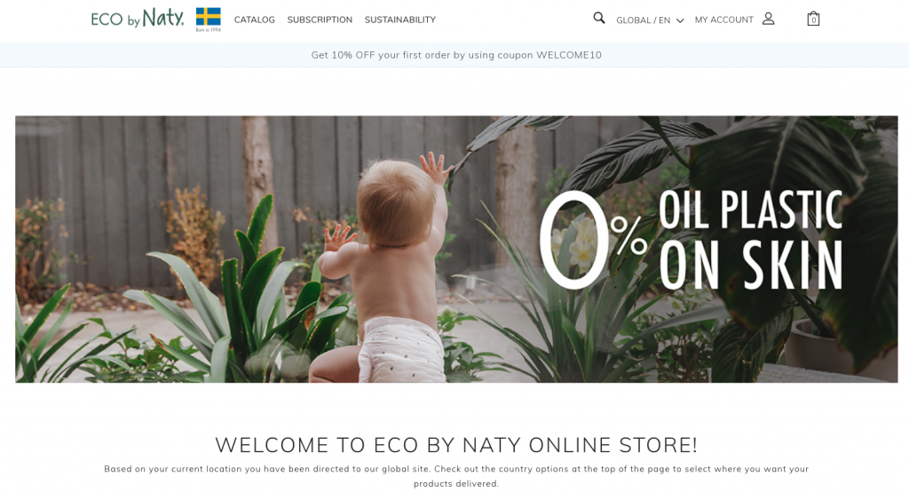
Source: naty.com
Now, compare that beautiful visual with the one used by one of Naty’s competitors, GroVia. The best way to describe this hero image is to say that it’s a missed opportunity. Not only does the visual overwhelm with too many colors, but the typography is hard to read.
Furthermore, the value proposition is unclear. And, worst of all, clicking on the CTA leads to a poorly optimized landing page that leaves potential customers confused about what they’re supposed to do to win the $200 gift card.
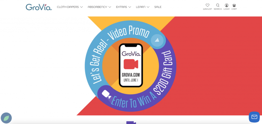
Source: grovia.com
Don’t: Be Afraid of Simplicity
You might think that the only way to grab your audience’s attention is to pull out the big guns. And sure, a striking image could be the way to go. But, remember that it’s not your only option.
Sometimes, a solid background can work just as well for your website’s hero section. Especially if your copy says enough.
For inspiration, you can look at the ISL Online homepage. Although it does use an animated website hero image, it relies on a solid color background that allows its unique value proposition to shine. And the solution works far better than any generic visual ever could.
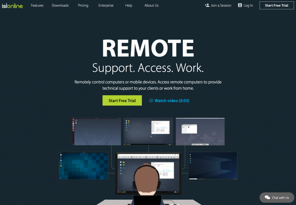
Source: islonline.com
Don’t: Ignore the Basics of Great Web Design
Unfortunately, web design mistakes aren’t too difficult to make. In fact, they’re more common than you’d think. So, if you’re looking for ways to ensure the success of your business, it’s not a bad idea to consult the ground rules of good web design.
- Choose a color palette that fits in with your brand’s identity.
While you don’t have to choose color palettes based on culturally conditioned rules, it’s still essential that you don’t pick the wrong colors for your website. For example, if you’re running an insurance business, you probably won’t want to go with a combination of bright yellow and hot pink. Yes, these hues do communicate a carefree approach to life. But they’re hardly synonymous with security and safety.
- Pay attention to contrast.
Another easy way to harm conversions on your website is to pick a hero image without considering how it will look combined with your copy. Sure, this product photo from FantasyJocks does look good. But the fact is, the white letters simply don’t stand out enough. A much better solution would have been to use a smaller product image. Alternatively, they could have used a solid color background and let the copy (which works great) speak for itself.
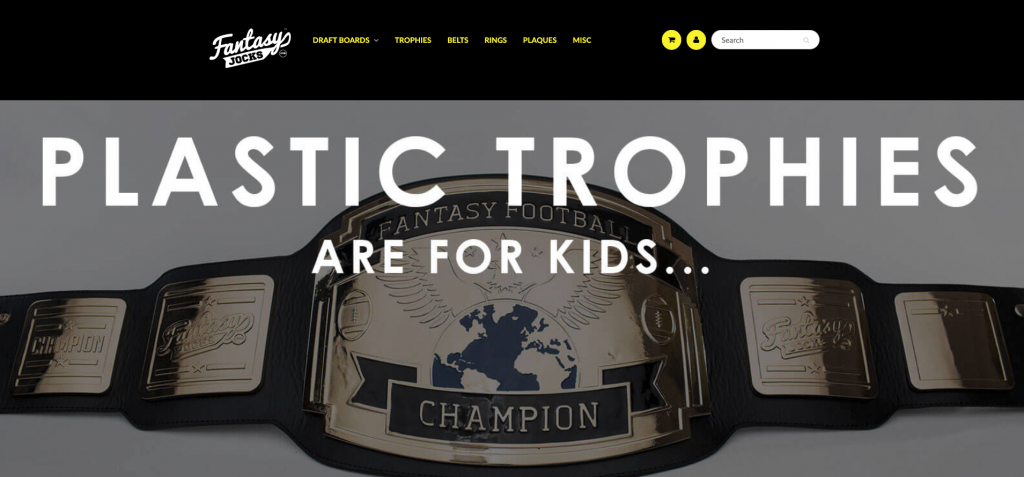
Source: fantasyjocks.com
- Use sufficient negative space.
When trying to boost conversions on your website, you must remember that your most valuable elements have to stand out. And while you can choose the right image and typography and write exceptional copy, it will all amount to nothing if these elements are too crowded to be noticed. For this reason, utilize white space in a way that’ll allow your hero section to do its magic. In this example from Growave, you can see how effective it can be to separate the hero image from the value proposition and CTA on your site. This lets the user’s eyes land on the most valuable part of the hero section while still providing a contextual product photo that drives the message home.
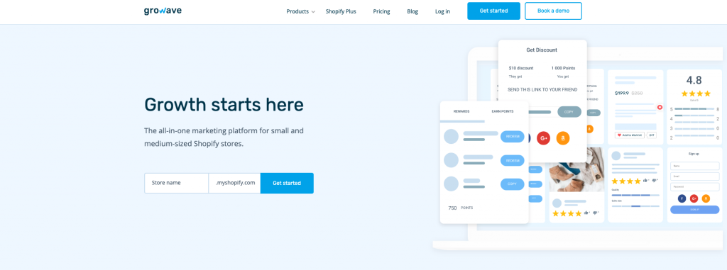
Source: growave.io
Do: Include a CTA
This should go without saying, but you must remember that a hero image won’t be able to boost conversions without a well-designed (and well-placed) CTA button to go with it.
So don’t expect a beautiful picture to do all the work. Instead of letting potential customers slip through your fingers because you haven’t provided them with clear instructions on what to do once they’ve landed on your site, ensure that you present a logical course of action from the moment they’ve arrived.
If you check out this landing page for Armadillo x House of Grey, you’ll quickly realize that it’s one of the most visually (and auditorily) stunning pages on the web. However, it still manages to make a huge mistake. Not only is the main CTA (“Shop Collection”) small, but it’s also overshadowed by a button that invites visitors to “Begin Journey.” This button, unfortunately, doesn’t turn them into customers – it just leads them through a series of beautiful visuals that do nothing to encourage conversions.
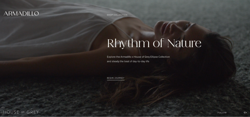
Source: rythmofnature.armadillo-co.com
Don’t: Forget to Track Performance
The last piece of advice for taking your website to the next level using hero images is to track conversion rates. How well you match up to the benchmark CRs in your industry can be a great indicator of whether there’s anything you need to do to improve your web design.
Moreover, don’t hesitate to use techniques such as A/B or split testing. These aren’t just methods for choosing one of two visuals. They’re also a great way to find out what works best with your target audience, giving you data you can use to make decisions regarding all other digital marketing strategies.
Final Thoughts
There you have it, the main dos and don’ts of choosing website hero images to boost conversions.
As you can see, there aren’t any strict rules on what type of visual you need to pick. In fact, the only person who can tell you what you need to do is you. No one knows your brand and your audience better.
Nonetheless, don’t be afraid to experiment. If you’re still looking for the perfect hero-section look for your brand, the best course of action will always be to follow the data. Try a few options and pick the one that works best. That way, you’ll be sure you haven’t made the wrong decision that could be hurting your conversion rates.

What Is WooCommerce Product Slider and Why Your Store Needs It
Why Do Product Images Matter So Much in Online Stores? When someone visits an online store the…
0 Comments9 Minutes

How to Streamline Your Customers’ Shopping Experience?
The goal for any online store is to make shopping as smooth as possible. When visitors move…
0 Comments8 Minutes

Strengthening Brand-Customer Relationships Through Gamified Loyalty Programs
Creating lasting connections with customers has become increasingly vital as the marketplace grows…
0 Comments6 Minutes

How to Use SEO and SEA Together in Search Engine Marketing
In digital marketing, search engine marketing (SEM) plays a critical role in improving online…
0 Comments10 Minutes

Content Marketing Growth Hacks: Real Shortcuts to Drive Traffic
Are you still lagging in content marketing? Sticking to these old strategies seems…
0 Comments10 Minutes

How to Build a Strong Local Following Using Social Media Marketing
In the days of likes, shares, and stories, local businesses have a golden opportunity to create…
0 Comments9 Minutes

Why WooCommerce is the Best Choice for Your Online Store?
WooCommerce stands out as a top option for anyone looking to build an online store. This platform…
0 Comments8 Minutes

How to Use AI-Powered SEO Tools for WordPress eCommerce
SEO is a critical factor in the success of any e-commerce WordPress store. As competition…
0 Comments11 Minutes