
How to Design a Homepage With Emotional Impact
No matter how rational we like to perceive ourselves, we humans are highly emotional beings. We tend to respond to emotional stimuli with an emotional response – even when we don’t actually perceive this to be happening.
Quick Links
This is a fact that designers and marketers have always been familiar with – and they have played on it from the very first TV ads all the way into the era of digital marketing.
In fact, emotional impact is one of the web design trends that has been huge this year.
Now, let’s explore how you can incorporate emotions into your own homepage design:
Start with Your Why
Before you actually begin designing anything, you need to be clear on the message you want to send.
While you may know that your main goal is to improve your conversions and boost sales, there is no one-size-fits-all solution for that. You need to think of your target audience, your brand and what it stands for, what the actual message is (for example, our products are fun and easy to use), and then think of the elements that will help this message come across.
Choose the Right Colors

Source: depositphotos.com
The colors you choose to use on your homepage will be incredibly important. There is an entire science devoted to examining the way different colors affect our thoughts and emotions, but suffice to say for now: you want to choose a color that is in line with your message.
You can read more about how each color and hue impact emotions, and then start aligning your color scheme with your message.
Make sure that the color you choose remains consistent throughout your website and all of your marketing assets. That way, you won’t be confusing leads and customers, and you will stay true to your brand identity.
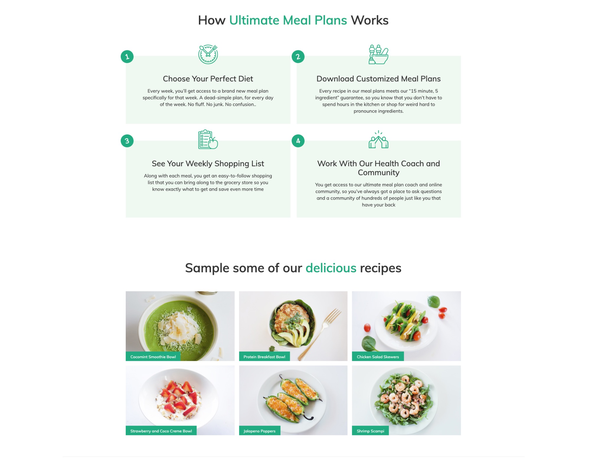
Source: ultimatemealplans.com
A good example of the clever use of colors is the homepage of Ultimate Meal Plans, who have chosen to go green. The color has very natural associations with nature and health, which is what their brand is all about. Try to imagine the same website with orange accents, and you’ll notice it just does not work as well.
Choose the Right Images
Images have the power to invoke deeper emotions much more instantaneously than words. As such, you need to be very careful with the images you use, as they can inadvertently trigger an unwanted response. This brings us back to our initial point about choosing a message here – what are the images on your homepage meant to reflect?
Can you show your product or services in action? If yes, this is always a good choice. Show visitors what it is they are getting – but in the best possible light.
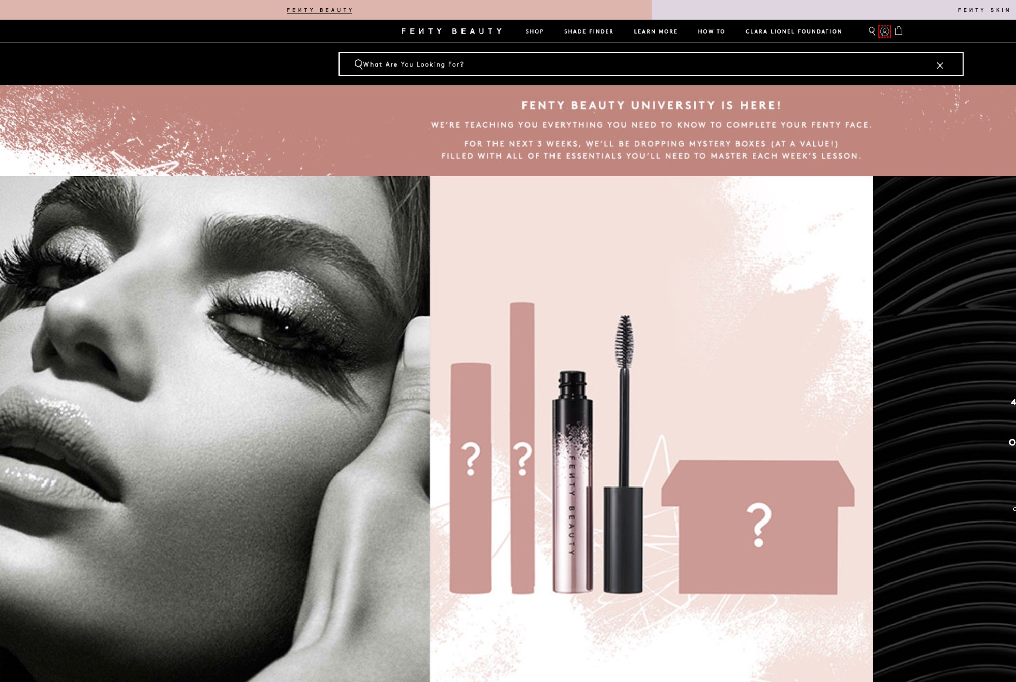
Source: fentybeauty.com
Here is an example from Fenty Beauty. They have plenty of images of their products on the homepage, but they are not just images – they are little bits of art. Each product flatlay is carefully considered and chosen as it shows the product in the best light. It just makes you want to try it.
On the other hand, if you don’t have a product you can show to elicit emotions, maybe you can show a representation of what you stand for and what you provide.
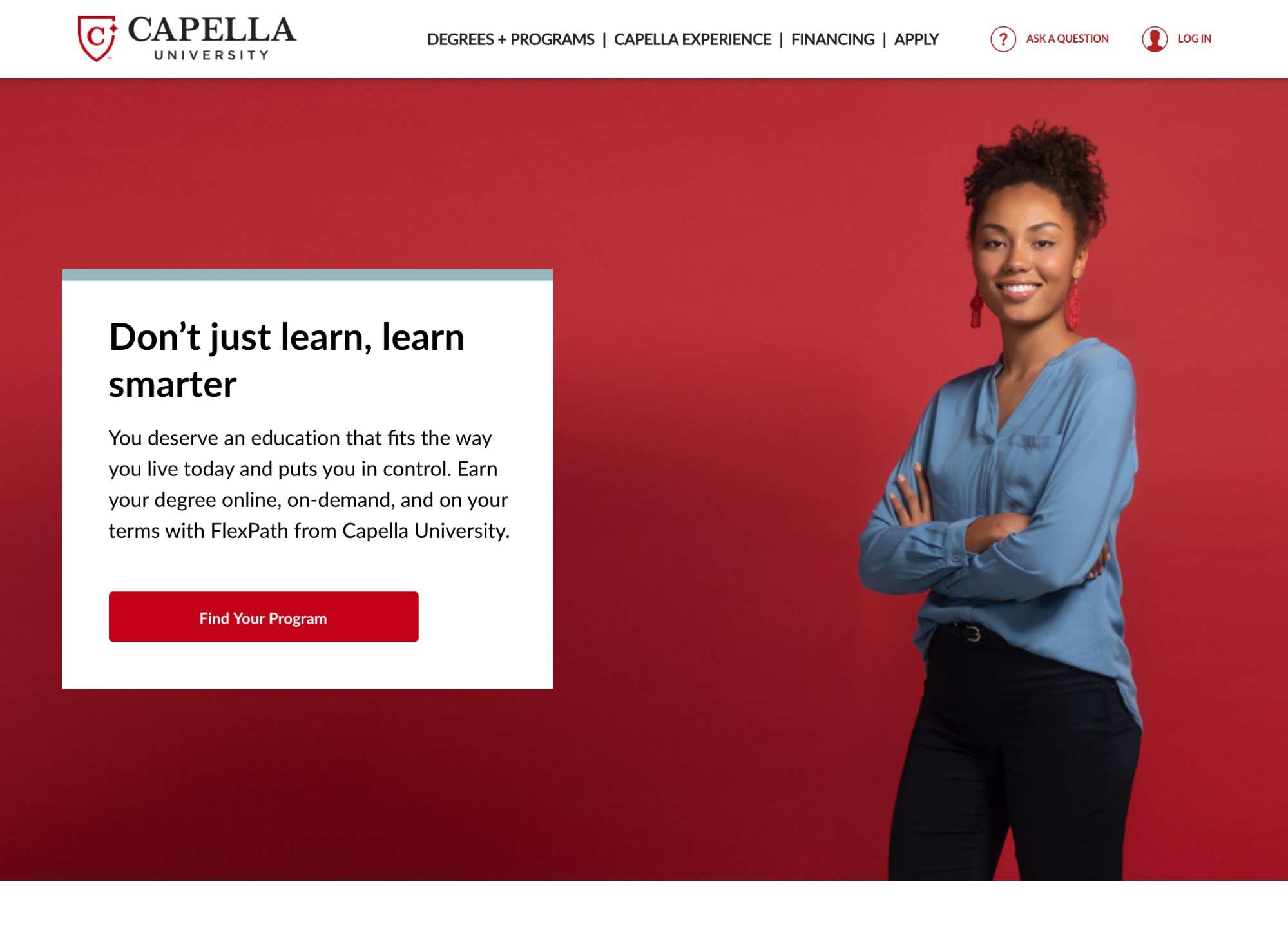
Source: capella.edu
Capella University features two very simple images of their students (or models standing in for their students) on their homepage. The images are stripped down and very minimalistic, but the emotion is certainly there, smiling at you from the screen.
When considering your images, also factor in everything you know about colors and how they impact emotions as well.
Even if you don’t have a product or service, the images you choose should be adequate representations. For example, Best Spy features images for each product category on their homepage. They have been carefully selected to spark a positive emotion. As you look at them, they inspire trust and a sense of calm (or playfulness, when you get to the pets section). All in all, the imagery is perfectly in line with their brand message – “reliable reviews you can trust.”
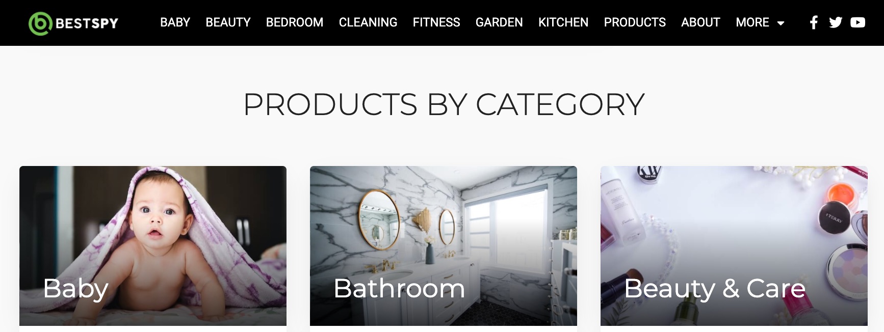
Source: bestspy.co.uk
Think of Solutions and Not Just the Problems
One of the main rules of marketing is to provide solutions as opposed to focusing on pain points and features. Don’t go into detail about what a product is – explain what it will do to make someone’s life easier, better, more enjoyable.
You can achieve the same effect with the design features of your homepage. If the page is easy on the eyes, if it provides all the necessary information in a simple and organized way, if the images you feature are in line with the solution – your entire page will exude the right emotion.
What this means in practice is:
- Focus on UX: That includes ease of navigation and plenty of negative space; don’t clutter any segment of the page with unnecessary copy or visual elements.
- Don’t try to do too much at once: While you might be tempted to throw plenty of information at your visitors, a better option is to keep your homepage minimal. You have other pages for adding value – the homepage is all about that instant connection.
- Don’t be too obvious: Eliciting an emotional response and banking on the fact that humans are emotional creatures is certainly your aim, but don’t make it too obvious. You don’t want to throw a bunch of cutesy images of babies and kittens on your homepage just so you can inspire an emotional reaction.
Here is a nice example from Heystack about the kind of design we have in mind. What they have on their homepage is neither cute nor particularly evocative of any pleasant emotions. However, the emotions are certainly there. First, you have a sense of bewilderment and confusion; then, when you click on the Make it simple button, you get a sense of relief and a smile – brilliantly executed and in line with their brand to the T.
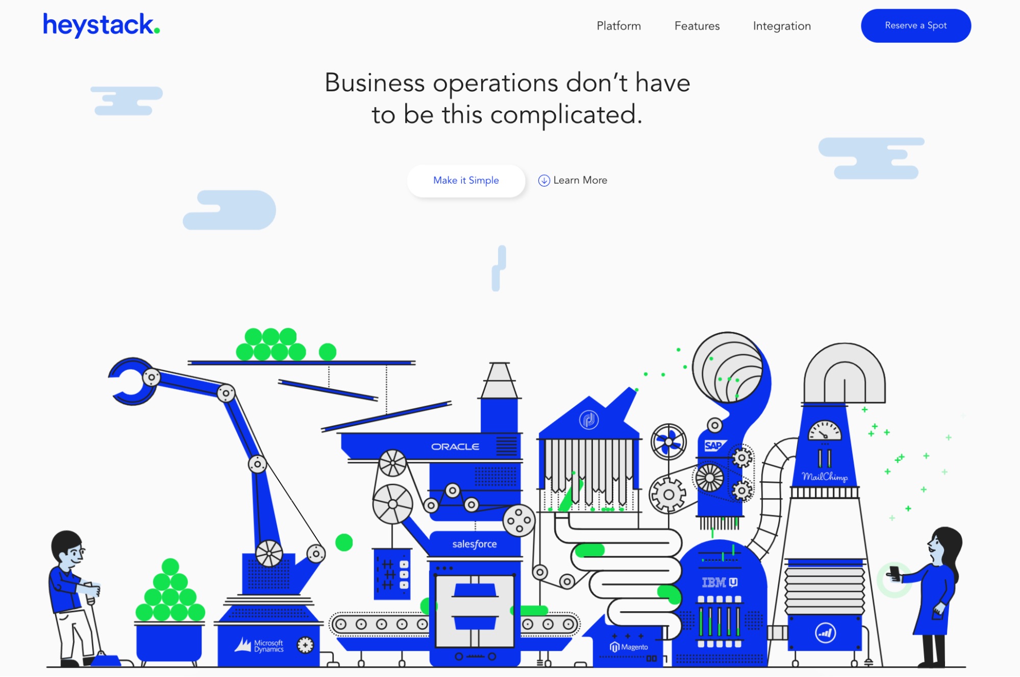
Source: haystack.is
Alternatively, if you don’t want to go down that elaborate route, you can do something much simpler and achieve the same effect.
Here is an example from Forms on Fire – they don’t actually show their product on the homepage, but they still play with emotion pretty well with the images of satisfied customers. The colors are neutral and the white space has been replaced by gray, but all the key elements of an emotive homepage design are certainly there.

Source: formsonfire.com
To Sum It All Up
Human emotions are complex things, and they depend a lot on our own experiences and existing associations. As a business, you can never actually know what an individual’s responses will be, but what you can do is apply all of the best practices we’ve just outlined above.
Do your research thoroughly, analyze the emotions and responses you wish to achieve, and think about the core message your stand behind. The additional effort will make adding that emotional value to your design much easier.

What Is WooCommerce Product Slider and Why Your Store Needs It
Why Do Product Images Matter So Much in Online Stores? When someone visits an online store the…
0 Comments9 Minutes

How to Streamline Your Customers’ Shopping Experience?
The goal for any online store is to make shopping as smooth as possible. When visitors move…
0 Comments8 Minutes

Strengthening Brand-Customer Relationships Through Gamified Loyalty Programs
Creating lasting connections with customers has become increasingly vital as the marketplace grows…
0 Comments6 Minutes

How to Use SEO and SEA Together in Search Engine Marketing
In digital marketing, search engine marketing (SEM) plays a critical role in improving online…
0 Comments10 Minutes

Content Marketing Growth Hacks: Real Shortcuts to Drive Traffic
Are you still lagging in content marketing? Sticking to these old strategies seems…
0 Comments10 Minutes

How to Build a Strong Local Following Using Social Media Marketing
In the days of likes, shares, and stories, local businesses have a golden opportunity to create…
0 Comments9 Minutes

Why WooCommerce is the Best Choice for Your Online Store?
WooCommerce stands out as a top option for anyone looking to build an online store. This platform…
0 Comments8 Minutes

How to Use AI-Powered SEO Tools for WordPress eCommerce
SEO is a critical factor in the success of any e-commerce WordPress store. As competition…
0 Comments11 Minutes