10 Mobile SEO Best Practices That Help You Rank Better
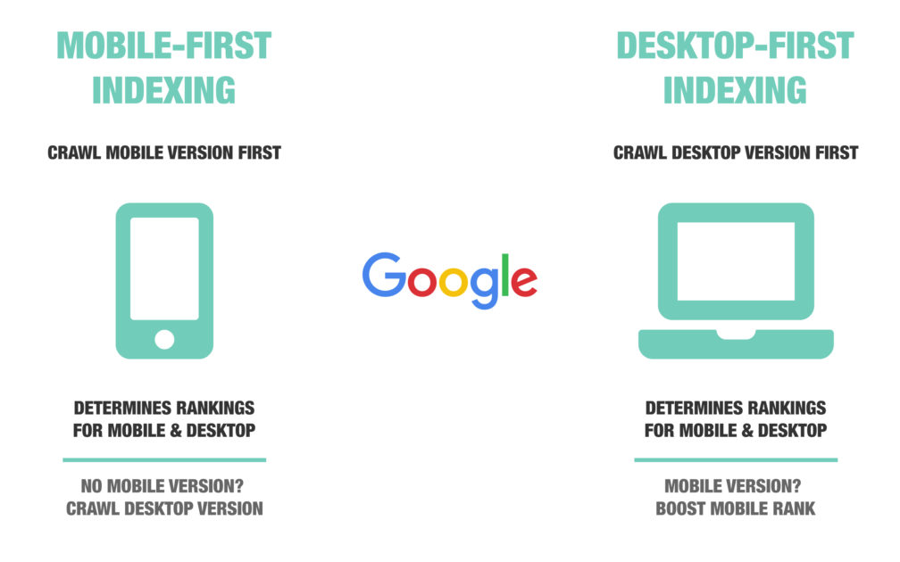
Google uses Mobile-first indexing as a primary criterion to rank websites in the search results.
Quick Links
It doesn’t stop here, as it penalizes you for having a non-mobile-friendly website. Don’t worry; Google doesn’t smack you but lowers your website’s SEO ranking.
That means the mobile-friendliness of your website will be a make or break for indexing and ranking on Google.
As per 2021 statistics, mobile devices (excluding tablets) generated 54.8% of global website traffic.
So, ignoring the mobile-friendliness of your website is a bunder you should not make!
To easily check the mobile-friendliness of your website, you can use the Mobile-Friendly Test tool.

It will give you a fair idea about the responsiveness of your website. However, your website needs work if you don’t get a green tick.
You need to upgrade your website to a mobile-optimized website by following these 10 best practices:
- Never Hide From Crawlers
- Tackle User Bumpers
- Practice 2-Way Web Page Optimization
- Monitor Page Speed
- Follow Design Rules For Your Content
- Be Clear About AMPs
- Optimize For Voice Search
- Optimize For Local Search
- Opt For Dynamic Serving
- Use Schema Markup
To begin with, You should know a little about search engine crawlers.
1. Never Hide From Crawlers
You must not block the Smartphone GoogleBot from crawling your website and its content.
Be fearless to expose your javascript, CSS, images or other parts of your site’s code to crawlers.
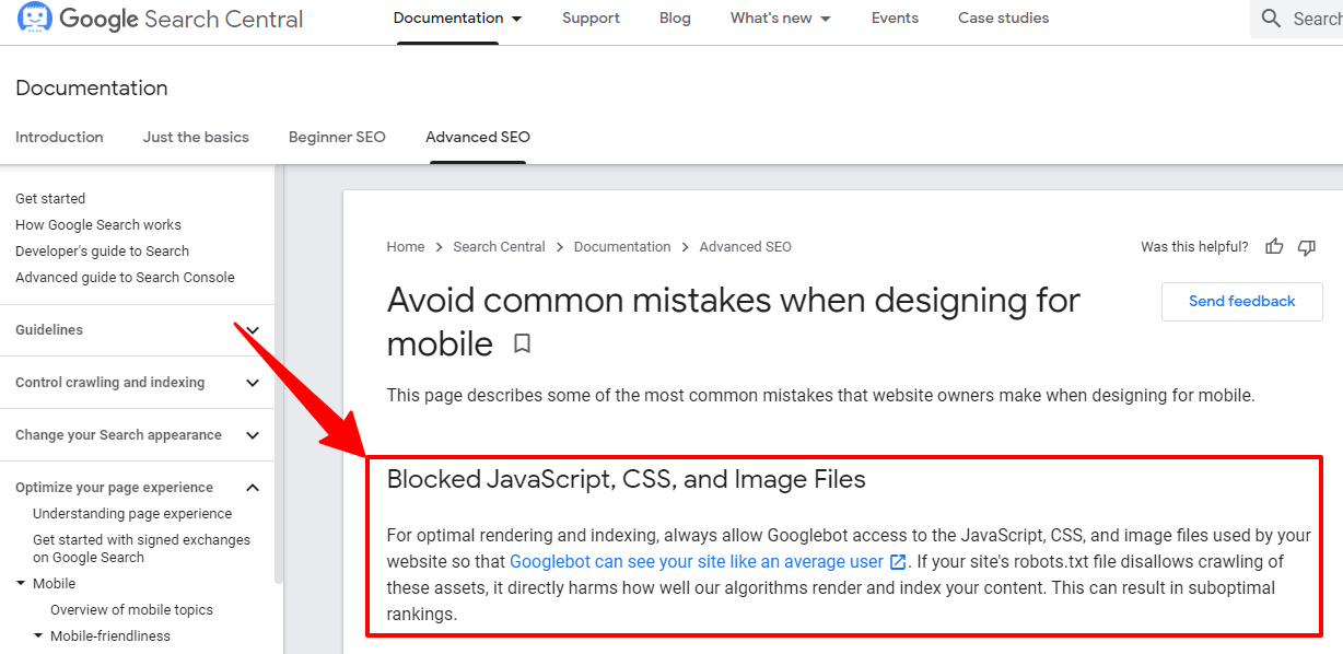
You can check if you have permitted crawling using Google’s URL inspection tool.
It shows how google renders your website and indexing errors, if any.
After you fix crawling issues, tackling user bumpers is another handy practice.
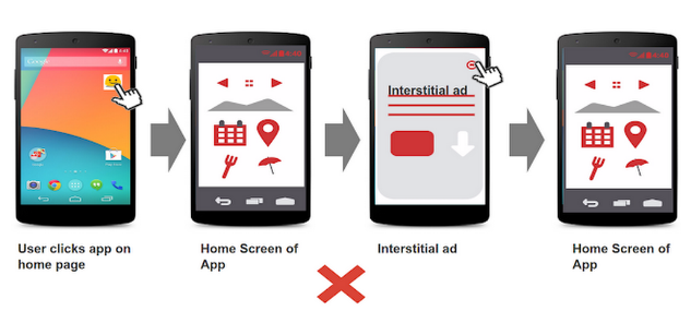
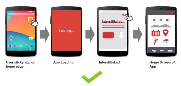
2. Tackle User Bumpers
You must avoid unwanted interstitials, including pop-ups, advertisements, etc.
Also, most users already have the “Block all pop-ups” setting ON, which is bad for your pop-ups.
But you can add relevant interstitials if optimized for:
- Time of appearance on the page
- Speed of loading of interstitials
- Size
- Position on the page
Remember not to cover any important content on the page.
You must note that there are certain exceptions that Google allows as interstitials.
These include:
- Cookie usage info
- Sensitive content warnings
- Login displays
- Disclaimers
- Pop-ups within acceptable limits (not blocking all or most of the screen)
After dealing with pop-ups, you can go for 2-way web page optimization.
3. Practice 2-Way Web Page Optimization
To break this down for you, optimize your website for both mobile and desktop users.
There are certain key tips to follow:
- You can have a single URL for both mobile and desktop versions of the website. But to improve its responsiveness, you need to put a meta viewport tag in your content.
It helps the browser automatically adjust the page’s dimensions to the width of the user’s device.
Here’s the syntax of the meta tag you need to add to the head of the document:
<meta name=”viewport” content=”width=device-width, initial-scale=1.0″>
- Use proper redirects to escape mobile-404 errors. If you have a different URL for your mobile website, redirect the user to that URL.
- Many smartphones do not support the flash player. So, It would be best to opt for HTML5 instead of flash player format for special effects. You may also use an “all-device friendly” video embedding.
After this, understand how to accelerate your page’s loading speed.
4. Monitor Page Speed
A slow page loading speed increases the bounce rate of your website.
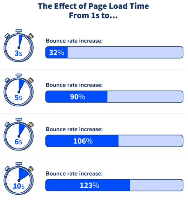
It also affects your business’s UX and conversion rates, which leads to a low SEO ranking.
You need to follow these practices to attain a good page loading speed:
- Leverage browser caching
- Reduce redirects
- Keep your images’ size small
- Avoid unwanted huge marketing pop-ups
Remember to backup your site settings to save time while improvising the changes.
Now comes the minute but important part of the website – the design of the content.
5. Follow Design Rules For The Content
Your content should have optimum negative space between lines, images or icons.
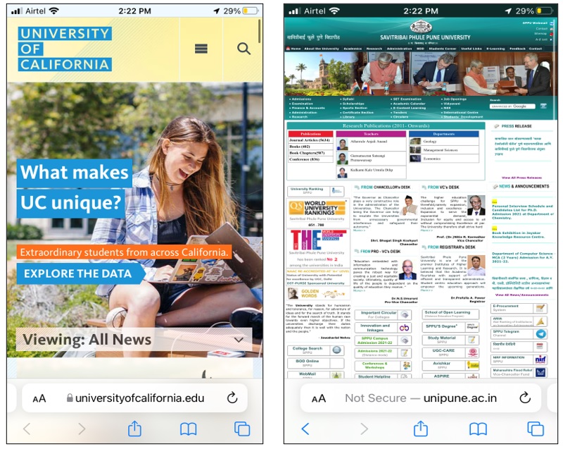
In the above image, the left side screenshot has proper negative spaces, while the right side screenshot lacks a lot.
Here are some tips to follow to improve your site’s utility:
- Highlight important icons or clicks with different colors or sizes
- Use an easily readable font size for a normal vision person (14-16 px)
- Avoid small-sized icons to fit every tap
Designing the content isn’t enough; AMP is also helpful for mobile SEO.
6. Be Clear About Accelerated Mobile Pages (AMPs)
Let me clear your dilemma about AMPs.
AMPs are designed to load pages quickly but leave out certain website content.
Google pushes AMP-enabled websites upwards, but it may not be good for you as it limits your page’s functionality.
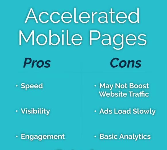
Your decision to opt for AMPs should depend on two factors:
- Nature of your business
- Number of local visits
Now it’s easy for you to choose AMPs.
Then comes the interesting part of the process – optimizing for voice searches.
7. Optimize For Voice Search
Ok Google! Hey Siri! Alexa! – these are slowly becoming common communication ways for users today.
27% of the global online population performs voice searches on mobile. And the volume is nearly 1 billion per month.
Hence, you should optimize your website for voice searches.
Once you are ready to do so, keep the following in mind:
- Write in a conversational style.
- Target more question keywords.
- Enhance for rich results.
- Keep the questions in simple and short forms.
But this might not be enough for local users. You should also look into optimizing your website for local search.
8. Optimize For Local Search
Having a local element to your business increases your conversion rate.
60% of smartphone users have contacted a business directly using the search results (e.g., “click to call” option).
That’s why It is important to have a Google Business account.
Even then, do not forget to standardize your details – name, address, phone number, city, state, etc., in your site’s metadata.
It will surely reduce the bounce rate of your website from local searches.
Other ways to get more traffic from local searches are:
- Enlisting your business in local web directories
- Asking for customer reviews
- Updating your details with time
- Building a local social network
Now let’s simplify dynamic serving for you.
9. Opt for Dynamic Serving
What if you can serve both desktop and mobile users with one URL and no new website designing hassle?
You simply need one URL to display different sets of HTML and CSS depending on the type of device (mobile, tablet or desktop) used by the user.
With this setting, the mobile users will be served the mobile version of your website, while the desktop users will be served the desktop version of your website.
To apply this, you need to put a Vary HTTP Header to your website’s code. Its purpose is to signal the caching servers to serve the user:
- Mobile HTML for mobile device
- Desktop HTML for desktop devices
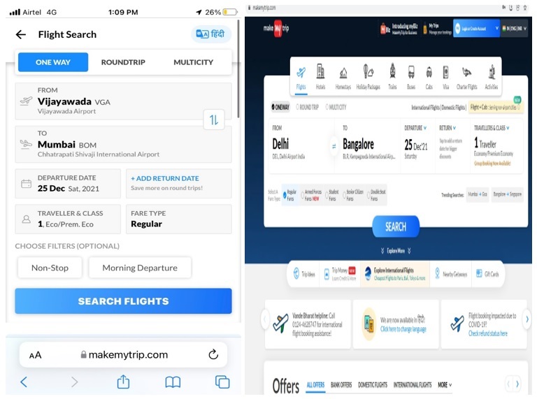
For example, a user is checking out hotels for booking on Makemytrip.
You can see the difference in content between mobile and desktop sites. It is the work of the dynamic serving method.
Great right!
The only problem here is updating the new users to your list. Make sure to avoid certain mistakes while doing so.
Finally, we reached our last practice – schema markup.
10. Use Schema Markup
Schema Markup, a website jargon, structures your website’s data to convey your content precisely to the search engine crawlers.
It is a part of rich snippets, which provide additional and search intent relevant information within the SERPs.
There are different types of schema markups that you can use as per your business requirements:
- Articles
- Events
- People
- Products
- Organizations
- Local Businesses
- Product reviews
- Medical conditions
- Recipes
- Breadcrumbs within the website
- Job postings
- FAQ pages
- Job training
- Books
- Podcasts
- How-to
- Logos
- Movies
- Sitelinks search box
- Subscription and paywall content
- Videos
- Image license metadata
Once you decide your options, here’s a tool to create your website’s schema code.
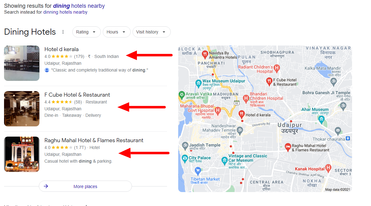
The red arrows in the above image show the rich results visually, which is the magic of the schema structured sites.
With this practice, you gain:
- High click-through rate
- High local SEO ranking
- Improved mobile SEO
Now you have everything to get your website mobile-optimized.
Conclusion
These 10 practices will help you make your website mobile-friendly and get the most out of your mobile SEO efforts.
Keep checking your progress from time to time and make required changes for better results.
Finally, you have what it takes to rank better.
Which of the above practices were you not following yet? Let me know the ups and downs of your website in the comments.
Author Bio

Sahil is the CEO and Founder of Rankwatch – a platform, which helps companies and brands stay ahead with their SEO efforts in the ever-growing internet landscape. He keeps sharing his knowledge and experiences on the RankWatch blog, and likes making creative products that can help in the automation of mundane tasks. You can connect with him and the Rankwatch team on Facebook or Twitter.
Social media Links:
Facebook- https://www.facebook.com/RankWatch/
Linkedin- https://www.linkedin.com/company/3478204/
Twitter- https://twitter.com/RankWatch
Instagram: https://www.instagram.com/rankwatch_seo/
Website- http://www.rankwatch.com

What Is WooCommerce Product Slider and Why Your Store Needs It
Why Do Product Images Matter So Much in Online Stores? When someone visits an online store the…
0 Comments9 Minutes

How to Streamline Your Customers’ Shopping Experience?
The goal for any online store is to make shopping as smooth as possible. When visitors move…
0 Comments8 Minutes

Strengthening Brand-Customer Relationships Through Gamified Loyalty Programs
Creating lasting connections with customers has become increasingly vital as the marketplace grows…
0 Comments6 Minutes

How to Use SEO and SEA Together in Search Engine Marketing
In digital marketing, search engine marketing (SEM) plays a critical role in improving online…
0 Comments10 Minutes
Content Marketing Growth Hacks: Real Shortcuts to Drive Traffic
Are you still lagging in content marketing? Sticking to these old strategies seems…
0 Comments10 Minutes

How to Build a Strong Local Following Using Social Media Marketing
In the days of likes, shares, and stories, local businesses have a golden opportunity to create…
0 Comments9 Minutes

Why WooCommerce is the Best Choice for Your Online Store?
WooCommerce stands out as a top option for anyone looking to build an online store. This platform…
0 Comments8 Minutes

How to Use AI-Powered SEO Tools for WordPress eCommerce
SEO is a critical factor in the success of any e-commerce WordPress store. As competition…
0 Comments11 Minutes