
The Top 4 Rules Of A User-Friendly Website Design
In today’s digital age, there’s one business asset that’s a must-have: a website. You can consider this as your showroom in the digital space. It’s here that potential buyers can purchase any of your products or avail of your services. It’s also through your website that you can post content and other promotional materials for your brand.
Quick Links
Given that there are thousands of websites all over the World Wide Web today, it’s also not surprising to find a whole lot of directions and styles by which you can come up with your website. There are themes for every desired preference. Think, colorful or minimal, modern or classic—whichever choice is up to you. You can achieve these either on your own or through the help of web design experts like https://www.smartlydone.com/ and others.
But whatever your intended purpose and style for your website is, there’s one important standard you have to comply with: your website has to be user-friendly. This means, notwithstanding all of the design elements you have on your website, your visitors shouldn’t have a hard time navigating through your site. Even those who are newbies to exploring websites should find what they’re looking for.
There are many ways for you to achieve a user-friendly website design, starting with these top four rules:
1. Build A Mobile-Responsive Website
When a potential website visitor views your website from a mobile device, your interface shouldn’t get distorted. Your website is meant to adapt to different screen sizes. The rise of smartphones means many more Internet users are browsing websites through their smartphones. You need to adapt to those individuals. Otherwise, you’re losing website visitors if you only prep yours for a desktop or laptop screen.
Having a mobile-responsive website goes hand-in-hand with user-friendliness. When your website isn’t shaped even for mobile visitors, your usability gets affected. This means potential website visitors are going to experience a hard time navigating through a distorted website on their small mobile screen.
With that in mind, these are some of the best tricks to apply to have a mobile-friendly website:
- Think with your thumb and index finger
This means when you design tabs or links on your website, you should be able to successfully click it without any difficulty by using your thumb or index finger. These are the two biggest fingers in the hands, so if you can click with those fingers and not opening other links as well, then you’re good to go.
- Keep the content brief
Your website content has to be short and brief. If not, those long chunks of text are going to appear heavy on a small screen. You wouldn’t want to overwhelm your website visitors with information overload.
Mobile users are interested in scrolling quickly, so keep the text short. If you have a lot to talk about a particular subject matter, a good practice is to make those more interesting through infographics and videos instead.
- Optimize images for mobile use
In connection with the point above, long content can be made more interesting for mobile users by posting photos and videos instead. But be sure also not to cross the line of images and videos that are too heavy for mobile users. If not, media that aren’t optimized for mobile use will only slow down your page loading speed. In fact, your website won’t be attractive anymore to your potential website visitors if they have to wait too long for your page to load.
2. Keep A Minimalist Homepage
A cluttered homepage is never a user-friendly one. The reason for this is simple. When your homepage is cluttered, potential website visitors won’t even know where and how to find what they’re looking for. Right there and then, you’re sure to lose those visitors in favor of a website with a better-looking homepage.
You have to strike the balance between having a well-designed homepage and one that’s also minimalist. Your homepage should only have what needs to be there—nothing more. Don’t overwhelm it with too many graphics or other elements that might be distracting. Your homepage should also easily lead first-time visitors to the information they’re looking for on your site.
Keep in mind these tips, so you can come up with a presentable but inviting and clutter-free website design:
- Space out your content
This applies to the latest content you have, which is usually housed on the homepage. Perhaps the announcements to any events or promotional activities that may be upcoming can be here. When you leave some areas blank with white space, you’re giving your design a more spacious and well-balanced feel.
- Ensure every design aspect serves a purpose
The whole point of a minimalist website is that every design element has a good purpose. You don’t just place any design element or graphic at random. Eliminate any fluff.
- Choose the right fonts
This means your font styles for the tabs and links on your homepage are easy to read. Choose the right font color too, so the color stands out from your website’s background.
- Highlight any main promotions, messages, or new arrivals
Your homepage should be interesting enough to your website visitors such that they don’t just linger on it. Your website visitors become so drawn to your website that they go through your site and shop. You can achieve that by highlighting any main promotions, messages, or new arrivals your website has.
3. Maintain Simple Navigation

A user-friendly website is also one that’s necessarily easy to navigate through. This means by scrolling through your site, your visitors know where to go. The search button is easy to find. There are proper headings for groupings of like information. Your contact information is easy to find. Simplicity in a website isn’t a new concept. And it’s definitely one of the most effective in achieving your intended goal of having a website that’s easy to navigate through.
What makes a website easy to navigate? Here are four best practices:
- Make your sidebars stand out
If your sidebars blend with the rest of your page, then unfortunately, your website visitors will find it challenging to navigate your page. This breaks its usability as well.
Make sure your sidebars don’t blend with the rest of your content. The best way to achieve this is to give it a different color from the background or the content. If you want to maintain the same color hue, then at least make your sidebars one to three shades darker than the content and the background.
- Make your hypertext or links stand out
Like the sidebars, any links or hypertext you have on your website’s content should stand out. That way, it’s easier for your website visitors to get the gist that those hypertexts are meant to be clicked to link you to another page on your site or an authority site. There’s no confusion.
How do you make your hypertext or links stand out? Make them bold, italicize them, or use another color.
- Have a search bar
Whatever your website’s design is, never skip the search bar. A website without one isn’t a user-friendly one. It offers extra convenience to your website visitors when a search bar is available. With one, they can simply type the keywords to the information they’re looking for. This cuts the time they have to scroll through all of your content just to find certain information.
As an added tip, be sure to place the search bar where it’s supposed to be placed: on the top right corner. This can take the guesswork out of lost website visitors who have to look through your website just to find the search bar that’s nowhere to be found.
- Link your logo back to your home page
As the search bar is usually positioned on the upper right corner of your website, the logo is usually on the opposite: the upper left corner. Your logo is constantly and consistently placed there even if the website visitors go through other pages within your site. The reason for this is your logo should serve the purpose of being a click-through to link back to your homepage.
As you can see, having your logo on your website is more than just a marketing tactic. Rather, it also contributes to ensuring your website stays user-friendly and easy to navigate. Whenever a website visitor has to go back to the home page, they can immediately do so by simply clicking your logo.
4. Create Easy To Read Website Content
Your website’s content is just as important as the design itself. These two have to go hand-in-hand. No matter how well-made and well-designed your website content is, it ceases to be effective when the content isn’t easy to read.
Easy-to-read website content is always a part of a user-friendly website. This means your visitors don’t just have an easy time finding their way around your site. But they can also seamlessly digest and understand the message you’re trying to get across.
Achieving website readability is relatively easy. You can start by applying these five key rules:
- Post in large font sizes
Most Internet users may find it difficult to read small texts through a computer or mobile phone screen. So, you have to be selective about your font size selection process to ensure your fonts are large enough to be read and understood. A good rule of thumb is to choose a font size that’s at least 16pt. But you have to change this also according to the number of fonts you’ll wind up using on your website.
- Limit the number of fonts
Don’t go overboard with having too many fonts, or your website is going to look messy and confusing. Don’t let your fonts distract your website visitors from the most important thing they have to gather from your site—information.
- Give text room to breathe
This means making use of white space. Don’t forget proper spacing in between paragraphs. And if you have multiple posts or content on one page, have even more space in between two different types of content. Giving your content’s text room to breathe will also make it easier on the eyes of your website visitors. They don’t have to feel swarmed by too many words placed on a single page.
- Keep subheadings short
Another effective way of improving user-friendliness in your website content is to keep subheadings short. The subheadings are important so you can cut and break information. This will make it easier for your website visitors to skim through your text, especially when they’re in a rush. The subheadings give a clue as to whether the information can be found on that section of the content or if they have to look further.
Be sure not to have subheadings that are too long. Like your content’s title, the subheadings have to be short but concise.
- Use strong headlines
Help your website visitors find what they’re looking for by having strong headlines. By reading your title, your website visitors should already have that ascertainment of whether they can find the specific information they’re looking for on the post. Or perhaps they’re looking for products that are sub-grouped according to your product classifications and headings.
The more compelling your headings are, the higher the chances your website visitors will linger on your site with a pleasant reading and shopping experience.
Conclusion
The rules above may seem numerous, but they’re important if you want to have a website that delivers. A user-friendly website is also an effective one. This means every feature has a purpose and no added elements that don’t serve an intended function are in place. It’s also a profitable one as it becomes more attractive to a wide range of website visitors.
You don’t have to overwhelm yourself with applying all of the rules above all at once. It’s for you to take one at a time and see the changes in your website. Whatever your website theme or style is, don’t fall short out of applying the top rules above.
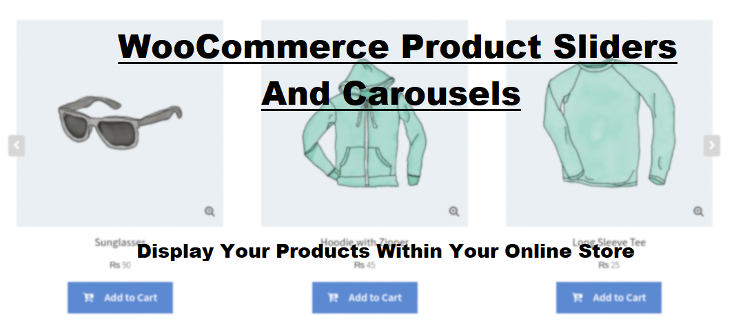
What Is WooCommerce Product Slider and Why Your Store Needs It
Why Do Product Images Matter So Much in Online Stores? When someone visits an online store the…
0 Comments9 Minutes

How to Streamline Your Customers’ Shopping Experience?
The goal for any online store is to make shopping as smooth as possible. When visitors move…
0 Comments8 Minutes

Strengthening Brand-Customer Relationships Through Gamified Loyalty Programs
Creating lasting connections with customers has become increasingly vital as the marketplace grows…
0 Comments6 Minutes

How to Use SEO and SEA Together in Search Engine Marketing
In digital marketing, search engine marketing (SEM) plays a critical role in improving online…
0 Comments10 Minutes

Content Marketing Growth Hacks: Real Shortcuts to Drive Traffic
Are you still lagging in content marketing? Sticking to these old strategies seems…
0 Comments10 Minutes

How to Build a Strong Local Following Using Social Media Marketing
In the days of likes, shares, and stories, local businesses have a golden opportunity to create…
0 Comments9 Minutes

Why WooCommerce is the Best Choice for Your Online Store?
WooCommerce stands out as a top option for anyone looking to build an online store. This platform…
0 Comments8 Minutes

How to Use AI-Powered SEO Tools for WordPress eCommerce
SEO is a critical factor in the success of any e-commerce WordPress store. As competition…
0 Comments11 Minutes