How to Use Colors to Draw Attention to Important Web Elements
Website design plays a crucial role in user experience, as we all very well know. Visitors are not likely to explore a website if it’s clunky or poorly organized.
Quick Links
There are numerous web design elements to take into consideration. In this post, we’ll talk about how you can use colors to draw attention to some of the most important elements on any page.
Hopefully, this advice can help you reconsider the way your site is designed. Let it inspire you to make some tweaks that can result in higher conversion rates and better UX.
Make the Value Pop
Perhaps the most obvious way to use color on a page is to emphasize the value a visitor will get if they choose to convert.
This can mean highlighting
- specific segments of your offer (for example, free shipping), or
- specific benefits a product or service can deliver (for instance, 25% more efficient than our previous product)
To bring out these key messages, you can simply choose a different color for the font. It can be a part of the same color family as the rest of the page, or it can be bold and bright. Inkable Label used a very bright red on their homepage to underline the value of their products in dollars and cents, for example.
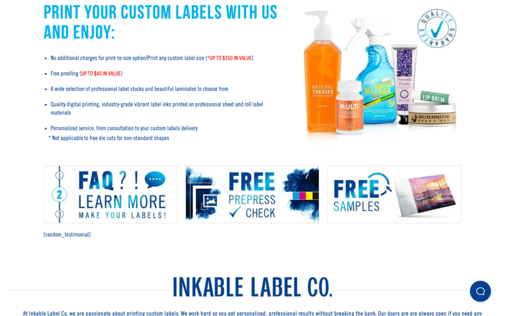
source: inkablelabel.com
Save It for the Product
You can adopt a very minimal approach to color and reserve it only for the products you stock.
Modern web design values white – or “negative” – space. If you keep every other element of your website neutral in black and white (the background, the menus, the buttons, the footer), you can easily draw all of your visitor’s attention to the images.
This also makes for a very pleasant user experience. It enables you to showcase what matters most, stripping back any unnecessary bells and whistles.
This is what Storq did – the only color on their site is that of the clothes and the models wearing the clothes. Even the photos have been taken against a neutral background, helping them blend in with the design of the website. This helps every item pop, as there are zero distractions.
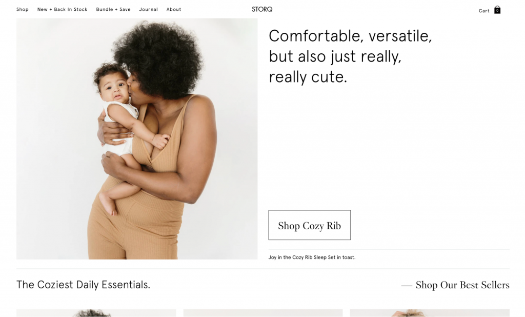
source: storq.com
Save It for the CTA
Probably the most important element on any page is the CTA button, and most websites rely on color to make it pop.
To draw the eye to your CTA, though, you need to make sure you’re not too garish, as that can produce quite the opposite effect.
Remember those websites that had flashing arrows pointing to their CTAs? Or the websites that still have pulsating or dancing CTA buttons? Try not to do that. Just choose a color that will stand out against the rest of the page.
Here’s a good example from Perspective. They went the traditional route – minimalistic design, plenty of white space, some pops of color, and a blue CTA. The blue is vibrant enough to be noticeable, yet it’s not too over the top. It’s also the only blue element on the page, so it won’t ever get confused with something else.
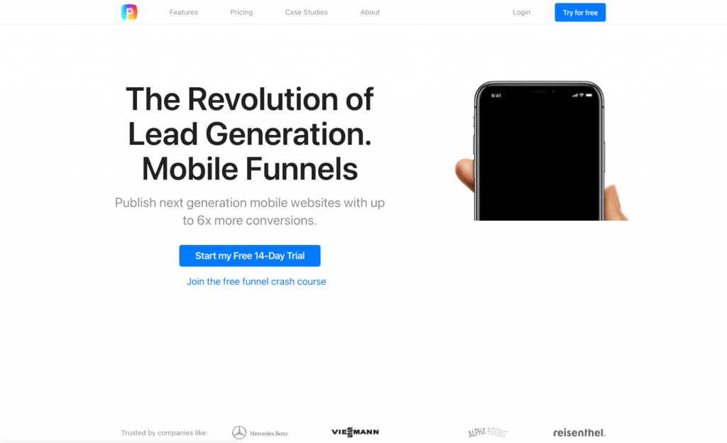
source: perspective.co
Limit Your Color Palette
While talking about the use of color in web design, we need to discuss a very important tip: try not to use too much color.
Unless your website has a solid reason to be very colorful, it’s best to stick to a specific color palette. Choose a palette that will help your audience remember you and that is in line with your brand. Then, just stick to that.
Which color story you choose is usually a matter of research. However, don’t feel pressured to do what most brands in your industry are already doing. For example, if you’re an eco-friendly company, you don’t necessarily have to go all green on the website.
Here’s a pleasant example from Mail Munch. They went for a combination of yellow, blue, and grey. They sprinkle this combo with other colors when they need them (like on company logos, for example). It’s a very soothing solution that establishes trust and makes the visitor feel relaxed while browsing. Plus, the generous use of white space makes the site feel airy and fresh.
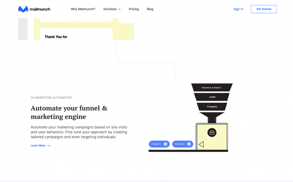
source: mailmunch.com
Use Complementary Colors
There are different routes you can take when it comes to choosing said color palette. You can choose contrasting colors if you want a more vibrant effect. You can choose neutral colors if you’re aiming for a more modern, minimalist atmosphere.
By choosing to use complementary colors, you can select any color palette that matches your brand’s story and ethos. Plus, you will ensure that you’re not inadvertently making a choice that “just doesn’t fit.” Color psychology and color theory are both important elements of web design, and just because you like something doesn’t mean you’re not hurting your visitors’ eyes.
Here’s a colorful yet complementary example from Aerial. They’ve definitely stepped outside the box with their use of purple, and the usual eco-green is there. But, paired with its complementary colors, the green can pop, instantly making the whole page much more dynamic. The purple is amazing as well – lively yet muted, and soothing yet playful.

source: aerial.is
Paint It Black
We can’t talk about the use of color in web design without mentioning black. Technically not a color, it’s still an option many websites go for. And it usually helps them project an image of sophistication and professionalism.
The one thing about black, though, is that you need to be aware of its impact. If you’re a fun-loving brand that aims to attract a more laid-back audience, it’s definitely the wrong choice. If you are what can be described as a “serious” brand and you’re looking to establish a level of expertise, black can be a good choice.
Just make sure you provide some color as well and don’t keep it all black and white. That may be a bit too harsh.
Raw has done a great job with their dark background. As UX is their bread and butter, they’ve certainly made sure that they offset the background with plenty of more vibrant elements that stand out against the black-blue.

source: raw.studio
Stick to the Brand
Finally, make sure you align the color story of your pages with that of your products. If you have more than one, you can go for a neutral white background. But if there is only one, the website needs to be an extension of the product. They need to be instantly connected.
The simplest way to do this is to color match. Use the most prominent color of the product as your background, and build the rest of the palette from there.
That’s what Mezcal Rosaluna did. Now, the dusty pink/brown of their label (giving off those desert vibes) makes their website instantly recognizable.
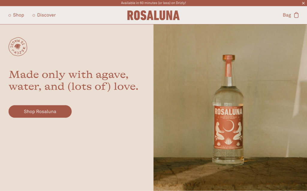
source: mezcalrosaluna.com
While we’re on the subject: try to brand your products with colors that match your ethos and target audience. It will make for a much easier sale.
Final Thoughts
Keep these tips in mind when you’re playing around with the colors of your website. They’ll help you bring in some new traffic and make visitors spend more time browsing your pages.

What Is WooCommerce Product Slider and Why Your Store Needs It
Why Do Product Images Matter So Much in Online Stores? When someone visits an online store the…
0 Comments9 Minutes

How to Streamline Your Customers’ Shopping Experience?
The goal for any online store is to make shopping as smooth as possible. When visitors move…
0 Comments8 Minutes

Strengthening Brand-Customer Relationships Through Gamified Loyalty Programs
Creating lasting connections with customers has become increasingly vital as the marketplace grows…
0 Comments6 Minutes

How to Use SEO and SEA Together in Search Engine Marketing
In digital marketing, search engine marketing (SEM) plays a critical role in improving online…
0 Comments10 Minutes

Content Marketing Growth Hacks: Real Shortcuts to Drive Traffic
Are you still lagging in content marketing? Sticking to these old strategies seems…
0 Comments10 Minutes

How to Build a Strong Local Following Using Social Media Marketing
In the days of likes, shares, and stories, local businesses have a golden opportunity to create…
0 Comments9 Minutes

Why WooCommerce is the Best Choice for Your Online Store?
WooCommerce stands out as a top option for anyone looking to build an online store. This platform…
0 Comments8 Minutes

How to Use AI-Powered SEO Tools for WordPress eCommerce
SEO is a critical factor in the success of any e-commerce WordPress store. As competition…
0 Comments11 Minutes