
How to drive traffic with an Opt In Form
Have you ever shopped at a store where they go a little over the top?
Quick Links
They greet you at the door, they are there every time you simply touch a piece of clothing, and then they’re falling all over themselves when you start walking toward the door. Your first reaction is just to leave to get them out of your hair.
On the web, the experience can be equally intimidating
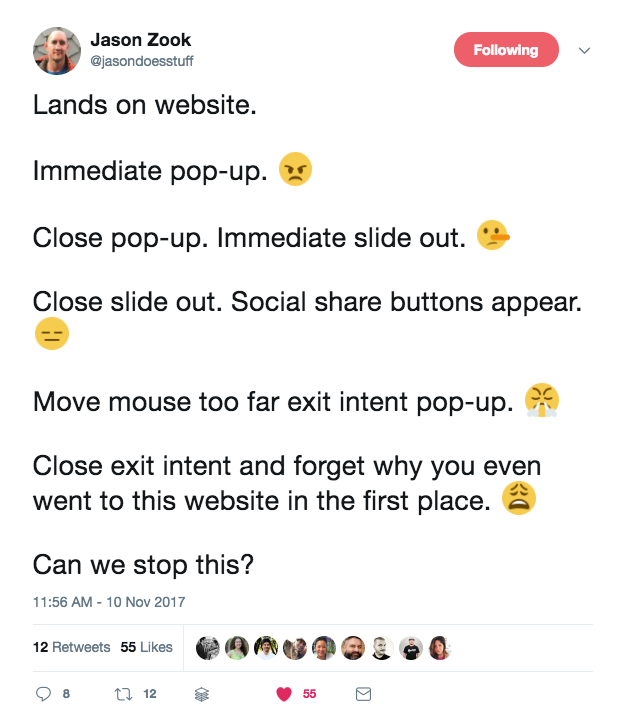
I feel you, Jason.
First off, we can all agree that Push Notifications suck. (We do agree on that, right?)
But now it seems like we have to talk about pop-up forms too. In fact they are everywher you go – including yours truly – stick around for 20 seconds and you will see it come up.
Let’s think about that for a moment, actually.
That website you built? I bet you built it for real humans to read and feel compelled by, and I bet that you want real humans as your customers.
So why (WHY???) are you employing all of the “marketing hacks” you’ve ever seen in one place?
Why are there still pop up opt ins that make you want to close the page before you ever really read any of it?
Why?
Because we forget that actual humans are on the other side of the screen. Actual humans have to click around your pop ups and get frustrated and eventually click away from the content you’ve worked so hard to create for them.
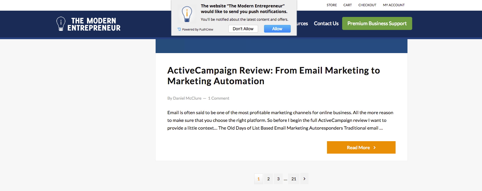
Actual humans are landing on your website, experiencing the tactics you’ve layered on top of the hacks, and are looking at you like this:
Boring. Bored. Annoyed. Bored.
Actual humans aren’t converting to customers because of your pop ups.
So what’s a modern marketer to do?
Well, I’m not advocating that you remove your pop-ups altogether. Not a bit. I’m even testing one on my website as I write this.
Pop-ups themselves aren’t bad. But you need to get them right. The guys over at OptinMonster have come up with a free 63 point checklist for getting optin forms right. You need to download it (did I say it was free?).
[eafl id=”18992″ name=”Optin Form Guide” text=”Download the 63-Point Checklist to build the Ultimate Optin Form”]
It’s how they’re implemented, the language they use, and what is used alongside them that matters most.
Are you ready to dive into exactly how those popups are killing your conversions? Let’s go.
Take the customer journey
We all know you’re working hard to build your email list. And you’re smart to do so. Email marketing is still the main driver for business acquisition and those subscribers should be treated like gold. You might even already do some segmenting, personalization, and conditional logic for your email list. Good for you!
- Email list building is crucial to running a successful online business. You know that and you want to be sure to capture your website visitors on that list.
- You’ve signed up for multiple opt in form plugins and installed them all on top of each other.
- The [eafl id=”18993″ name=”Optin Monster” text=”form builders”] you’ve installed are all running the free version which means you don’t have as much control over them as the paid versions allow.
- Big name marketers have multiple pop ups and opt in forms on their website so you follow suit. (“It works for her and I want to be like her so I’m doing that.” Neil Patel does it so I’m gonna do it too. Love that guy. Etc. Etc.
So it makes sense that you’d want to treat your potential subscribers with the same loving care in the signup process, right?
Let’s go on a quick journey together through an all-too-common scenario.
Someone who’s never heard of you before (and happens to be an ideal client!) finds a link to your blog post on Twitter.
He clicks through to your post and starts reading.
Ten seconds in, he’s hit with a nearly full screen pop up:
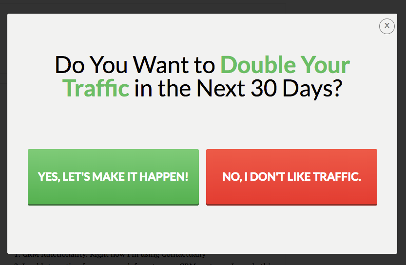 He’s barely read the headline on the article and now he’s forced to stop and consider his options here.
Well, he does like traffic but he really wants to keep reading that blog post (…what was it about again?) so he clicks the “no” button hoping to move on.
Your brand new reader is getting frustrated. And what was he doing on your website in the first place?
He can’t find the very faint grey X in the corner to close this second pop up but he can find the X that closes the tab and now he’s gone.
And this is happening again and again on your website all day long.
Do yourself a favour and [eafl id=”18992″ name=”Optin Form Guide” text=”download the guide”]

What Is WooCommerce Product Slider and Why Your Store Needs It
Why Do Product Images Matter So Much in Online Stores? When someone visits an online store the…
0 Comments9 Minutes

How to Streamline Your Customers’ Shopping Experience?
The goal for any online store is to make shopping as smooth as possible. When visitors move…
0 Comments8 Minutes

Strengthening Brand-Customer Relationships Through Gamified Loyalty Programs
Creating lasting connections with customers has become increasingly vital as the marketplace grows…
0 Comments6 Minutes

How to Use SEO and SEA Together in Search Engine Marketing
In digital marketing, search engine marketing (SEM) plays a critical role in improving online…
0 Comments10 Minutes

Content Marketing Growth Hacks: Real Shortcuts to Drive Traffic
Are you still lagging in content marketing? Sticking to these old strategies seems…
0 Comments10 Minutes

How to Build a Strong Local Following Using Social Media Marketing
In the days of likes, shares, and stories, local businesses have a golden opportunity to create…
0 Comments9 Minutes

Why WooCommerce is the Best Choice for Your Online Store?
WooCommerce stands out as a top option for anyone looking to build an online store. This platform…
0 Comments8 Minutes

How to Use AI-Powered SEO Tools for WordPress eCommerce
SEO is a critical factor in the success of any e-commerce WordPress store. As competition…
0 Comments11 Minutes
Comments are closed.