How to create the perfect landing page that converts (10 easy steps)
Designing a good landing page is about more than just making it look nice. For your efforts to pay off and create the best possible experience for site visitors, make sure you’re including all the features they find valuable when shopping online.
Quick Links
What should you do? Keep reading, and we’ll give some useful tips that other designers use to craft great landing pages!
What is a landing page?
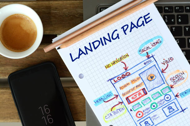
A landing page is a single, one-page website that targets a particular group of customers. It covers the basic product information and highlights the key features, but it’s not as long as an online store.
You may be familiar with a few different terms for this kind of page: squeeze page, microsite, and lead capture page are some others commonly used to describe it. You might also have heard people refer to them as conversion pages or lead generation pages.
When designing (or redesigning) your web property, consider how many landing pages you need to make sure your site communicates effectively with its intended audience.
The 10 steps to creating the perfect landing page (conversion-optimized)
Headline
The headline is the single most important element on your landing page. It must communicate, in a single sentence, what it is that you’re offering. It should be worded to speak directly to your target audience and contain keywords relevant to your industry or niche.
The best headlines are short and punchy – no more than 6 words, usually 3 is best, followed by a comma (therefore 20-30 characters). They also need to answer 2 questions: “What’s in it for me?” and “Why should I care?”.
Headline example: Increase Your Blog Traffic In 30 Days Or Less With My Proven System To Increase Website Conversions And Sales Now!
Subheadline
One of the most important factors in creating a powerful landing page is having a compelling headline.
A powerful headline can increase visitors’ attention, and a persuasive subheadline can keep them engaged on the page. When used together, they form an impactful combination that encourages action from visitors.
Your subheadline should further explain the main headline and add more detail. It is also a good idea to include keywords in the subheadline as well. The best subheads are usually between 4-10 words long but can go longer depending on your industry/niche.
Sub Headline example: Here’s What You Should Include In Your SEO Campaign For Maximum Exposure
Benefits Proposition
A benefits proposition is an explanation of how the product will benefit the customer. It’s a more in-depth look at what you promised your customers in the headline.
Benefits should be short, to the point, and continually support your main message. Avoid long lists of benefits that clutter your page and waste valuable space. Also, avoid repeating yourself through multiple bullet points as it can bore visitors into not wanting to read it all or get confused with information overload along with being repetitive.
Benefits of using your product and services instantly communicate value to consumers, so make sure you cover all angles such as ease of use, time savings, money savings, etc.
The benefits most likely to resonate with target users will be mentioned first – write them in order of importance from left to right (first – most important), or right to left (last – least important).
Credibility Boosters
The easiest way to gain credibility on your landing page is by sharing sources that back up whatever you’re offering as part of your product or service. These can be testimonials, case studies, reviews (professional or user-generated), third-party accreditation, client logos, and so on.
You can also use content upgrades (free bonus materials that users have to give their email to access) to back up your claims and add credibility. Offering case studies, white papers or exclusive interviews are just a few ideas of how you can do this.
Images
You know you’ve seen it before: a landing page with no imagery and just a wall of text that looks like it was written by the IT department.
Short, easily scannable paragraphs are key here (about 3-4 lines per paragraph).
Your images should be just as carefully chosen to reflect your product or service being offered. Many people use stock photos which can work well when they’re relevant but can also look cheap and unprofessional if not used thoughtfully.
Images add interest to your page and help break up the text into manageable chunks for users to digest. Don’t overload your user’s senses though – remember this is supposed to make them convert!
Use Video
If you’re able to include a video on your landing page, it’s usually best to do so.
It’s often more effective than images and text because users can see how your product or service works rather than simply reading about it. Of course, this may not be possible for all businesses with some types of services (for example lawyers or accountants) but if yours does involve something that can be easily demonstrated through video, you should find a way of including one on the landing page.
Your copy should also jar well with the tone of your site as a whole – don’t let the feeling of your website suddenly become formal when potential customers arrive on your landing page; they need to feel at home.
Page Loading Speed
As it’s the first thing people see, your landing page needs to be as attractive and accessible as possible. It may well be that you have lots of content on other pages, but this is where you need to get across the primary message of what you’re offering quickly and concisely.
Avoid widgets and animated gifs – they are distracting. Use high-quality images instead but make sure these aren’t too large or heavy for slow connections (people who still use dial-up are probably not your target market anyway!)
Be aware that some browsers only load one item at a time on a page, so if lots are waiting to appear it may take them longer than others. If you have multiple short pages rather than a single long
Mobile Responsive
Mobile phones are used all the time and there’s no need for a separate version for them. Make sure your landing page is responsive, otherwise you might lose out on valuable traffic from those browsing on their mobiles.
When designing the page, keep in mind the size of mobile screens, and how much will be visible. Make sure to have the important information above the fold (where people see it without scrolling down) for mobile users, if you don’t, you might lose sales due to lack of visibility.
Make It Scannable
If a user has fewer than 2-4 seconds to view your landing page on mobile, they will quickly decide if it is worth their time or not.
It can be difficult not to sound pushy when asking for a sale on the landing page, but it is important to not sway from that objective. The user needs to know they are special and have exclusive access.
The more difficult your landing page is to understand, the less likely it will convert. If users are bouncing from your site because they can’t find what they are looking for, you have a problem and need to fix it fast.
Marketing experts suggest that if a user stays on your page for 4 seconds or more, there’s a good chance they will continue to explore your site for more information. If you make them wait too long, however, they grow impatient and leave.
Call To Action
Your call to action can mean the difference between a page that converts and one that does not. Think of it as a sales pitch, but for it to work, you have to be honest.
There are several kinds of call to action available. You can have a pop-up window appear after they’ve opened your site or right before (exit popup). The arrow button is another type (the most popular). It’s important when choosing a CTA style to make it stand out so users know exactly what they will get if they click on it. You also need to think about how much time you’re willing to give them before closing the site down again.
The best way to fix this problem is by creating trust with your users. If you have a site where you’re offering your visitors something, be it eBooks or some other type of download, make sure that the product you’re offering is actually worth the time they will have to spend on your site.
Perform A/B Test
A/B testing is a method of comparing two versions of a page to see which one performs better. With this, you can find out how changing different factors such as size, position, and color affect the success rate of your CTA.
When it comes to A/B testing some things are best kept simple. For instance, you wouldn’t want to have 3 different types of arrow buttons in every corner as that would be overkill and look messy, it also means that if there’s an issue with 1 or 2 of the people will be less likely to use any others available.
When choosing between landing pages make sure you choose only one at a time for your tests – switching between too many options will muddle up your data and make the results unusable.
You should also try different layouts for your landing page – testing is a great way to figure out what works.
Conclusion
Uninspiring landing pages that lack compelling copy, are poorly optimized and present visitors with the wrong offer will never be effective at converting.
Landing pages are created to transform visitors into subscribers or social media fans with a single click. If the prospect cannot be persuaded to sign up within 8 seconds, it’s safe to assume that you have failed as a marketer. The success of your business depends on it. So, take action now!
Want help with crafting your landing page? Call Pixel Street – Web Design Agency today.
Author Name: Khurshid Alam.

Author Bio: Khurshid Alam is the founder of Pixel Street, a web design company. He aspires to solve business problems by communicating effectively digitally. In his leisure, he reads, writes and occasionally plays a game of table tennis.

What Is WooCommerce Product Slider and Why Your Store Needs It
Why Do Product Images Matter So Much in Online Stores? When someone visits an online store the…
0 Comments9 Minutes

How to Streamline Your Customers’ Shopping Experience?
The goal for any online store is to make shopping as smooth as possible. When visitors move…
0 Comments8 Minutes

Strengthening Brand-Customer Relationships Through Gamified Loyalty Programs
Creating lasting connections with customers has become increasingly vital as the marketplace grows…
0 Comments6 Minutes

How to Use SEO and SEA Together in Search Engine Marketing
In digital marketing, search engine marketing (SEM) plays a critical role in improving online…
0 Comments10 Minutes

Content Marketing Growth Hacks: Real Shortcuts to Drive Traffic
Are you still lagging in content marketing? Sticking to these old strategies seems…
0 Comments10 Minutes

How to Build a Strong Local Following Using Social Media Marketing
In the days of likes, shares, and stories, local businesses have a golden opportunity to create…
0 Comments9 Minutes

Why WooCommerce is the Best Choice for Your Online Store?
WooCommerce stands out as a top option for anyone looking to build an online store. This platform…
0 Comments8 Minutes

How to Use AI-Powered SEO Tools for WordPress eCommerce
SEO is a critical factor in the success of any e-commerce WordPress store. As competition…
0 Comments11 Minutes