
Ecommerce Product Page Design Tips to Boost Conversion Rates
The commerce landscape is getting more and more saturated by the day. With over 2 billion online shoppers in 2021, standing out and securing a conversion is becoming increasingly difficult.
Quick Links
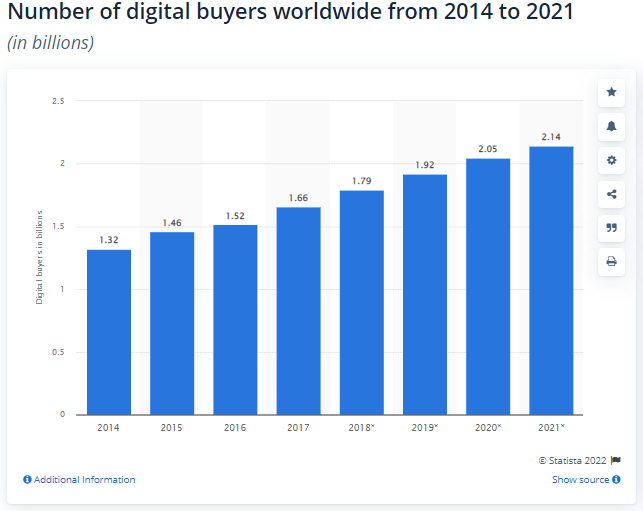
Source: Statista.com
No matter the industry and niche you sell in, chances are there is some competition out there. How you design your product pages can, among other things, significantly impact your bottom line and the kinds of conversion rates you can expect to see across the board.
So, let’s take a look at some ecommerce product page design tips that can help you boost conversion rates and grow your business even in the most crowded of markets.
Use Explainer Videos
Explainer videos on product pages can significantly boost your conversion rates. They are just another way to highlight what makes your product special and why a customer should consider it above what else is on the market.
This is especially useful if the product is niche or if a portion of your target audience might be uncertain how to use it. The more guidance you are able to provide, the better.
You can also boost your product pages with very simple and straightforward explainer videos that showcase how a product can be used to the best effect. This is what Biaggi does, with their packing videos incorporated into their product pages.
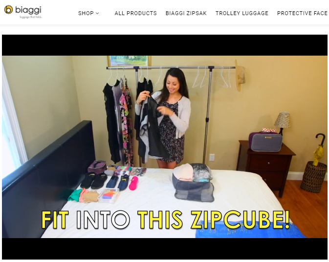
Source: Biaggi.com
Since the videos are also available on YouTube, they can be found even by those who have not heard of the brand before but have been looking at packing videos.
As for video length, 60-90 seconds is the usual norm. Your own explainer videos can be much longer if necessary, especially if you’re illustrating a more complex process. However, sometimes you only need 15-20 seconds to demonstrate everything a customer will need to know.
Address Common Concerns Head-On
Chances are, a fair few of your potential customers will land on your pages armed with some concerns.
They may be wondering if the product they are looking at is worth the money. They could be unsure about the size or the color and material. Or, maybe they’re wondering what it will cost them to return it or if they can return it at all.
Simply by addressing all of these concerns right up front, you can significantly impact your visitors’ decision-making process. If they don’t need to search for additional information and spend extra time on your website looking for answers (or worse still, contact your customer service department), you will be doing a lot to improve the CX of your product pages.
Let’s take a look at a good way to address some very common concerns head-on.
Homestead Supplier is a good example to check out. They clearly designed their product pages around the customer’s concerns. They detail everything there is to know about it and offer plenty of choices for customization as well.
Also, as you can see on their EZ-Fit Sheds page they feature a lot of trust badges that speak to the safety of the transaction that’s about to occur. Finally, they also have a dedicated section below the product that addresses returns, satisfaction and price guarantees, and shipping costs.
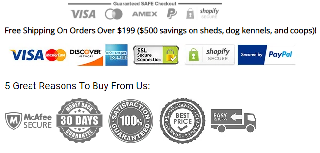
Source: Homesteadsupplier.com
Given the nature of their store and products (which come in all kinds of designs and finishes), all of this information can go an incredibly long way in ensuring a conversion.
Make Sure the CTA Pops
Your product page CTAs also play a very important part in conversion rate optimization. If they are bland, unattractive, and blend into the background, they may lower your chances of making a sale.
This does in no way mean that you should make them too flashy or too distracting. They need to stand out, yes, but they also need to blend in. It’s not that difficult a balance to achieve.
For example, take a look at Lems Shoes Boulder Boot vegan page. Their Add to Cart CTA is the same color as their menu, so it blends in. But at the same time, it pops just enough against the white background.
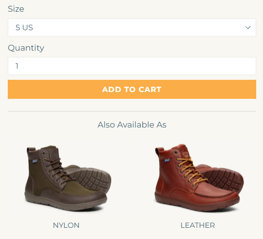
Source: Lemsshoes.com
Their newsletter subscription CTA is much more subtle, but since it’s a part of the footer, it will be quite effective.
They do also feature a CTA that only appears when you scroll down the page. This is a brilliant way to improve CX, as you no longer need to scroll back up to make your purchase. You can read up on the shoe model you’re interested in and add it to your cart from the bottom of the page.
The most general rules of thumb for writing converting CTAs are simple: keep them short and clear, and find a design solution that blends in and captivates.
Combine Reviews with User-Generated Content
User-generated content always provides a great incentive to shop. It’s much more trustworthy than any traditional media outlet and anything you could say about your products. After all, you have a very obvious ax to grind.
But if you pair user-generated content with your product reviews, you’ll boost the impact of your product pages significantly. You can achieve this by doing something as simple as allowing your customers to leave product images with each review.
This will also give you the opportunity to showcase your products in use in real life without having to go through the trouble of shooting these kinds of images yourself.
US Fireplace Store did a good job of capitalizing on this feature as shown on their Touchstone electric fireplace page. Their product pages are full of user-generated content that demonstrates what their fireplaces look like in a wide range of homes, making it much easier for future customers to imagine one in theirs.
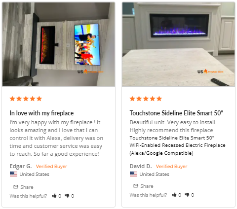
Source: Usfireplacestore.com
Generate Urgency and FOMO
Fueling a sense of urgency on your product pages and playing the FOMO card is another good way to inspire more conversions. Just make sure you don’t play it too often. Otherwise, you can inadvertently cause some negative feelings among your customers who might start feeling like they constantly need to stay alert for the latest deals.
You can incorporate FOMO by highlighting low stock levels or displaying how much is left of a specific product. You can also display “people have also bought” banners or how many people have bought a certain product recently. Sale prices work just as well too.
Swiss Watch Expo, for example, chose to feature two types of FOMO incentives on their Rolex page. They have a banner at the bottom of their product pages that offers $100 off with a PayPal purchase for a limited time, plus they also have a popup that offers up to %60 off if you sign up to their newsletter.
You don’t need to feature more than one urgency-heightening offer. One will work just as well, especially if it’s not tied to a specific date that usually warrants lower prices, like Black Friday or Christmas.
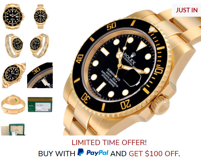
Source: Swisswatchexpo.com
Simplify the Quote Process
Finally, you also want to ensure that the process of getting a quote from your business is simple and straightforward.
If you sell customizable or personalizable products that don’t come with a set price tag, you most likely need each customer to contact you with their specific needs. It’s vital that you make the process easy for them. Demanding too much information or creating clunky forms will only deter potential shoppers.
Mixam made their quotes process very fast and effective as shown on their booklet printing page. You can add your product to the cart even though it’s completely customized and you’re not buying anything off the rack.
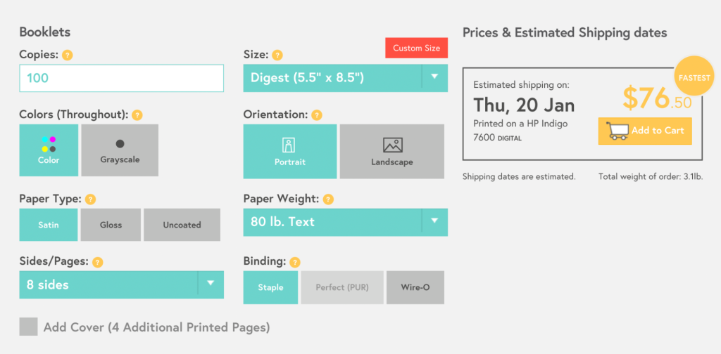
Source: Mixam.com
If you can’t be as helpful right off the bat and you need to take a look at each request before adding a price tag to it, make sure to add details like your working hours and the time it will take you to get back to a customer. Provide as much detail about the process as possible.
Furthermore, request all information right up front that will help you set a price. You don’t want too much back and forth with a customer, but you do want them to feel in control of the process and satisfied with the experience.
Final Thoughts
Incorporating any of these design tips into your ecommerce product pages will help you boost your conversion rates and attract even more attention from your target audience.
Make sure you carefully consider your present product page layout, the product itself, and your target audience’s preferences before committing to any changes. You can always A/B test different solutions and discover which will be the most impactful.

What Is WooCommerce Product Slider and Why Your Store Needs It
Why Do Product Images Matter So Much in Online Stores? When someone visits an online store the…
0 Comments9 Minutes

How to Streamline Your Customers’ Shopping Experience?
The goal for any online store is to make shopping as smooth as possible. When visitors move…
0 Comments8 Minutes

Strengthening Brand-Customer Relationships Through Gamified Loyalty Programs
Creating lasting connections with customers has become increasingly vital as the marketplace grows…
0 Comments6 Minutes

How to Use SEO and SEA Together in Search Engine Marketing
In digital marketing, search engine marketing (SEM) plays a critical role in improving online…
0 Comments10 Minutes

Content Marketing Growth Hacks: Real Shortcuts to Drive Traffic
Are you still lagging in content marketing? Sticking to these old strategies seems…
0 Comments10 Minutes

How to Build a Strong Local Following Using Social Media Marketing
In the days of likes, shares, and stories, local businesses have a golden opportunity to create…
0 Comments9 Minutes

Why WooCommerce is the Best Choice for Your Online Store?
WooCommerce stands out as a top option for anyone looking to build an online store. This platform…
0 Comments8 Minutes

How to Use AI-Powered SEO Tools for WordPress eCommerce
SEO is a critical factor in the success of any e-commerce WordPress store. As competition…
0 Comments11 Minutes