
What is the role of UX in responsive web design?
If your website isn’t mobile-responsive, 48% of users might be frustrated. Nearly half your audience may associate a negative emotion with your brand.
Quick Links
Responsive web design does not need to be an added luxury. It is now a fundamental requirement for all websites. Due to the growing adoption and acceptance of mobile search by Web Design London companies, users are more likely to trust sites that offer seamless experiences, regardless of their device.
Previously, User Experience (UX) was limited to digital spaces. It now covers every screen, from smartphones to tablets and small watches.
You need a website that educates and interacts with your customers to increase your business. It is imperative to remember that the ultimate goal is to make the interface user-friendly at all times.
Here is where UX enters the picture.
What is responsive web design?
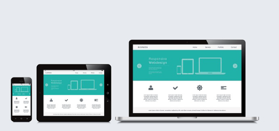
Responsive web design (RWD) is a development method that considers the appearance and performance of websites across different screen sizes, orientations, and devices. The environment in which the website is opened will affect the layout.
The standard HTML code is the base HTML code. The elements that shrink or hide the content provide a proportionate view for the visitor. Responsive designs can also rearrange content to make it more legible.
RWD was born out of the need to eliminate redundant web coding on every device and scale it with the future.
Responsive web designing is the process of creating a responsive website that adapts to the device being used by the visitor. This includes desktops, tablets, and smartphones. Users can navigate a website within their devices’ limitations.
These media queries alter column layouts, image sizes, and hiding or revealing content. So, while the website’s functionality is the same, the site’s content and structures adapt to different screen sizes.
UX design refers to creating the best user experiences. This includes optimizing interfaces to fit the device of the user. Designers need to develop consistent experiences across devices and viewports.
If you want search engines to rank and index your website, responsive web design is crucial. Google’s mobile-first indexing gives priority to responsive websites in mobile search results.
What is UX?
Responsive web design is a subset that can provide fantastic user experiences. Because UX is about creating a website that meets user needs, responsive web design must be carefully considered.
UX is the customization of your website to include or exclude elements from the mobile version. This is not about creating small components but replicating the buyer experience that works well. A responsive approach optimizes site navigation, product imagery, and buttons, as well as menus, buttons, icons, and other parts.
How can you measure responsiveness within UX?
UX effectiveness can be measured by the time a visitor spends on your site. In addition, responsive web design introduced a new view that considers the loading speed of a mobile website. Both parameters are essential, but the first must be adjusted correctly, and the second requires implementation.
Your website must offer intuitive options that simplify surfing and give navigational support to meet consumer demands. You also need to ensure that your backend services are up to date, offering a user-friendly interface.
What is the impact of UX design elements on the overall experience?
A responsive web environment requires a UX that goes beyond reducing the dimensions of some elements. For example, the page may seem disorganized if all parts work together.
UX is important because it allows for cross-compatibility between different sizes. UX is important because it will enable cross-compatibility between a 15-in. screen. The UX, content, and design teams must work together to ensure a pleasing result.
This can be achieved by extensive testing and keeping accessibility and usability in mind. In addition, each element must be capable of functioning on its own and should also be part of the overall portal.
What is scrolling?
Websites now have a long scroll feature that is compatible with mobile technology. This reduces the number of pages that are required to access more information. It even creates a sense of continuity in the experience by eliminating interruptions that could lead to a higher bounce rate.
It is easy to build a responsive website with just a few pages. Based on the mobile UI, the desktop site feels seamless and engaging.
What performance modifiers are there?
When you’re out and about, mobile devices might not have access to fast-data connections. RWD transmits the entire code to your phone and then waits for it selects the required parts. This can slow down the loading speed and performance of smartphones.
UX’s role is to provide equal access for all users regardless of device capabilities. As a result, many Web Design London firms opt for simple designs that are quick to load and have a unique aesthetic. This helps to combat the performance drop. You can also use priority loading to show the core message first.
What should you focus on?
You will not see all your content due to the changing screen resolution. Although infinite scrolling can be a great solution, it’s not comprehensive. You only have 15 seconds to capture visitors’ attention and convince them to stay.
Knowing your audience’s needs helps you create engaging and converting content. This should also be taken into consideration when designing content for buyers.
Conclusion
Responsive web design is a way to reach your target audience. UX, on the other hand, is vital to keeping your audience engaged and allowing them to interact with your products. This is a difficult task, and you may be unable to handle it. However, you can research to find Web Design London firms ready to help you.
Like other digital marketing channels, your website should be kept up-to-date with current trends. The upcoming models have been popular in adaptive and responsive modes.
Your website’s navigation abilities and organic flow will determine its success or failure. A responsive layout in tune with your audience’s needs can be the first step to achieving a higher traffic rate.

What Is WooCommerce Product Slider and Why Your Store Needs It
Why Do Product Images Matter So Much in Online Stores? When someone visits an online store the…
0 Comments9 Minutes

How to Streamline Your Customers’ Shopping Experience?
The goal for any online store is to make shopping as smooth as possible. When visitors move…
0 Comments8 Minutes

Strengthening Brand-Customer Relationships Through Gamified Loyalty Programs
Creating lasting connections with customers has become increasingly vital as the marketplace grows…
0 Comments6 Minutes

How to Use SEO and SEA Together in Search Engine Marketing
In digital marketing, search engine marketing (SEM) plays a critical role in improving online…
0 Comments10 Minutes

Content Marketing Growth Hacks: Real Shortcuts to Drive Traffic
Are you still lagging in content marketing? Sticking to these old strategies seems…
0 Comments10 Minutes

How to Build a Strong Local Following Using Social Media Marketing
In the days of likes, shares, and stories, local businesses have a golden opportunity to create…
0 Comments9 Minutes

Why WooCommerce is the Best Choice for Your Online Store?
WooCommerce stands out as a top option for anyone looking to build an online store. This platform…
0 Comments8 Minutes

How to Use AI-Powered SEO Tools for WordPress eCommerce
SEO is a critical factor in the success of any e-commerce WordPress store. As competition…
0 Comments11 Minutes