Top 6 Typography Trends in Web Design Today
There are a couple of things that constitute your web design. From the smallest interactive button to the largest typeface, these elements contribute to its totality. These small things dictate whether your design will stand out from the others.
Quick Links
Every bit of text that you find on a website has specific fonts and sizes. Each differs depending on the importance of the text. Larger fonts denote greater importance and smaller fonts are for the least important blocks of text.
Think of it as a football team. Not all can be strikers, and not all can be goalies. Your design will determine which is which. Images can be your focus (strikers) while texts can capture your reader’s attention (goalies).
Whether you make your own brand design using logo makers or make your own from scratch, you can use different fonts to emphasize your message. That’s the role of typography. It leads the eye of the reader towards what you want them to see.
If you find yourself stuck in a creative rut, fear not. In 2021, there is no shortage readily available online from where you can be given a creative hand. A great place to start is with prominent website builders. Go-to solutions for web-designers, these platforms will typically showcase cutting-edge typography trends. Viewed as a platform to showcase their work, designers will almost always offer cheat codes and valuable, actionable information.
What to consider with typography
The primary goal of typography is to deliver your message clearly through texts on your website. This means you have to deliver your message clearly and effectively through texts.
User-experience is still a huge part of determining the quality of your web design. You have to be able to deliver your content to the satisfaction of your readers. Thus, you need to consider if your text is pleasing and can be read easily, or if it’s distracting and discordant.
Let’s take a quick look at the recent trends that have been considered pleasing by most of the population:
Typography trends in the past
The year 2020 has been rough for everyone on the planet. Emotions have been running high as we’ve been beset by one great challenge after another. There has just been too much, to the point that we’ve all needed some time to breathe.
And that’s what typography for 2020 is all about. Everything looked refreshing and revitalizing, with symbols of hope.
Now let’s look at the list of what we’ll be expecting for typography trends in 2021.
Typography trends in web design for 2021
1. Experimental fonts and typefaces
The new-to-the-eye experience is quite fundamental for typefaces. People are searching for something new and fresh. Something that will instantly get their attention when they land on your website.
For many, this can understandably be quite challenging. But for experienced graphic designers, they’ll take this typeface to a whole new level. Advancements in technology also allow you to design your own typeface on-the-go. There are tablets for graphic designers that can support graphic-heavy software like Adobe Illustrator. If you won’t use gadgets that can handle these kinds of graphic loads, you’ll end up with a poorly-rendered output.
An experimental font will look like this.
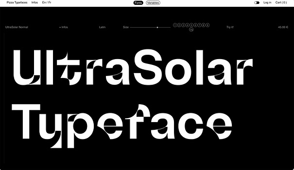
UltraSolar Typeface is an example of an experimental typeface.
Even at first glance, you can immediately see the unique, custom look of this typeface. It captures the reader’s attention as soon as they land on your website. This typeface is usually used for headlines and other important texts.
What’s good about experimental typefaces is that you can customize them the way your readers would want to see them. It gives you the power to make it more representative of your unique message than pre-made typefaces available online.
2. Distorted baselines
Although this can have a chaotic feel, there seems to be a certain level of arrangement that happens when the individual letters are combined. You can alter the height, size, and form of each letter to create variety.
Here’s an example of a distorted baseline:
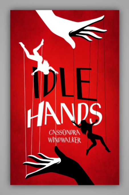
Idle Hands shows an inconsistent baseline. Each letter has a different form, shape, and size.
What’s amazing about distorted baselines, however chaotic they might look, is that they bring a whole new level of perspective to your readers. Who would have thought that you can make your font look like they’re being pulled by the strings?
3. Disco fever
Since the release of disco-themed typefaces, there has been a ton of demand for them. The ’70s were such an explosive influence on the use of colors, and people still yearn for that nostalgic feel.
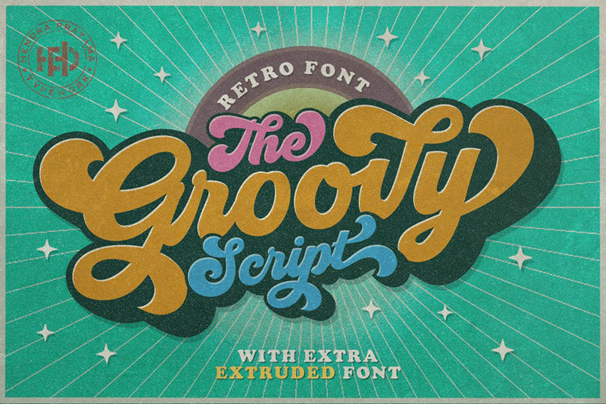
The Groovy typeface explodes in colors of the retro ‘70s.
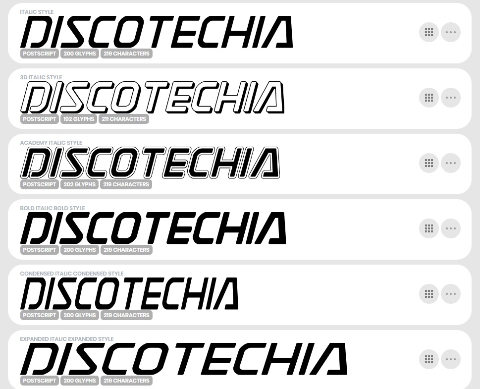
Discotechia typeface shows a more “digital” feel of the ‘70s from the arcades.
The arcade-disco vibe brings color and creativity to your typefaces. It is composed of thick, multicolored letters in psychedelic effects. Since it brings a “groovy” feel to it, be sure to use this typeface to highlight your brand.
4. Timeless serifs
If you didn’t already know, there are two general typefaces. The serifs have a pointy edge, typically used for headings. Sans serifs have a blocky feel to them, making them subheading typefaces.
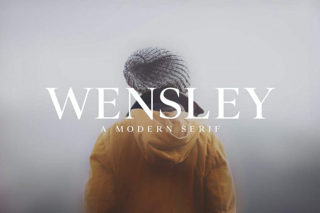
The Wensley modern family serif brings simplicity and elegance to your design.
If you’re looking to add elegance to your website but just want to keep it simple, then timeless serifs are still a popular choice for typefaces in 2021.
5. Standout letters
A standout letter is something that gives more context to the brand. It adds value to the text and your readers will more easily remember your brand. That’s why the famous animation studio, Pixar, is using standout letters for their brand.
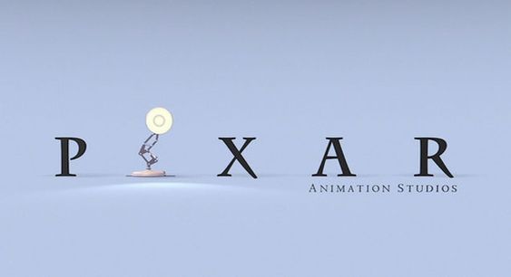
This might look very simple. Just add a lamp on a pre-fixed typeface and you’re done. But graphic designers take their time making the unique typeface coherent with the standout letter’s message.
That’s why it’s used by many brand agencies. It’s so simple, yet it’s so full of context. If your goal is to make your brand stick with your readers, this is the way to do it.
6. Humanized sans serifs
With a stylish look and geometric form, sans serifs can tell a lot of stories based on the typeface alone. Since it’s used by most of the websites for the body of their contents, we’re all more familiar with sans serifs.
We don’t notice it that much because we’re so used to it. But when it’s used for a headline, it brings a fresh, humbling, and humanizing touch to it. It gives life and character to your message which is always appealing to your readers.
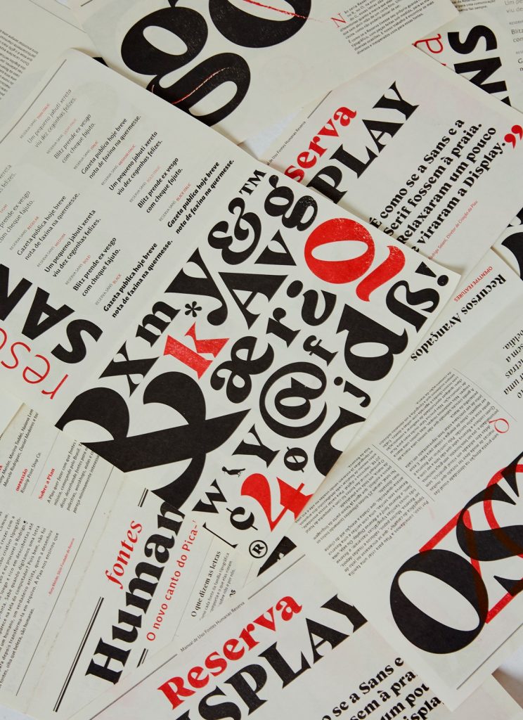
Reserva typeface is a humanized sans serif that is both quirky and professional.
This typeface places your website in a playful, yet professional stance. And since it’s surprisingly easy to read, it’s perfect for web design. We’ll be seeing a lot of humanized sans serifs in website redesigns.
Your choice matters
These are the trends that we can expect from web designers in 2021. You can either follow these trends and be noticed, or you can keep the design you prefer for your website.
But always remember that your choice matters. If it doesn’t fit your website, you might not want to force it. The essence of typography in web design is to deliver your message clearly and effectively to your readers. Always stick to that.

What Is WooCommerce Product Slider and Why Your Store Needs It
Why Do Product Images Matter So Much in Online Stores? When someone visits an online store the…
0 Comments9 Minutes

How to Streamline Your Customers’ Shopping Experience?
The goal for any online store is to make shopping as smooth as possible. When visitors move…
0 Comments8 Minutes

Strengthening Brand-Customer Relationships Through Gamified Loyalty Programs
Creating lasting connections with customers has become increasingly vital as the marketplace grows…
0 Comments6 Minutes

How to Use SEO and SEA Together in Search Engine Marketing
In digital marketing, search engine marketing (SEM) plays a critical role in improving online…
0 Comments10 Minutes

Content Marketing Growth Hacks: Real Shortcuts to Drive Traffic
Are you still lagging in content marketing? Sticking to these old strategies seems…
0 Comments10 Minutes

How to Build a Strong Local Following Using Social Media Marketing
In the days of likes, shares, and stories, local businesses have a golden opportunity to create…
0 Comments9 Minutes

Why WooCommerce is the Best Choice for Your Online Store?
WooCommerce stands out as a top option for anyone looking to build an online store. This platform…
0 Comments8 Minutes

How to Use AI-Powered SEO Tools for WordPress eCommerce
SEO is a critical factor in the success of any e-commerce WordPress store. As competition…
0 Comments11 Minutes