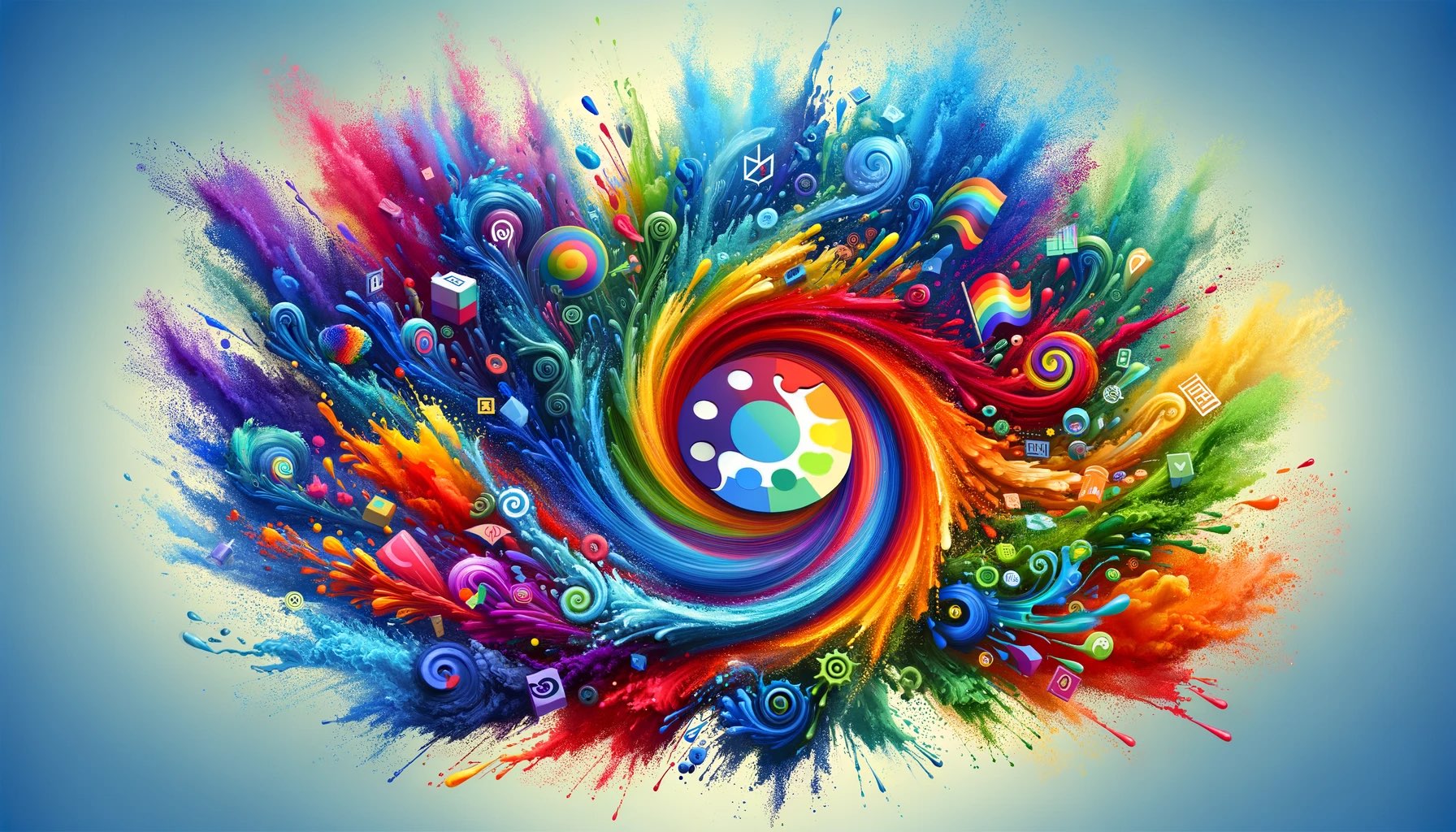
The Psychology of Color in Branding and UI/UX
Ever wondered why some logos instantly make you crave a burger or feel an urge to share your life updates? Well, there’s more to those colors than meets the eye. We’re about to spill the beans on the not-so-secret language of design – it’s all about the Psychology of Color in Branding and UI/UX. Think of it as the ultimate cheat code for creating visual experiences that stick in your mind like your favorite song lyrics. From the reds that scream excitement to the blues that whisper tranquility, we’re taking a laid-back stroll through the palette of emotions and perceptions. Grab your shades because we’re diving into the cool, warm, and everything-in-between shades that shape how you see the world, one pixel at a time. Welcome to a colorful conversation where design isn’t just about pixels; it’s about playing with your feelings. Let’s paint this canvas together!
Quick Links
Color Wheel And Its Significance in Design
Let’s delve into the color wheel – an often-underappreciated gem in a designer’s toolkit. Picture it as your trusty compass for colors. Start with the classics – red, blue, and yellow – as they lay the foundation. From there, embark on a journey through a spectrum of shades, each with its distinct personality.
The color wheel is more than just a pretty circle; it’s a matchmaking service for hues, guiding designers to colors that harmonize. As designers navigate this wheel, they uncover which colors are besties, which are distant acquaintances, and which ones throw a visual party when combined.
As they spin through this wheel, designers unveil the secrets of complementary combinations, the harmony of analogous pairs, and the excitement of triadic groups. It’s like a color mixer, where warm tones mingle with cool ones, creating a visual blend that catches the eye.
But why does it matter? Well, the color wheel isn’t just for show; it tells a story. Reds exclaim, “Let’s make a statement!” while blues suggests, “Keep it chill, folks.” It’s a language beyond aesthetics, shaping how we connect with what we see.
So, forget the fancy terminology. The color wheel is more than a tool; it’s a storyteller. Join us as we navigate through this user-friendly guide where colors aren’t just for looks – they’re the backbone of design. Welcome to a practical universe where the color wheel reigns, and the hues are poised to paint your next project!
Emotions Associated With Specific Colors in Branding
When it comes to branding, color isn’t just about making things look pretty—it’s a powerful tool that taps into our emotions, influencing how we perceive and connect with a brand. Each color carries its own unique vibe, triggering specific feelings and associations. Let’s dive into the emotional palette of branding colors and uncover the psychological triggers that make us feel a certain way.
Red: Passion and Energy
Red is the rockstar of emotions. It screams passion, energy, and excitement. It’s the color of bold statements and immediate attention. Brands like Coca-Cola and Netflix leverage red to ignite a sense of urgency and enthusiasm.
Blue: Trust and Serenity
Blue is the calm in the storm. It exudes trust, reliability, and serenity. Think of the soothing blue of Facebook or the dependable blue of IBM. These brands use blue to establish a sense of security and reliability.
Yellow: Optimism and Happiness
Yellow is the sunshine in the branding world. It radiates optimism, happiness, and friendliness. Brands like McDonald’s and IKEA splash yellow to create a cheerful and welcoming atmosphere, making you associate their products with positive vibes.
Green: Freshness and Harmony
Green is the color of nature, and it brings a sense of freshness and harmony. Brands like Starbucks and Whole Foods use green to connect with themes of health, sustainability, and growth, creating a harmonious and eco-friendly image.
Purple: Luxury and Creativity
Purple is the royal player, signifying luxury, sophistication, and creativity. Brands like Cadbury and Hallmark use purple to add a touch of elegance and uniqueness to their products, making consumers feel a sense of indulgence.
Orange: Energy and Playfulness
Orange is the life of the party. It exudes energy, enthusiasm, and playfulness. Brands like Fanta and Nickelodeon use orange to create a vibrant and lively image, making consumers feel a burst of energy and excitement.
Black: Elegance and Power
Black is the epitome of elegance and power. Luxury brands like Chanel and Mercedes-Benz opt for black to convey sophistication, exclusivity, and a touch of mystery.
Pink: Femininity and Sweetness
Pink is the color of femininity and sweetness. Brands like Barbie and Victoria’s Secret use pink to tap into themes of romance, charm, and a playful sense of femininity.
Understanding the emotional impact of colors in branding is like having a secret weapon in the world of marketing. It allows brands to create connections, evoke specific emotions, and leave a lasting impression on consumers. So, the next time you see a logo, take a moment to consider the emotions it might be trying to stir up in you.
Current Color Trends in Branding And UI/UX Design
As we step into 2023, the design landscape is brimming with fresh trends set to shape UI and graphic experiences. From 3D design elements adding depth and realism to interfaces, to the resurgence of earthy tones conveying authenticity, the color trends in branding and UI/UX are as dynamic as the digital era itself.
- 3D Design Elements: Adding depth and realism, 3D elements engage users but require careful use due to potential hardware limitations.
- Bright, Bold Colors: Strategic use of vibrant hues grabs attention, enhances branding, and fosters creativity. Caution is advised to maintain focus and prevent visual chaos.
- Hand-Drawn Elements: Infusing warmth and creativity, hand-drawn elements personalize interfaces and contribute to storytelling. Careful application is crucial for consistency.
- Asymmetrical Layouts: Breaking symmetry fosters creativity, emphasizing specific elements while maintaining visual interest. Requires careful application to prevent confusion.
- Motion Graphics: Enhancing interactivity and storytelling, motion graphics bring interfaces to life. Designers must consider performance and accessibility.
- Textured Backgrounds: Aligned with organic design, textured backgrounds add depth for a visually engaging user experience.
- Dark Mode and High Contrast: Catering to visibility and brand identity, dark mode and high contrast are popular but require balanced usage to avoid overwhelming users and ensure accessibility.
Final Thoughts
In our exploration of the Psychology of Color, the Color Wheel’s magic, Branding’s emotional cues, and the dynamic trends in UI/UX, we’ve decoded the language of design. From timeless color wheels to emotional branding and the pulse of current trends, each element shapes a visual symphony.
Design isn’t just about pixels; it’s a journey where every color, trend, and pixel tells a memorable story. Armed with color psychology and ever-evolving trends, let your designs resonate with purpose and creativity. Here’s to a colorful conversation that creates not just eye-catching visuals but lasting impressions. Cheers to the kaleidoscope of design wisdom!
Author Bio

Hey, I’m Ovsanna, your friendly content writer on a mission to make marketing trends as exciting as your favorite playlist. Join me on this journey as we explore the coolest updates and tendencies together!

What Is WooCommerce Product Slider and Why Your Store Needs It
Why Do Product Images Matter So Much in Online Stores? When someone visits an online store the…
0 Comments9 Minutes

How to Streamline Your Customers’ Shopping Experience?
The goal for any online store is to make shopping as smooth as possible. When visitors move…
0 Comments8 Minutes

Strengthening Brand-Customer Relationships Through Gamified Loyalty Programs
Creating lasting connections with customers has become increasingly vital as the marketplace grows…
0 Comments6 Minutes

How to Use SEO and SEA Together in Search Engine Marketing
In digital marketing, search engine marketing (SEM) plays a critical role in improving online…
0 Comments10 Minutes

Content Marketing Growth Hacks: Real Shortcuts to Drive Traffic
Are you still lagging in content marketing? Sticking to these old strategies seems…
0 Comments10 Minutes

How to Build a Strong Local Following Using Social Media Marketing
In the days of likes, shares, and stories, local businesses have a golden opportunity to create…
0 Comments9 Minutes

Why WooCommerce is the Best Choice for Your Online Store?
WooCommerce stands out as a top option for anyone looking to build an online store. This platform…
0 Comments8 Minutes

How to Use AI-Powered SEO Tools for WordPress eCommerce
SEO is a critical factor in the success of any e-commerce WordPress store. As competition…
0 Comments11 Minutes