How to Make your Site More User-Friendly
Do you feel as though your site isn’t as user-friendly as it could be? If so then now is the time for you to do something about that. If you make a change to your site now then you may find that you end up experiencing an increase in sales and that you also end up being able to optimize more efficiently. If you don’t know what steps to take when it comes to your site then take a look below.
Quick Links
Optimize for Mobile
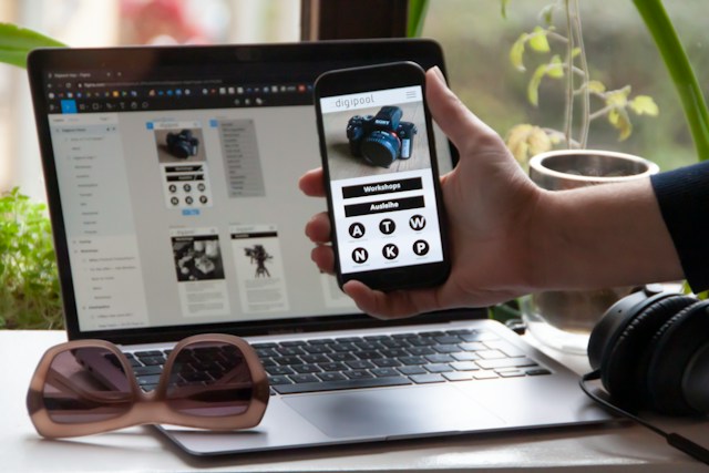
One of the first things you need to do is optimize for mobile devices. This should go without saying, but it’s surprising to see how many sites are not optimized for mobile users. Users from mobiles are doing more than just browsing from their devices too. They buy from them too. There are now more mobile users than ever and if you are not capitalizing on them then this is a huge mistake. If possible, you need to make sure that your site is optimized and when this is done, you can then move on to making it user-friendly. You can do this by using a responsive theme for your site. These are themes that will adjust your content to match the screen size in question. When someone is browsing from a desktop, it’s very easy for them to click anywhere on the screen and this can make finding the right button easy. On mobile, you need to make sure that you have a big, clear button that is easy for people to find. If you can do this then you will soon find that it is easier for people to browse by using their phone, which is great, to say the least. It can also be a major boost to your brand, so be mindful of that.
WCAG Standards
You have to make sure that you are always following WCAG standards. These were created as a way to help websites meet the needs of those who may have disabilities. This gets updated all the time, so you need to check back regularly so you can see what you need to change to stay compliant. Around 1.2 billion people across the globe have some kind of disability, and the last thing you want is to discriminate against anyone who may be visiting your site. If you want to help people then you need to take note of those who have auditory disabilities. This encompasses those who are hard of hearing and fully deaf. If your site relies on video or music to convey a point then you have to make sure that your site is still accommodating this audience. If it isn’t then this indicates that there is work to be done. Cognitive issues are also a thing to take note of. Neurological issues such as Alzheimer’s and even dementia mean that people have a hard time focusing on one task for a long period. If you want to help them then make sure that you simplify your site as much as you can. Make sure that you do not pack your navigational menu with a ton of items and don’t make people think about where they should go. If they do then this could make it harder for them to find what they need.

Common Elements
It is also imperative that you stick with common design elements. When you are designing a site, it can be tempting for you to get creative. It may be that creativity is part of your brand image or that you just want to try something new. This is fine, but at the same time, you do need to take into account marketing and functionality. There is a reason why these practices are tried-and-true, so make sure that you save innovation for the products and the marketing campaigns that you are releasing. When it comes to usability, you need to try and follow common sense website design practices, as this is the best way for you to come out on top. At the end of the day, people have expectations when the time comes for them to land on a site and they also demand a certain service. Think about what you expect when you walk into a McDonald’s, you may wait in line and then order. You will then be called when your food is ready, which is a very standard experience. What if you walked in and then someone sat you down, handed you a menu and then waited on you as you made your decision, though? If this happened then you would probably feel a little lost because it’s not the type of experience that you would want or expect. At the end of the day, there are certain things that your users expect from you, and it is your job to provide them with it.
Visual Hierarchy
You also need to put a prime focus on visual hierarchy. It only takes 2.6 seconds for someone to form an impression about your site. What does this mean in terms of general usability? You simply need to help your visitors to understand what it is they are looking at. The last thing you want is for your page to be messy, overwhelming and clustered. Put the important elements of your page in a format of natural focal points. If you can do this then you will soon be able to direct people to where they need to go. Put the most important points at the top, so that you can add value to your visitors. Without visual hierarchy, you may find that people end up navigating to the wrong pages or that they focus on things that aren’t too important. This is not what you want to happen. There are factors that you have to keep in mind when you are designing your hierarchy too. Remember that bigger is better, and that bright colors will always capture the eyes of your visitors. Contrast is also everything as this can help to emphasize or even deemphasize things on the page. Negative space is just as important as the things you do use too, so be mindful of that as it could make a major difference to your site.
Credibility
When you have a website, one thing to take note of is that credibility is everything. One way for you to appear credible would be for you to use web chat services. This way, people know that they can always get in touch with you if they need you. At the end of the day, credibility has to be established right away. If you don’t then visitors may not feel as though they can trust your site when they browse. You also need to make sure that you are transparent about your content and your information. Keep numbers in mind, and think about what percentage of your customer base is coming to your site, and what it is they are looking for. Prices should be listed next to every product and on top of this, you should also make sure that your delivery fees are clear. If people go to the checkout page and find a ton of fees added on then this will not work in your favor at all as it will look like you are trying to get more out of them when this may not be the case.
Legible Content
You also need to make sure that your content is legible. Just because a font looks nice doesn’t mean that it is readable to your users. You need to make sure that it belongs on your site and that it fits your theme and looks professional. Even after you have chosen your font, that doesn’t mean that your content is legible. You have to think about things such as your color choices, the length of your paragraphs and even your spacing. If you pick a standard font then it’s clearly legible but it won’t be if you put the text in yellow and then add an orange background. Remember that most people don’t read word for word either. When you are going through a site you are most likely trying to find the information you need and what is important to you. Your reader will probably do the same, so make sure that your content can be scanned. If it can’t then this could mean major issues for you in the future. If every section on your site ends up being a big paragraph of text then this will make it tough to read, but if you can break it up a little and add some subheadings then this will make it much easier for people to find what they need, which will boost the user experience. Things like this can make a huge difference, so try and keep that in mind and take steps to benefit your users as much as possible. If you can do this you are bound to see an improvement in your website traffic.

What Is WooCommerce Product Slider and Why Your Store Needs It
Why Do Product Images Matter So Much in Online Stores? When someone visits an online store the…
0 Comments9 Minutes

How to Streamline Your Customers’ Shopping Experience?
The goal for any online store is to make shopping as smooth as possible. When visitors move…
0 Comments8 Minutes

Strengthening Brand-Customer Relationships Through Gamified Loyalty Programs
Creating lasting connections with customers has become increasingly vital as the marketplace grows…
0 Comments6 Minutes

How to Use SEO and SEA Together in Search Engine Marketing
In digital marketing, search engine marketing (SEM) plays a critical role in improving online…
0 Comments10 Minutes

Content Marketing Growth Hacks: Real Shortcuts to Drive Traffic
Are you still lagging in content marketing? Sticking to these old strategies seems…
0 Comments10 Minutes

How to Build a Strong Local Following Using Social Media Marketing
In the days of likes, shares, and stories, local businesses have a golden opportunity to create…
0 Comments9 Minutes

Why WooCommerce is the Best Choice for Your Online Store?
WooCommerce stands out as a top option for anyone looking to build an online store. This platform…
0 Comments8 Minutes

How to Use AI-Powered SEO Tools for WordPress eCommerce
SEO is a critical factor in the success of any e-commerce WordPress store. As competition…
0 Comments11 Minutes