How to Design the Kids’ Website: 6 Best UI and UX Practices
Contrary to popular opinion, teenagers and “boomers” aren’t the only ones using the internet in today’s world. According to a study conducted by the Nielsen Norman Group, children between the ages of 3-12 are now proficient in using websites and apps.
Quick Links
So what does this mean for developers? Put simply, developers now have to broaden their target user demographics and ensure that their websites and apps are optimized for younger users.
Unfortunately, this can be quite challenging as designing a kid’s website involves a lot of technicalities and attention to detail. Let’s take a closer look at some useful tips and key areas to focus on.
What Does It Mean to Create a Child-Friendly Website?
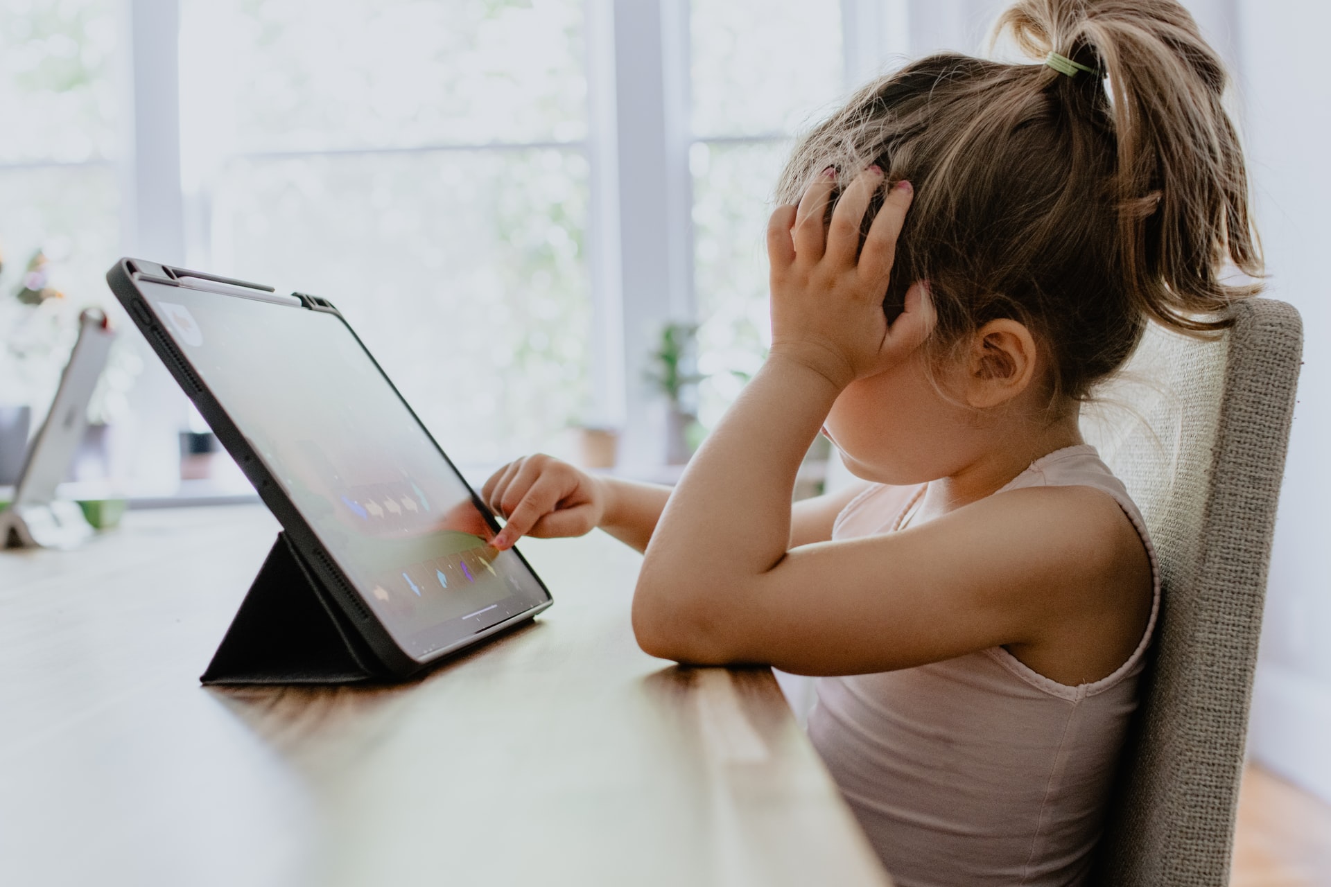
When creating a kids’ website, the first rule of thumb is simplification. Children’s cognitive functions are less developed than your average adult user, and as such, it’s essential to simplify your interface and features to suit them. This means simple texts and, of course, simple navigation buttons. However, this isn’t where it ends. To create a child-friendly website, you’ll need to think like a child and view the user experience from a child’s perspective.
Over the years, I’ve watched toddlers and children use tablets, and these are some tips I’ve garnered simply by watching and thinking like a child:
Childproof your navigations

Parents are taught to childproof their homes from the minute they have kids: gated stairs, window restrictors, shatterproof glass, and the likes. However, childproofing shouldn’t be limited to the home. It’s also a nitty-gritty detail that developers need to consider when building a website.
Using a website can be fun for children, but the experience is mostly short-lived. More often than not, children try to explore a website and end up accidentally removing themselves from a particular page. For instance, they might accidentally swipe the wrong button or click on a pop-up that transfers them to a different page.
So how do you stop this? For starters, you should ensure that your website doesn’t include unnecessary swipe gestures that can cut short the user experience or take them to a different page on the site.
Modal windows with text instructions are also a great idea to consider. For instance, if a user clicks on a button that leads to another page, they should be presented with a window that offers the option to either go back to the page they were previously on or continue with the new action.
Avoid accelerometers
It’s common to find games, apps, and websites that utilize accelerometers as part of the user experience. For instance, you might come across a website with instructions like “tilt your device to rotate XYZ” or “shake your device to turn the red button green.”
While this might be a seemingly fun feature, it can be disastrous for young users. Kids are often prone to accidents, and designing a website that requires them to tilt their device is simply a recipe for disaster. More often than not, they’d probably end up dropping the phones and destroying them.
Another factor worth considering when designing child-friendly websites and apps is multi-touch interaction. If you were to build kids’ math games or websites, how do you imagine your target users navigating the interface?
I’ve observed that children tend to use multiple fingers to navigate and explore website interfaces. Without multi-touch integration, your website may become unresponsive when this happens. As such, it’s essential to ensure that your website is compatible with multi-touch to enhance your users’ experience.
Tap, not press
Since children primarily interact by tapping, it only makes sense to incorporate this behavioral factor into your UX/UI design. As such, the navigation on your website’s interface should be easily deployed using a SINGLE tap. There’s an emphasis on “single” because double-tapping isn’t an ideal feature for a kid’s website.
Children expect immediacy from every action they take. Buttons that need to be double tapped don’t provide them with that immediacy. It may also take them a long while before they realize they need to double-tap the button to get the desired result.
Use images rather than text.
Here’s a fun fact: several studies have shown that humans process images faster and better than text. For children (who are primarily attracted to vibrant colors and images), images are even more essential. As such, it makes sense to ensure that your website contains vibrant images and minimal text.
If you’re targeting children aged ten and below, you should be aware that your target audience may have limited reading skills. They’ll also find long chunks of text boring and hard to follow.
To get around this hurdle, fill your website’s interface with colorful images and buttons. If you must use text, ensure that the text is in bold, colorful letters, and simplified enough for a child to understand. Brighterly has nailed this hack (even though their target audience may be parents) by filling their website with colorful images and bold text to catch any user’s attention.
Your website should be repetition-friendly
What does this even mean? This might seem like a strange term for anyone who’s hearing about repetition-friendly websites for the first time. However, it’s a vital factor to consider when designing websites for children and toddlers.
When exploring, children love to repeat actions several times (e.g., watching that same Cocomelon video over and over again). As such, your website has to cater to this innate need by offering replay value. For instance, you could provide buttons for replaying or restarting videos on your website. This will appeal to their repetitive nature and, of course, enhance the general user experience.
Let buttons be buttons.
Placebo buttons exist – not just in real life but also in web design. Every day, we see websites with buttons that only have aesthetic uses. It goes without saying that this is a horrible idea when it comes to designing websites for children.
When kids see buttons, they expect them to work (which should be simple logic, in my opinion). When they press placebo buttons that don’t work, they get frustrated and keep pushing harder. Rinse and repeat. It’s a tiring cycle that worsens the user experience.
Thus, when designing a website for kids, ensure that every button does what a button is supposed to do: deploy an action. And as a side note: if it’s a button, let it look like a button.
Final Thoughts
Creating a website for children involves a lot of considerations. Consider these practices to ensure that you give these little ones a great user experience each time they visit your website.
Good luck!
Author’s Bio

Jessica Kaminski is a mathematics tutor at Brighterly. She has a B.Sc and an M.Sc in Mathematics from the University of Ostrava. A seasoned math tutor with almost a decade of experience, Jessica is passionate about helping young children learn to love math.

What Is WooCommerce Product Slider and Why Your Store Needs It
Why Do Product Images Matter So Much in Online Stores? When someone visits an online store the…
0 Comments9 Minutes

How to Streamline Your Customers’ Shopping Experience?
The goal for any online store is to make shopping as smooth as possible. When visitors move…
0 Comments8 Minutes

Strengthening Brand-Customer Relationships Through Gamified Loyalty Programs
Creating lasting connections with customers has become increasingly vital as the marketplace grows…
0 Comments6 Minutes

How to Use SEO and SEA Together in Search Engine Marketing
In digital marketing, search engine marketing (SEM) plays a critical role in improving online…
0 Comments10 Minutes

Content Marketing Growth Hacks: Real Shortcuts to Drive Traffic
Are you still lagging in content marketing? Sticking to these old strategies seems…
0 Comments10 Minutes

How to Build a Strong Local Following Using Social Media Marketing
In the days of likes, shares, and stories, local businesses have a golden opportunity to create…
0 Comments9 Minutes

Why WooCommerce is the Best Choice for Your Online Store?
WooCommerce stands out as a top option for anyone looking to build an online store. This platform…
0 Comments8 Minutes

How to Use AI-Powered SEO Tools for WordPress eCommerce
SEO is a critical factor in the success of any e-commerce WordPress store. As competition…
0 Comments11 Minutes