
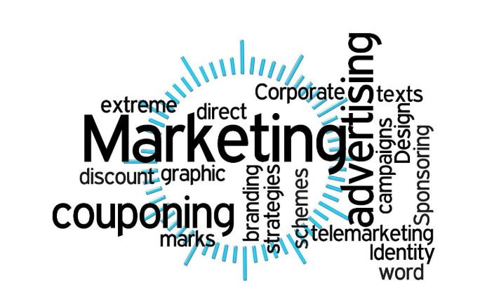
Bring Your Brand to Life – Colour Branding Inspiration
Aside from the enormous amount of people who gather to watch the champions league final, something significant- that, of course, stands out- is the colour of jersey each team wears. The crowd cheers on in similar colours of jerseys convinced that their respective teams rock! is not left out- they put on similar colours of clothes pertaining to the team they support.
Colour is life. It is an evident means of branding for anyone versed in the business world. Even countries have specific colour brands. Still, think the colour is an overrated entity?

Why Should I Pay Closer Attention to Color Branding?
Colour branding sets you apart from the pack of overzealous individuals who want to get the credit without getting their hands dirty. Can you imagine that? Sadly, without properly branding your goods, services or products- especially via colour-coding them, you would be handing your competitors an easy win. And that would be a shame. Here are a few reasons to keep you hooked on colour branding:
Boost Your Customer’s Trust

Get a 5/5 rating from clients by wooing them the right way. The trick is to use colours wisely.
 Colours have a way of eliciting the right emotions; emotions that could unconsciously instil trust and familiarity in the minds of your customers. For instance, if a customer’s favourite colour is red, the chances of him/her giving your product a closer look shoots up.
Skyrocket Those Sale Figures!

Statistics; supported by recent studies have shown that the colour of a brand affects 60-80% of customers purchasing decisions. This means that using the right colours for the design of a brand logo doesn’t only encourage familiarity, it skyrockets sales.

Your brand’s colour harnesses the psychology of your customer, delivering a message of conviction into your customers; a message strong enough to persuade a person to buy the products you sell.
Strengthen Customer Awareness of Your Brand
Sticking to the same colours have a way of alerting customers of your products. Let me ask you: When was the last time you saw a Cocacola Can that wasn’t red or a Twitter bird that wasn’t blue? Even when a red canned drink isn’t Coca-Cola, you might subconsciously think it is. Why? Because you have associated the Coca-Cola brand with the colour red!
What power colours possess.
Application of Your Brand’s Colors

For the sake of coordination, here are a few ways you might choose to apply your brand colours: in the form of a logo; such as Facebook or Twitter’s logo, staff uniform, advertisements in the form of retractable banner stands or billboards, website homepages, storefronts, etc..
What Responses Do People Give to Different Colors?
Different colours promote specific messages. This is why you have to decide what exactly you want your customers to see in your products. What would your brand’s identity be?
The first step would be to clearly state your brand’s goals. Do you want to provide your clients with luxury- in which case you could choose a bright colour, or is your aim to connect them with mother nature- in which case you’re likely to go with the lush and fertile colour green? Then, look out for a colour that best describes your aim.
Here is a brief compilation of what each colour projects:
RED
![]()
Vibrant, active, extremely present. The colour red does not represent a brand that wants to sit quietly in the background. It is loud and grabs all of the attention in the room.

Chanel is a well-known iconic red lipstick brand that can never be ignored. This is a true representation of the colour Red.
PURPLE

Power purple brands such as Yahoo have stood out in phenomenal ways with their choice of this elegant brand colour.
YELLOW

IKEA exemplifies a power brand that uses as one of its representative colours, the colour yellow; showing us how to pair it with blue to give a warm, trusty feeling.
PINK

Image source: https://commons.wikimedia.org
Want to represent warmth and badass feminine energy? The colour pink is just suitable.
BLUE

While other colours are represented in the Google logo, the colour blue clearly takes centre stage.
Light blue connotes a sense of openness, tranquillity, and peace while dark blue shows professionalism, maturity, security, and trustworthiness. Little wonder we trust Google so much?
BROWN
![]()
Polo has been making brown leather office briefcases and bags for decades, and they show a certain class and ruggedness. Pretty cool! After all, everyone wants a bag they can always depend on when the chips are down.
WHITE

Many companies specializing in the production of low-fat foods have turned to the colour white because it helps people be more relaxed about the use of their ‘harmless’ products. Cliche- but it works!
BLACK
![]()
Businessmen and women don’t often have much time to waste and as such, the colour black appeals to them. When marketing is targeted at such folks, keep the bright colours at bay and unleash power colours like black, which is a strong colour element that is both classic and sophisticated. Black creates a modern appeal and makes your brand stand out.
Wrapping Up
With so many colours to choose from to represent your brand, give a candid assessment of what you’d like to project to potential clients- and pick out the best solid colour, or group of colours, to help show the world what stuff your brand is made of.

What Is WooCommerce Product Slider and Why Your Store Needs It
Why Do Product Images Matter So Much in Online Stores? When someone visits an online store the…
0 Comments9 Minutes

How to Streamline Your Customers’ Shopping Experience?
The goal for any online store is to make shopping as smooth as possible. When visitors move…
0 Comments8 Minutes

Strengthening Brand-Customer Relationships Through Gamified Loyalty Programs
Creating lasting connections with customers has become increasingly vital as the marketplace grows…
0 Comments6 Minutes

How to Use SEO and SEA Together in Search Engine Marketing
In digital marketing, search engine marketing (SEM) plays a critical role in improving online…
0 Comments10 Minutes

Content Marketing Growth Hacks: Real Shortcuts to Drive Traffic
Are you still lagging in content marketing? Sticking to these old strategies seems…
0 Comments10 Minutes

How to Build a Strong Local Following Using Social Media Marketing
In the days of likes, shares, and stories, local businesses have a golden opportunity to create…
0 Comments9 Minutes

Why WooCommerce is the Best Choice for Your Online Store?
WooCommerce stands out as a top option for anyone looking to build an online store. This platform…
0 Comments8 Minutes

How to Use AI-Powered SEO Tools for WordPress eCommerce
SEO is a critical factor in the success of any e-commerce WordPress store. As competition…
0 Comments11 Minutes