5 UI/UX Designing Mistakes That Culprit of Bad User Experience
The difference between a successful and unsuccessful app is often decided by the level of excellence in UI/UX design. For building successful apps, every small detail corresponding to the UI and UX is essential. This is why it is vital to know the common pitfalls and mistakes of UI/UX designers in mobile apps.
Quick Links
Do you want to hire programmer from India for your startup app? Well, designers in India can also do a great job because of their massive experience in serving small business websites and apps.
Here we are explaining top UI/UX design mistakes that apps need to avoid.
Visual Clutter
You may have an affection for your creative mess, but app users generally don’t like it. This is why it is essential to put yourself in users’ shoes, and you can realize that apps and websites with visual clutter are frustrating to them.
What happens is that too many visual elements trying to compete to grab attention make the user journey difficult by simply not understanding where to look and what to prioritize. The user can simply miss the CTA button or a good deal. This is how cluttered design can ultimately make an app or website lose business.
To make your web or app UI clean and clutter-free, here we provide some tips.
- Keep the number of visual elements at a minimum level. The landing page should have a hero image, the headline, CTA, a small list of benefits, and few social proofs.
- Make sure every page focuses on one primary action.
- Make sure all your on-page elements have enough white space around to ensure optimum visibility.
- Use not more than three different colors in the design scheme and keep the number of fonts limited to one or two options.
- For the design decisions, give priority to usability and not aesthetics.
Complicated Navigation
Both hierarchy and navigation are essential to organize the on-page elements to make the website and app more useful. All the product and service descriptions should follow a precise hierarchical order. The landing page heading should come with the brand’s mission statement and tell the customers about your offerings. The subheadings, on the other hand, have to know about the customer benefits
The website or app navigation should be very intuitive and easy to understand. Provide a menu where customers generally expect to find it and maintain the conventional positions such as the horizontal top menu bar or the vertical left sidebar. Lastly, make sure the number of menu items doesn’t cross five or six.
Confusing Inconsistency in UI
Consistency is important not just to make a brand statement but also to help users engage easily with an app. Make sure you don’t use too many different design styles. Instead of p, it is advisable to use patterns and elements that repeat throughout the interface as and when required. The design consistency will only help establish trust from your users.
In order to stay clear of inconsistency, make sure you have total control over the following design elements.
- Ensure consistency in the use of color palette for different design elements such as text, links, buttons, header, footer, hover, etc.
- Maintain consistent font for all text areas, including titles, subtitles, text paragraphs, links, etc.
- Choose rounded or squared corners for the icons, cards, buttons, etc.
Not Maintaining Legibility and Readability of Text
Fonts make the app design look good, but fonts also play an important role in legibility and readability. This is why designers always have to optimize the usage of size, weight, and color and use the right combination. Doing A/B testing is necessary to ensure legibility in all screen sizes.
The designers should focus upon coming with a font that perfectly addresses the device type for choosing between thin or thick fonts or for choosing a lightweight or heavy font. A thin and lightweight font type may look great on the designers’ high-quality monitors but can be unfit for cheaper displays.
While testing the font and color scheme in mobile app design, make sure the participants open the app on various mobile device screens in broad daylight so that the legibility and readability can be rightly evaluated.
Primary and Secondary Buttons Looking Similar
As for the UI design of apps and websites, you need to provide users with several options for taking action. To make user’s choices easier, it is important to bestow the visual importance of certain buttons over others. The primary buttons should look different from the secondary buttons.
The design tips to help you distinguish the primary buttons from the secondary buttons include the following.
- Maintain different visual depth and weight for primary and secondary buttons. This will create priorities for grabbing user attention.
- Make use of stronger colors, bold font, and bigger button size to create more visual weight for primary buttons. Reduce the visual weight accordingly for the secondary buttons.
Using Less Legible Icons
Icons actually should make a UI design easier. Since mobile users mostly detest text and prefer visual clues for decisive on-screen actions, using the right symbol for in-app actions is very important.
Here are some useful tips for using icons in design.
- Use vectors or SVG to create icons that look prominent on all devices.
- Maintain consistency of style in designing icons.
- Make sure that the message behind the icon remains clear.
Conclusion
All the above-mentioned mistakes are common, and they have been dealt with the appropriate measures as mentioned above. Make sure when creating UI/UX design for your app, every element goes through A/B testing.
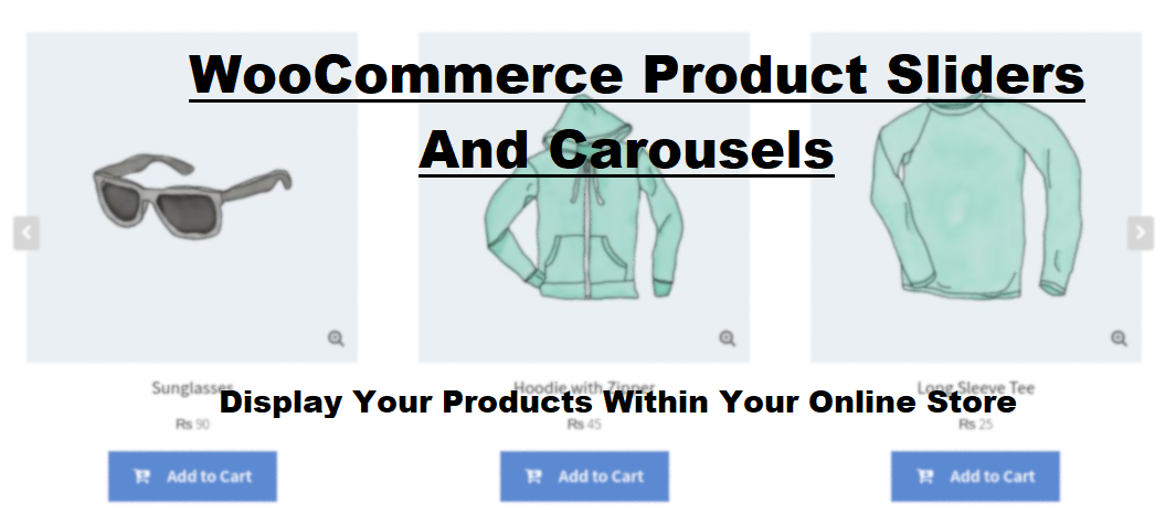
What Is WooCommerce Product Slider and Why Your Store Needs It
Why Do Product Images Matter So Much in Online Stores? When someone visits an online store the…
0 Comments9 Minutes

How to Streamline Your Customers’ Shopping Experience?
The goal for any online store is to make shopping as smooth as possible. When visitors move…
0 Comments8 Minutes

Strengthening Brand-Customer Relationships Through Gamified Loyalty Programs
Creating lasting connections with customers has become increasingly vital as the marketplace grows…
0 Comments6 Minutes

How to Use SEO and SEA Together in Search Engine Marketing
In digital marketing, search engine marketing (SEM) plays a critical role in improving online…
0 Comments10 Minutes
Content Marketing Growth Hacks: Real Shortcuts to Drive Traffic
Are you still lagging in content marketing? Sticking to these old strategies seems…
0 Comments10 Minutes

How to Build a Strong Local Following Using Social Media Marketing
In the days of likes, shares, and stories, local businesses have a golden opportunity to create…
0 Comments9 Minutes

Why WooCommerce is the Best Choice for Your Online Store?
WooCommerce stands out as a top option for anyone looking to build an online store. This platform…
0 Comments8 Minutes

How to Use AI-Powered SEO Tools for WordPress eCommerce
SEO is a critical factor in the success of any e-commerce WordPress store. As competition…
0 Comments11 Minutes