What should you consider when creating a logo?
So you have picked your company name and now are ready to embark on the task of creating a logo. The image that the world will soon know and remember you by.
But how do you even go about deciding how your logo should look?
How do you pick the right colours or fonts that will best represent your brand and/or services?
Do you base your decision on what’s popular or trending?
Or do you stick to the tried and tested that are commonly used in your profession or industry?
Wow. So much to consider, and these are just a few of the questions that you might start asking yourself. No wonder creating a logo is such a daunting task that a lot of business owners and designers could do without.
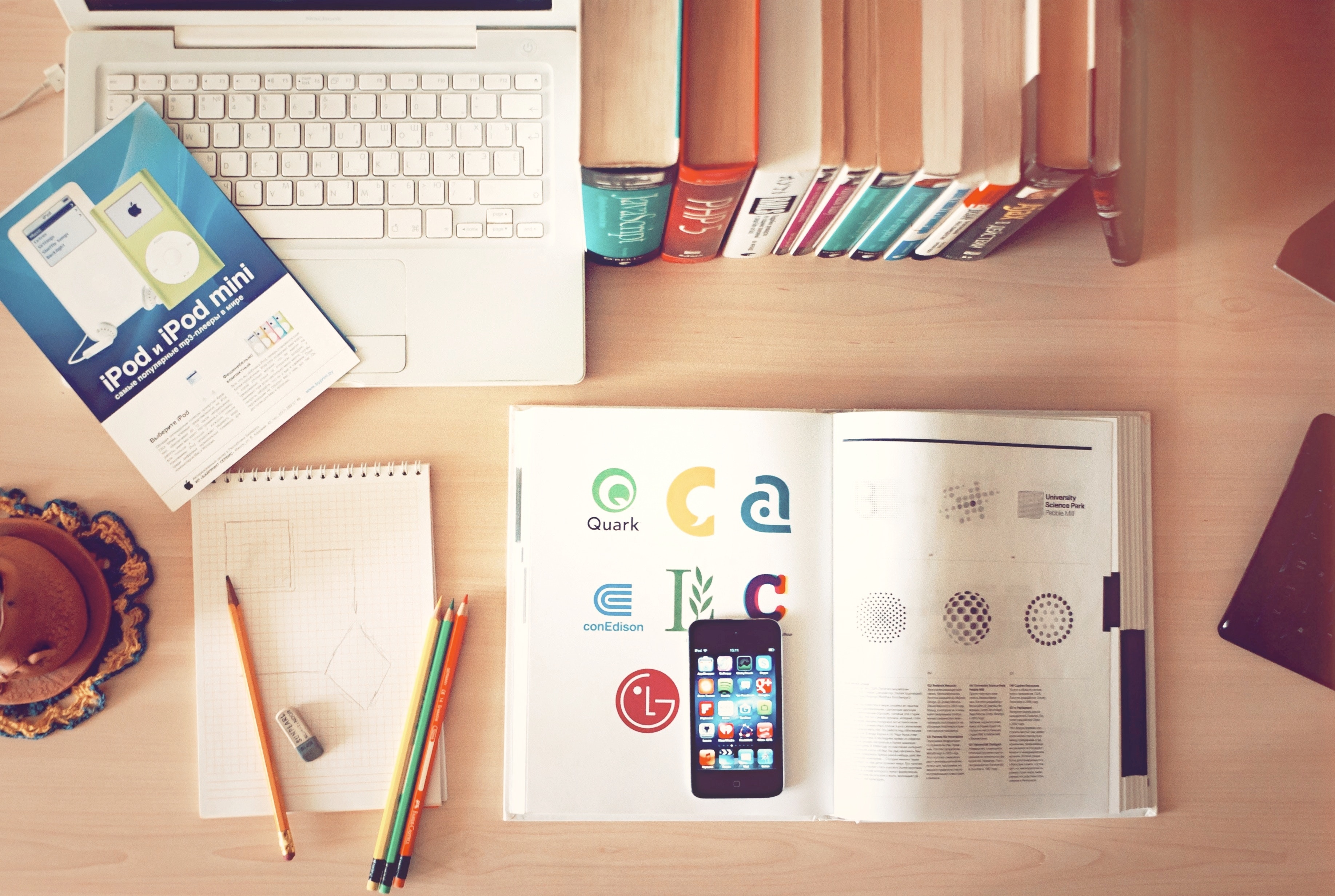
Your logo arguably is one of the most integral parts of your brand design and creating the right logo that will withstand the test of time can be challenging. When designing a great logo there are many things to keep in mind such as fonts, colours, and how it will look when printed or viewed on different digital media. With everything to consider of “what you need” I often try and think about what is not needed when designing a great logo and start to eliminate these things to help me zero in on needs. I reverse engineer the process. Most users won’t always have the eye to figure out what’s missing about a design— fortunately there are logo design tools like Logo.com that do that for you.
When trying to communicate a brand through a logo, consider the following:
- Does it require a word mark?
- Is a symbol necessary?
- Do we integrate a tag?
A logo typically works best when it is able to stand on its own. Creating a logo that will not only stand out but will also adapt to its surroundings makes a huge difference in getting consumers to recognize and remember your brand. A logo doesn’t need to necessarily convey what the business is or does. While that certainly works in some circumstances, logos are capable of adding meaning to the brand and keeping the brand top-of-mind without an immediate connection to the brand’s product or service. The relevance of a logo to the product or business can be unique and different, which will only help to add intrigue, interest, and engagement.
A perfect example of this would be a brand such as Nike and its legendary “Swoosh” logo. With just a simple, curved line, that one little swoosh represents motion and speed, which are synonymous with athleticism. This is what Nike stands for. The brand is so popular with this logo that there really isn’t even a need for the tag “Nike” to be seen anywhere – you see the swoosh, you know it’s Nike. With some great marketing and years of branding, the swoosh is just as relevant as the tag “Nike:”. Taking it even a step further, Nike doesn’t need a shoe, a ball or merchandise as their logo to connect with their potential buyers. They know what the brand is and what they sell.
Although Nike uses a symbol for its logo, your logo doesn’t need a symbol or image. Having only a symbol for a logo design doesn’t always serve its purpose, and sometimes, a wordmark logo is a much better fit. Some examples of popular wordmark logos include Google, Coca-Cola, Star Wars and Disney. These companies word marks are so popular that they even have their own font set named after them that you can use for everyday notes and designs. Talk about powerful.
But whether you are considering a word mark or symbol, or even a combination of both, you should stop to think which will connect with your target audience best. In the beginning stages of your business, you have a targeted audience that you are trying to sell to, and your logo is generally more geared to them as they are key individuals that will be purchasing your product or service (for now). So, when creating your logo you should think about these individuals and where your logo will appear for them to see it. Will it be in printed ads? Online? On T-shirts and cards? You need to make sure the message and meaning are clearly understood on all platforms that you are intending to utilize.
A properly planned logo design is the key to success. Determine what is the best way to connect the audience with the brand and remember that just because it’s relevant doesn’t mean it’s best. Below are a few pointers and tips that could assist you along the way, during this design process.
- Colours, what do they mean, and can they help your logo, (ex, Red = Aggression).
- Fonts selection – Is your business bold or fancy? Traditional or Tech? Picking the right font that gets this message across will be key. PRO TIP. Stay away from generic Typefaces. With millions of fonts out there, be original.
- Do you require an image or symbol that helps tie your business name to what you do?
- Do you require a landscape and portrait orientation of your logo?
- Will you need guidelines, for when others will be using your logo in publications?
- Try and Keep the design simple so it is scalable and will work with different applications.
- ALWAYS ensure your logo is designed in vector format, which will allow you the freedom to make it as large or small as needed along the way without compromising the quality.
- Get a few opinions and feedback. Positive or negative there is always something to be learned.
- Keep it simple – use only 1 trick. Try not to get to intricate. There is longevity in simplicity.
By taking the time to consider the above points you can start to tailor your logo for it to meet the needs of the audience and the brand. This will help you stand above your competitors while saving you time and money in the end.
Author Bio:
Marinos is the founder at MGS, a marketing, design, printing and creative agency in Toronto. His skill set and experience in the print and graphics industry stems 15+years and his greatest expertise revolves in the worlds of interactive design. Connect with him on LinkedIn.
Photo by Aleks Dorohovich on Unsplash

What Is WooCommerce Product Slider and Why Your Store Needs It
Why Do Product Images Matter So Much in Online Stores? When someone visits an online store the…
0 Comments9 Minutes

How to Streamline Your Customers’ Shopping Experience?
The goal for any online store is to make shopping as smooth as possible. When visitors move…
0 Comments8 Minutes

Strengthening Brand-Customer Relationships Through Gamified Loyalty Programs
Creating lasting connections with customers has become increasingly vital as the marketplace grows…
0 Comments6 Minutes

How to Use SEO and SEA Together in Search Engine Marketing
In digital marketing, search engine marketing (SEM) plays a critical role in improving online…
0 Comments10 Minutes

Content Marketing Growth Hacks: Real Shortcuts to Drive Traffic
Are you still lagging in content marketing? Sticking to these old strategies seems…
0 Comments10 Minutes

How to Build a Strong Local Following Using Social Media Marketing
In the days of likes, shares, and stories, local businesses have a golden opportunity to create…
0 Comments9 Minutes

Why WooCommerce is the Best Choice for Your Online Store?
WooCommerce stands out as a top option for anyone looking to build an online store. This platform…
0 Comments8 Minutes

How to Use AI-Powered SEO Tools for WordPress eCommerce
SEO is a critical factor in the success of any e-commerce WordPress store. As competition…
0 Comments11 Minutes
Yes. Logo design is your brand’s first impression on your customers. So it should be very creative and eye-catching.