The Role of Color Psychology in Branding and Web Design
As a species, we humans have had a complex relationship with colors, especially since we figured out a few things and started building civilizations around the globe. In different parts of the world, different colors got assigned specific associations and meanings. Combined with our natural, biological responses to different hues, colors have a sizable influence on our decision-making process.
Quick Links
Of course, people whose livelihoods depend on “guiding” consumers to certain decisions (brand experts, advertisers, designers) have made color one of their most trusted allies in helping sell stuff. It is no surprise that they have also become some of the biggest experts in color psychology in branding and, later, web design.
If you are interested in the subject, you can dive much, much deeper by consulting this extensive review of color psychology by T. W. Whitfield and T. J. Wiltshire.
If there was ever a branding topic that would benefit the most from specific examples, it’s this one, so let’s start looking at different colors and how they are best used in branding and web design.
Blue
We will kick things off with blue, a color that, believe it or not, didn’t even exist if you asked the Ancient Greeks.
Spend only half an hour opening random websites, and you’ll notice that blue is by far the most commonly used color in web design. The main reason for this is that blue is the most agreeable color for the vast majority of demographics.
For instance, some research done in the U.S. showed that blue is the top choice for 35% of Americans when asked about which color they liked the most. Blue also “does it for us” on a deeper, biological level as we, as a species, associate it with clean water and accommodating surroundings where we can easily survive. This is suggested by Dennis Dutton in Aesthetics and Evolutionary Psychology, his contribution to The Oxford Handbook of Aesthetics, a fascinating read altogether.
The color blue is associated with a whole range of positive emotions and associations, such as competence, quality, and reliability. This is why so many websites that want to project those values use blue.
Take Pretest Plus as an example:

Source: Pretestplus.co.uk
Their choice of a vibrant blue hue helps to indicate to potential customers that their products will be of high-quality, that they know what they are doing, and that you can order from with them without second-guessing.
Green
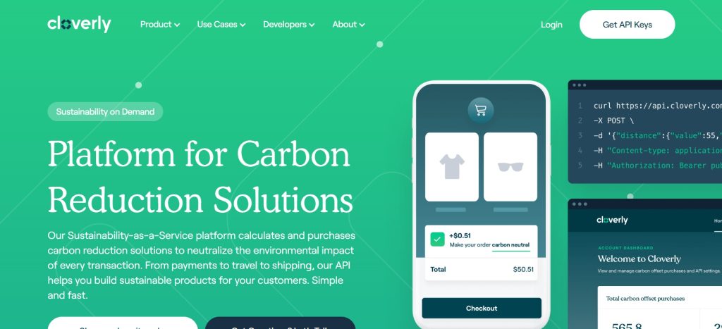
The color green was ranked as the second most pleasant in both of the aforementioned studies, and this should come as no surprise. This is yet another color that affects us on a deep, biological level, as we associate it with food as well as shelter from predators and the elements.
Green is also a color that is associated with health, good taste, and money, at least in the United States (possibly because of the color of dollar bills).
Thus, it’s no wonder that a brand such as Cloverly chose green as their primary color. It’s the perfect choice for the platform, which helps companies calculate and purchase carbon reduction solutions.
Source: Cloverly.com
Red
Red is perhaps the most interesting color when we’re talking color psychology. For one, it is associated almost universally with love, excitement, attraction, and lust. This effect is most pronounced in heterosexual men, as shown in the paper Romantic red: Red enhances men’s attraction to women.
Spend a few minutes on Tinder’s website and check out their buttons, loading screens, and even the clothes people are wearing in their profile photos.
Quite a bit of red, right?
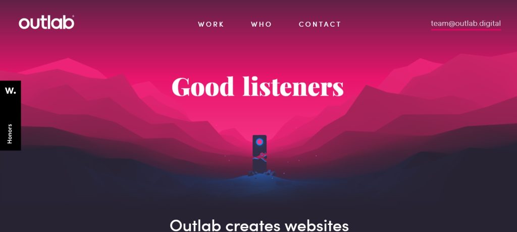
On the other hand, red is often associated with negative emotions and feelings such as anger, aggressiveness, and danger. This is why red in web design is usually “softened” by using specific shades of red or by combining it with other colors. Outlab does exactly this:
Source: Outlab.digital
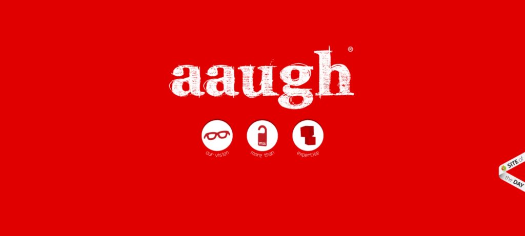
Due to these complexities, outright red is very rarely used in web design. However, this allows braver brands to really stand out from the crowd by using it aggressively. Check out the homepage of aaugh, an Italian creative studio:
Source: Aaugh.it
That is a page that will stick with you. Imagine if someone was looking at 30 creative studios, all blue or yellow or green (perhaps black). And then aaugh comes up – it immediately jumps to the top of the shortlist.
Yellow
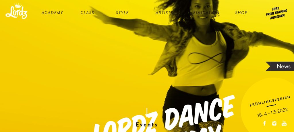
While, according to evolutionary psychology at least, yellow is not among the most positively perceived colors due to its associations with arid, unwelcoming surroundings, it definitely found its place in web design and branding. This is mostly due to its warmth and the ability to evoke bright, happy feelings in people. Dance academy Lordz utilizes this very well, making yellow its obvious primary choice:
Source: Lordz.cz
Another reason why yellow is often used in web design and design, in general, is that it combines very well with other colors, especially as a contrasting color. You can see it in the Lordz example – black, white, and yellow work particularly well together.
It is, however, important to be careful with the color yellow. According to at least one study, yellow is often associated with inexpensiveness and, probably related to this, low quality.
In short, be careful.
Black
Simply put, black equals luxury in the world of design. It conveys sophistication and quality, and it’s used to let consumers know that a product/service is not going to be the cheapest on the market. But that is fine – you are paying for the highest quality imaginable.
This color association has become a tradition. For instance, just take a look at the logos of some of the most exclusive luxury fashion brands, such as Hermès, Prada, or Yves Saint Laurent. The only two colors that are used are black and white.

Source: Google.com
It is almost comical, but it obviously works (and has worked for decades).
The best proof of this concept are creative studios themselves. You will find that a majority of them want to exude this feeling of luxury by using black, like 1md, for instance:

Source: 1md.be
Brands that have to do with the stock market and investments also lean heavily on black, working that exclusivity, opulence angle. Altvia is a great example:

Source: Altvia.com
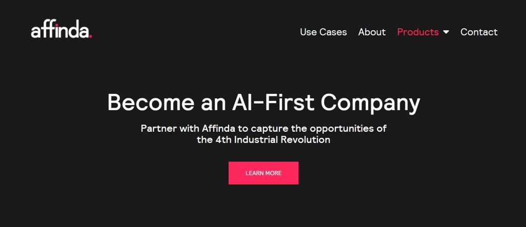
Tech companies also sometimes go for the color black, especially if they are targeting enterprise customers or if they have a product or service that is forward-looking (once again, there is that exclusivity factor). Affinda is the perfect example:
Source: Affinda.com
What color should I use?
Unfortunately, there is no magical chart that will tell you the right color (or combination of colors) to use for your brand or website. Even if your niche may seem like the perfect fit for a blue + white combo, it may not be the right choice.
There are a few reasons why it is more complicated than just going with the most obvious choice.
For one, the differences in color preferences and emotional responses are staggering across various demographics. Age, gender, nationality, ethnicity, upbringing, and at least a dozen more factors affect how we perceive colors. In other words, you really need to know who your target market is and then do research on how they respond to specific colors.
Also, you do not want to get lost in the forest of same-looking brands in your industry. For example, take a look at this list of best project management tools. You could spend a month in the open ocean and see less color blue than this. Sometimes a bit of visual differentiation can do wonders for your brand.
Final Thoughts
Color psychology is an expansive field, and it takes a lot to really understand all of the implications it has on branding and web design. The good news is that there is always something new and interesting to learn, especially if you go into various cultural differences.
Good luck and have fun!
What Is WooCommerce Product Slider and Why Your Store Needs It
Why Do Product Images Matter So Much in Online Stores? When someone visits an online store the…
0 Comments9 Minutes
How to Streamline Your Customers’ Shopping Experience?
The goal for any online store is to make shopping as smooth as possible. When visitors move…
0 Comments8 Minutes
Strengthening Brand-Customer Relationships Through Gamified Loyalty Programs
Creating lasting connections with customers has become increasingly vital as the marketplace grows…
0 Comments6 Minutes
How to Use SEO and SEA Together in Search Engine Marketing
In digital marketing, search engine marketing (SEM) plays a critical role in improving online…
0 Comments10 Minutes
Content Marketing Growth Hacks: Real Shortcuts to Drive Traffic
Are you still lagging in content marketing? Sticking to these old strategies seems…
0 Comments10 Minutes
How to Build a Strong Local Following Using Social Media Marketing
In the days of likes, shares, and stories, local businesses have a golden opportunity to create…
0 Comments9 Minutes
Why WooCommerce is the Best Choice for Your Online Store?
WooCommerce stands out as a top option for anyone looking to build an online store. This platform…
0 Comments8 Minutes
How to Use AI-Powered SEO Tools for WordPress eCommerce
SEO is a critical factor in the success of any e-commerce WordPress store. As competition…
0 Comments11 Minutes
