How Can I Design an Effective Ecommerce Checkout That Converts
Ecommerce has been experiencing steady growth for the past few years. With everyone having an internet and Wi-fi connection, they can almost easily access anything they wanted online. However, as the growth continues, expectation follows. When someone visits your eCommerce website, you want them to press “Add to cart” and proceed to check out. Unfortunately, this does not happen all the time. Sometimes, before someone could click on that product, they leave your website. Either the website loads slow or the webpage design is ‘unappealing.’
Quick Links
Another problem that eCommerce websites face is the so-called ‘Shopping Cart Abandonment.’ Just like the name suggests, visitors to a website tend to abandon their cart. According to the abandonment rate statistics averaged by Baymard Institute, the average Shopping Cart Abandonment rate is 69.80%. I think we can all agree that this percentage reflects a big loss sale. And we do not want that for our eCommerce platform! So, here are simple things to remember when designing a highly converting eCommerce check-out.
Check Out That Add to Cart Button

(Source: Pixabay)
First, make sure that your add-to-cart button is highly distinguishable among all the text and images on your product pages. You can use a bright and striking color.
Second, once the shopper presses that button, it should make an indication that the product has been added to the cart. A clear confirmation is what the shopper needs. It is interesting how some eCommerce platforms failed to do this simple step.
Third, you also have the option to have a checkout page appear once the add-to-cart button is clicked. It will show what products are already in the shopper’s cart.
Lastly, we want them to purchase more, so make sure to add a button for the shoppers to go back to the product page.
Present the Contents of the Cart Well
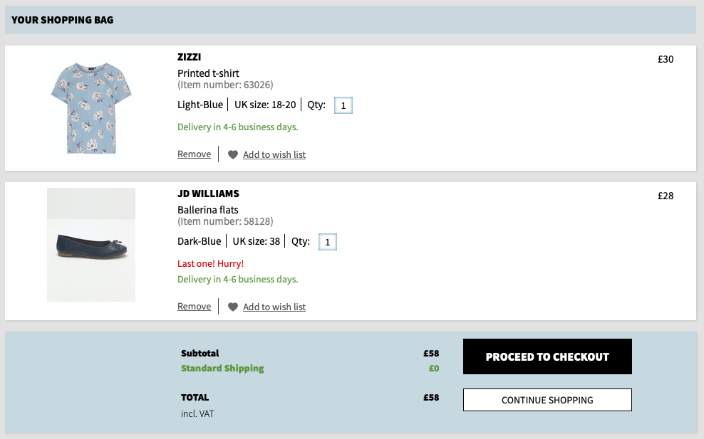
(Source: Ecommerce Guide)
Assuming your shopper is preparing to check out, they will most likely check the contents of their cart before proceeding to click ‘Checkout and/or Payment.’ When displaying the cart, make their chosen products visible. A summary description of each product should accompany each of the products in the list. This will remind the shopper what products they added to their cart.
At the same time, give the shopper control by letting them adjust the quantity, color, or sizes of their chosen purchase. Just imagine when this option is not given to you. Can you imagine the hassle of deleting the product from your cart and looking for the product again in the product list? All this effort just for you to change the color of the product. If this is the case, there is a chance that the customer will delete the product from the cart and proceed with the remaining goods. Worse, they can abandon their cart and find another platform to purchase their goods. Sometimes, a minute hassle could break a potential sale.
Show them the Checkout Process
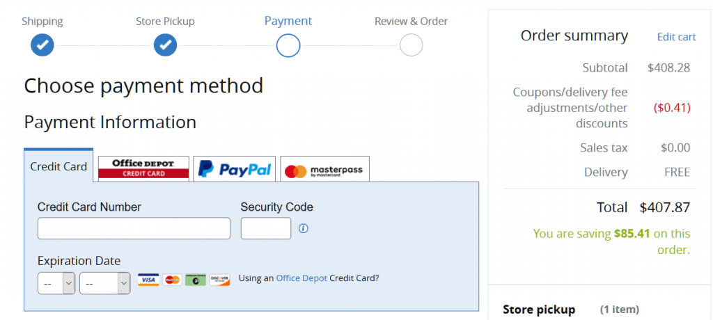
(Source: thegood.com)
Once the shopper is content with the items they picked, they will proceed to checkout. The checkout process must be visible to the shoppers. Why? This to assure them that the checkout will not take too much of their time. Giving them a breakdown of the checkout process will give them an idea of what will happen next. The most common way to show your shoppers the progress of their checkout process is by placing a progress bar on top of the page.
Make the Coupon Code Less Prominent
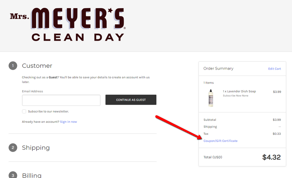
(Source: Community Spotfiy)
It may sound odd, but hear this out! If shoppers see “Enter coupon here,” there is a possibility they will leave their checkout process. Shoppers will search on Google to find these said coupons. And if they fail to find one, they may not return to your page.
A good way to avoid this is by making the text link less prominent. You can also use plain design for the enter-code field or subtly hide the coupon code somewhere on the page. Only those with coupons will try to find a box to enter their code.
Good Stuff for the Shoppers – Shipping, Returns, and Payment Methods

(Source: Pixabay)
You wanted to make your shoppers feel that they are making a great decision in picking your eCommerce site. How? Answer the following:
a. Are you offering free shipping if they are within your territory?
b. How will you make the shoppers assured that their transactions with your site are secure?
c. Is there any way for them to return the product when they found it faulty?
These simple questions can be answered by reminding them that you got the following covered. You can include in your payment button the simple words “pay securely…” You can also include a text link during the checkout process that the shopper is eligible to avail of a free shipping voucher for reaching minimum spending. A simple sentence such as “Return policy effective for 30 days from purchase” will make it more appealing to them.
Skip the Sign-up Process
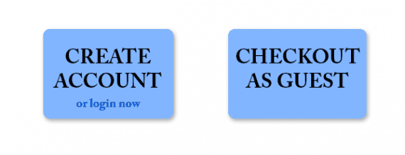
(Source: Practical Ecommerce)
A lot of eCommerce websites require that a shopper register before purchasing an item. However, instead of doing good, this may lead you to lose a potential sale! According to Econsultancy survey done in 2011, one in four shoppers abandoned their purchase due to the registration requirement.
We all wanted to hook shoppers into visiting our eCommerce platform often. Some of us thought by obtaining at least their email addresses, we can update them on our sales and future promos. But, it is not always the case as shoppers may see the required registration as a “hassle or unnecessary” to their shopping experience. To simply explain, look at it from the perspective of your shopper. Would you really want to register on an eCommerce website just to purchase? If you’re not a loyal customer, you will probably not register. You’ll leave the site and check out other eCommerce platforms providing the same good without the hassle of registration.
But, what is the proper remedy available when you really wanted the shoppers to sign without forcing them? Well, you can easily compromise this by providing a guest checkout. This is great, especially if you’re still building a relationship with your first-time shoppers.
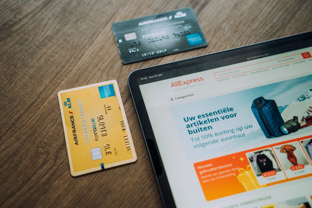
Asking for the Payment Details

(Source: Freeimages)
This should be an easy part. Most eCommerce websites have a standard payment form. But, you should remember the following. As already mentioned, you wanted to make your shopper feel secured when transacting a business with you. Assure them that their personal information is secured throughout the process.
Also note that, do not immediately give the shopper their billing. Ask them first for their shipping information. A simple procedure is to ask for the shopper’s shipping information first, then proceed with their chosen payment method. Lastly, ask them to review all the information provided before they seal the deal. This is for the shopper to double-check whether they input the proper information.
Conclusion
(Source: Unsplash)
You do not need to achieve all of these in one day. Take your time and learn as you go. You will be amazed at how an update on the design of your eCommerce checkout flow can massively make a difference.
To summarize, here are the following:
a. Make sure you make your Add to Cart button distinguishable;
b. Summary of what is on the shopper’s cart;
c. Give them the visual presentation of the checkout process;
d. Be careful with the “Enter coupon code”;
e. Good stuffs for the shoppers;
f. A choice for guest checkout and registration; and
g. Secured payment transaction.
Now that you know how to make an effective checkout design. Maybe it’s time for you to learn how to build your very own store from scratch.

What Is WooCommerce Product Slider and Why Your Store Needs It
Why Do Product Images Matter So Much in Online Stores? When someone visits an online store the…
0 Comments9 Minutes

How to Streamline Your Customers’ Shopping Experience?
The goal for any online store is to make shopping as smooth as possible. When visitors move…
0 Comments8 Minutes

Strengthening Brand-Customer Relationships Through Gamified Loyalty Programs
Creating lasting connections with customers has become increasingly vital as the marketplace grows…
0 Comments6 Minutes

How to Use SEO and SEA Together in Search Engine Marketing
In digital marketing, search engine marketing (SEM) plays a critical role in improving online…
0 Comments10 Minutes

Content Marketing Growth Hacks: Real Shortcuts to Drive Traffic
Are you still lagging in content marketing? Sticking to these old strategies seems…
0 Comments10 Minutes

How to Build a Strong Local Following Using Social Media Marketing
In the days of likes, shares, and stories, local businesses have a golden opportunity to create…
0 Comments9 Minutes

Why WooCommerce is the Best Choice for Your Online Store?
WooCommerce stands out as a top option for anyone looking to build an online store. This platform…
0 Comments8 Minutes

How to Use AI-Powered SEO Tools for WordPress eCommerce
SEO is a critical factor in the success of any e-commerce WordPress store. As competition…
0 Comments11 Minutes