Functional Color: How To Use Color For Successful Site Navigation
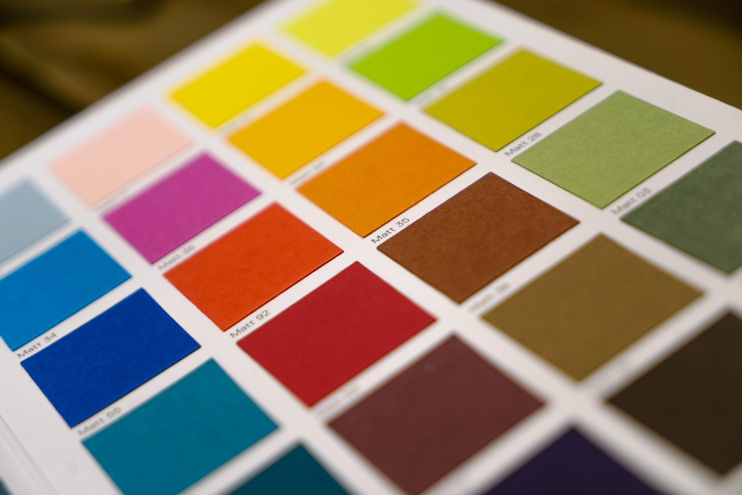
Marketing Research has cranked out thousands of studies over the years to understand which colors motivate people to buy. There is a good reason for marketers to focus on color – people respond to it. Color can change the look and feel of your brand and help people navigate your website.
Quick Links
We hope to share with you some of the elementary principles on how the mind searches for colors to take action. You can use this knowledge to help walk your guests down the yellow brick road to conversion on your site.
Color For Usability: First Examine What You Already Know
From your faucet in a hotel bathroom to a train station in a foreign country, you rely on color to help you function and navigate space. Color queues are generally universal, but they can be interpreted differently from culture to culture. Have you ever been confused by color queues that oppose your intuition? This happens in daily life and it happens even more frequently on websites. Let’s review some of the colors that help us navigate through everyday life and then examine how they can help us navigate using the same principles on your website.
Color Coding and Real Life Navigation
Think about the last time you were driving in traffic. How easy was it to understand the traffic signs before you were even close enough to read them? Have you ever driven in a foreign country where you could not read the language on the traffic signs? Were you still able to stop and go at appropriate times?
The universal usability of road signs and traffic signals keeps people alive every day. Imagine if you were in a foreign and you saw a sign like this:
The truth is that you might cause an accident because this sign says “STOP” in Tamil. Luckily, colors are so universal that you would be very unlikely to see a sign like this anywhere in the world. Color is the critical factor in the success of the visibility and readability of road signs.
Color Coding on Everyday Objects
You might have trouble understanding all the mystical features of the T.V. remote. Some people are amazing with them, wielding them like samurai’s with their swords. Some, on the other hand, can usually only figure out how it can be used to turn the television on and off. How can they even figure out that much? Every remote control has a colorful ‘Power’ button.
What about when you are using the gas pump, have you ever had any trouble there? Oftentimes gas pumps have 2 buttons, an “Enter” button and a “Yes” button. It can be difficult to tell which of those buttons you should press to get the gas pumping. One of those buttons might even be green, so you will push it over and over to get the gas to work, only to find that it is another grey button you are supposed to be pressing. This is an example of bad color communication and is something you can avoid on your website. Can you tell which of the buttons on this gas pump you should press after you run your credit card to make the pump work? The correct button to press is “Enter,” which is not immediately obvious based on the color scheme in place.
How Color Can Increase Ease of Navigation on Your Site
In the world of computers, the execution of proper colors for navigation lives under the term User Interface Design or UI. In the same way that color works to control traffic on the road, color combined with shapes and symbols will mean the difference between successful computer-human interaction or confusion.
For your site to be successful, it must be accessible to everyone. People will leave your site right away if they don’t find your site attractive and inviting. Your visitor must be able to move around your site and easily find what they need. Your visitor must be comfortable and feel secure just like they do at their local department store. They must be able to examine your products, service and merchandise and get all the information they need to make a decision. Finally, they must be able to successfully complete a purchase or procure a service on your site.
Color on your site needs to fulfill multiple functions:
- Product colors must be as accurate as technology will allow. You will lose money if you sell a pink sweater on your website that is actually purple in reality. To get the most accurate colors possible delivered to any monitor your guest might be on, make sure you calibrate your site color for the web.
- Colors must catch and hold your visitors attention, and then deliver appropriate and accurate information. Color will be essential in creating appropriate navigation elements. When you create buttons, make them green or orange, colors that will indicate to your guest they are moving forward. Always avoid colors like red or yellow which can indicate danger or a warning sign to your visitor. There is a wealth of information online about how to make the perfect call to action buttons.
- Colors must create a sense of visual harmony, trust, and professionalism. The aesthetic balance of colors on your site should make your customer feel like they can trust you. If you cannot hire a professional designer with a background of knowledge in color harmonies, you should take some time and learn what colors work well together on your site.
There is no right or wrong color scheme and the success of your site will depend on a variety of different factors. As long as you make sure to put some thought into your color scheme and how it will affect your guests’ experience, you should be successful. If you are not sure, you can always ask friends, family, coworkers or online usability testing professionals what colors they find the most appealing and the most helpful.
About the author: John M. Caviness is a successful copywriter at write my essay service. This job gives him an opportunity to express his opinion and thoughts on different topics including motivation.

What Is WooCommerce Product Slider and Why Your Store Needs It
Why Do Product Images Matter So Much in Online Stores? When someone visits an online store the…
0 Comments9 Minutes

How to Streamline Your Customers’ Shopping Experience?
The goal for any online store is to make shopping as smooth as possible. When visitors move…
0 Comments8 Minutes

Strengthening Brand-Customer Relationships Through Gamified Loyalty Programs
Creating lasting connections with customers has become increasingly vital as the marketplace grows…
0 Comments6 Minutes

How to Use SEO and SEA Together in Search Engine Marketing
In digital marketing, search engine marketing (SEM) plays a critical role in improving online…
0 Comments10 Minutes

Content Marketing Growth Hacks: Real Shortcuts to Drive Traffic
Are you still lagging in content marketing? Sticking to these old strategies seems…
0 Comments10 Minutes

How to Build a Strong Local Following Using Social Media Marketing
In the days of likes, shares, and stories, local businesses have a golden opportunity to create…
0 Comments9 Minutes

Why WooCommerce is the Best Choice for Your Online Store?
WooCommerce stands out as a top option for anyone looking to build an online store. This platform…
0 Comments8 Minutes

How to Use AI-Powered SEO Tools for WordPress eCommerce
SEO is a critical factor in the success of any e-commerce WordPress store. As competition…
0 Comments11 Minutes