Choosing the Best Type of Design for Your Website
Responsive design seems to be the king of current website design trends, but this approach may not work for every site. Each website requires a different design and style depending on a variety of factors. If you are creating a website for your company, it is important that you carefully select a good website design that will work best for you. Certainly, a responsive web design or a design that renders correctly and quickly for mobile devices is part of the best practices that will make sure that the search engines will rank your business website for the searches that your target audience uses. The loading speed of the website has now been confirmed as one of the signals that Google uses and is therefore part of search engine optimization.
Quick Links
Criteria to Prioritize in a Template
There are countless factors in website design. The color scheme or color palette, white space or negative space, patterns, other visual elements, comment boxes, separate pages, video content, and many other pieces are used by web designers to create a fantastic user interface website. The template that you choose is a major part of your site and forms the backbone of good web design. A well-designed website can be made by a designer from first principles, or it may be made from adapting an existing template or indeed by using on of the increasing number of non-code website builders any of which now incorporate AI in their design process.
The principal purpose of the website will also be part of the equation. A website that is fundamentally made up of blog posts will be different to the design of an ecommerce site. The degree to which you need user interaction, for example choosing options within a product, using a shopping cart or simply leaving comments will all rely on the visual design and visual appeal.
There are three criteria to consider that you should prioritize: content width design, home page header design, and menu bar design.
Content Width Design
Generally, there are two options for content width in website design templates: full-width and boxed-width. Full-width is when the background spreads throughout the entire screen as if it is endless. It is very popular and works well on mobile devices and websites with a lot of graphics. The wider width also allows you to fit more tabs in the menu bar. However, the background picture being stretched means that the content orientation and alignment may be different between computers and mobile device screens.
Boxed-width is a more traditional style. It has a more organized, professional feel so many businesses prefer it. A boxed-width template has a specific, fixed width, preventing it from changing or warping, depending on the device that the website is being viewed on. It is the ideal choice if you are prioritizing a professional look from any device.
The foundational difference between each design comes down to the impression that you want to give the viewer. As a broad rule, the full width will give a more creative, modern feel to your website. The boxed-width style will make your website seem more traditional and professional.
Home Page Header Design
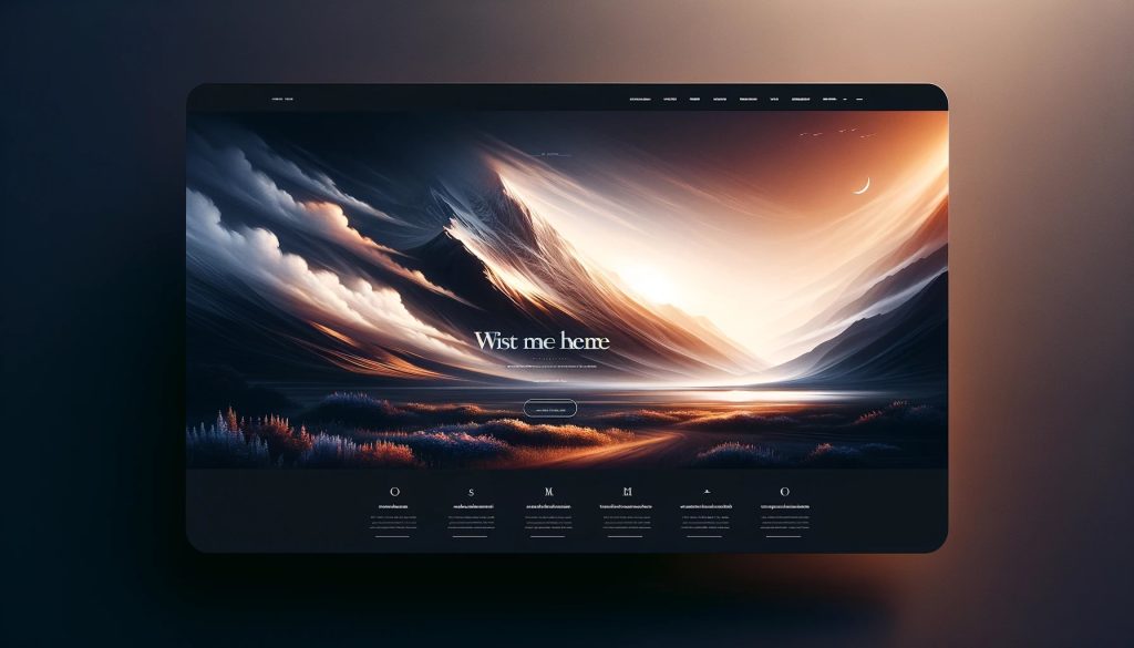
The home page header of your website is likely the first thing that a visitor will see when they come to your site and may well be part of the first impression a user may have of your business and online presence. It can be comprised of anything from images to text, to videos. When picking out your header, it is important not to hastily choose the one that you find the most impressive or entertaining. Carefully consider your image, and how your choice will affect your business. As the first thing people will see, your header choice is one of the most important decisions you will make for your website.
There are endless possibilities for different home page header designs. However, some are more popular these days than others.
Static Header Image with No Content
A static header image with no content design means the only content of your header is a still photo. There is no movement and no text over the image. Static header images with no content designs should only be used by businesses that rely on beautiful photos to appeal to customers, such as hotels, resorts, or restaurants. It is an appropriate choice if you believe that a beautiful photo will be enough to attract customers to explore your website.
You should not use a static header image with no content design if you run a business that requires further explanation about what you do and why people should use you. If your business needs even minor elaboration, having a static image as the first thing visitors see could confuse and possibly turn off potential customers. Only use a static header image with no content if your business can be easily summed up in one image.
Static Header Image with Content
A static header image with content design can be used by almost anyone. It is the safest option. A static header image with content includes a headline, supporting paragraph, call to action, and supporting image. In this design, the image should be secondary. It should support the text without overpowering anything.
Slideshow Header with Content
A slideshow header works best for businesses that have multiple products, different target audiences or is simply a portfolio website. It gives you the ability to showcase various items or services in the header, instead of limiting yourself to one thing. Being able to showcase multiple aspects of your business will widen the audience you appeal to and immediately draw in viewers.
Video Background Header
Videos have become an extremely effective way to attract website visitors. Having a video as your header engages viewers and displays the full gamut of what your business offers. If you are using a video background header, try to:
- Make sure your video has a message and is not random
- Use a unique video instead of finding a common one online
- Make sure your video is high-quality
- Keep it short
Menu Bar Design
People often fail to realize how important it is to have a good menu bar design. Visitors to your site must be able to easily navigate to other web pages and explore your content. Even if your home page is stunning, people will give up on your website if it is difficult to navigate.
When you are choosing a menu bar, be sure to choose a clean and simple design, so that your tabs are easy to read. The color of your menu bar and the text of your tabs should contrast, so that it is easy to see the text. Organize your tabs from most important to least important with the most important tab on the left side of the menu bar. Do not put too many tabs on the bar. You only want to display pages that are essential to representing your business.
More often than not this is where possibly the most important element will be place – your logo, a major factor in brand identity.
Website Layouts
There are also many types of website layouts to choose from when creating a website. The main options are static page, dynamic website, fixed design, responsive design, liquid or fluid design, and single page design. Thes
Static Page
A static page layout has a fixed and set width from any computer or device. It loads very quickly and is less expensive than some other layouts.
Dynamic Website Layouts
A s opposed to static layouts, with dynamic websites, you have far more options for design and organization. It allows for more creativity and dynamic website content served to different potential clients. In addition dependant on the type of page it allows the most important information to be shown in the right position for specific actions (think about different elements such as discounted prices or special offers in an e-commerce site).
Fixed Design
A fixed design layout, as the name suggests, employs a consistent, unchanging width for the entire webpage, regardless of the viewing device’s screen size or resolution. This approach assigns a specific pixel width to the main wrapper of the website, ensuring that all elements within the site—text, images, navigation menus, and other components—maintain their positions and sizes relative to one another. The primary appeal of a fixed design lies in its predictability and control, allowing web designers to meticulously craft a site’s appearance without worrying about varying screen sizes disrupting the layout or aesthetics.
In a fixed design, each component is allocated a precise portion of the page, measured in pixels. This precision enables designers to create layouts with exact spacing, alignment, and proportionality, ensuring that the visual composition remains as intended regardless of the browser or device it is viewed on. For websites where a specific design alignment and uniform appearance are crucial—such as online portfolios, digital magazines, or sites heavily reliant on graphic design—fixed layouts offer the stability and consistency needed.
However, the fixed design approach does have its limitations, particularly in today’s diverse device landscape. On larger screens, a fixed layout might appear too narrow, leaving excessive unused space on either side of the content, potentially diminishing the visual impact of the design. Conversely, on smaller screens, such as those of smartphones or small tablets, fixed designs may necessitate horizontal scrolling or zooming to view content not visible within the screen’s width, leading to a suboptimal user experience.
To mitigate these issues, web designers employing fixed layouts often create multiple versions of a site tailored to different screen sizes or incorporate adaptive design elements. These strategies can involve serving different stylesheets based on the user’s device or employing scripts that dynamically adjust certain elements while keeping the core layout fixed. Despite these adjustments, the essence of fixed design remains centered on the principle of a consistent, unaltered layout across different viewing contexts.
Fixed design layouts offer a straightforward, control-oriented approach to web design, appealing to those seeking reliability and precision in their site’s presentation. While not as flexible as responsive or fluid designs in adapting to the vast array of devices in use today, fixed layouts still hold a place in the web design toolkit for projects where design fidelity and consistency are paramount. In balancing the trade-offs between fixed and more adaptive design approaches, the choice often comes down to the specific goals, content, and audience of the website in question.
Responsive Design
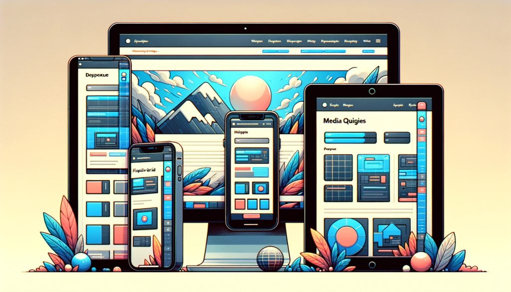
No more static, one-size-fits-all pages, but it is now all about responsive design that has revolutionized web development like a game changer, taking the user right to the center irrespective of the gadget in use. You might sit on a laptop one minute and browse on an iPad the next. The website just flows and even adjusts to look every bit as beautiful, whether you are viewing it from a big screen, small screen, vertically, or horizontally. But really, it’s like magic—that’s what you get when you mix some very clever code with flexible grids and layouts, and then top it off with some crafty CSS media queries.
Responsive design, in essence, ensures that everything on a website—be it text, pictures, or video—looks and works just perfectly, whether you’re glued to the desktop or tapping away on your phone. “No more squinting, endless scrolling, or zooming; just a super-smooth user-friendly experience that works seamlessly across all your devices.
How do we pull this off? Well, it’s all about fluid grids and percentages.
Out with the rigid pixels and in with the flexible content that wraps to the screen like a glove. And those CSS media queries? It’s the secret sauce that fine-tunes your site’s style so it looks just right on the device being viewed, specifically screen width.
And what do I have to talk about when it comes to pictures? Have you ever noted that some of the pictures appear sort of hazy or even very large on the screen of a phone? Responsive design takes care of that through some smart techniques, guaranteeing the clear view and size at whatever device the images are viewed. The growth in smartphone and tablet use made responsive design not just an added advantage but a necessity. Google even accords better ranks to mobile-friendly sites, and that says something about the direction the web is drifting. Plus, it’s a win-win for the website owners. One site that works everywhere means less hassle and expense in the long run. Keep it simple and consistent for all.
To sum it up, responsive design isn’t just about tech. This is a completely new way of looking at websites, placing at the core user comfort and accessibility. It means your site isn’t a real location on the web, but rather a welcoming space for all, both now and in the future.
Liquid or Fluid Design
This is the method in which the content of a website changes its dimension with the width of the user’s browser window. It is often referred to as liquid or fluid design, and it is proclaimed to be the base for flexible web layouts. This approach makes it such that the content on the website is only able to flex in or out to fully occupy all space, independent of the device and browser a user may be using, for instance, a computer, laptop, or a mobile device. Hence, liquid or fluid design is especially valuable with today’s adaptability to the digital landscape, where users’ internet activity comes from any of an array of devices with different sizes, resolutions, and many other features.
The reasoning for a liquid or fluid design was very plain but quite powerful. Using percentages—or sometimes viewport width (vw/vh) for height and width) rather than fixed-width measurements—did away with most awkward white spaces while avoiding forcing a small screen to scroll across horizontally. This basically means that all elements of the page, including navigation menus, pictures, text containers, footers, are set to take up a certain percentage of the screen’s width. The objective is to keep the structural integrity and visual coherence of the site at any size.
Liquid design simply improves user experience by catering to more users. In other words, through the absence of unnecessary scrolling and making the content accessible and readable on any devices, the website would become available for a bigger audience, which would yet again increase engagement while decreasing bounce rates. This flexibility can, in addition, help in improving the site’s positioning on the search engines since responsive design is one of the factors through which search engines base their determination of usability and relevance.
However, implementing liquid or fluid design comes with its challenges. Therefore, it is very careful to know how elements will scale and interact at different sizes without facing problems in the layout.
To solve these problems, developers typically resort to a hybrid approach that has fluid layouts combined with media queries—a part of the CSS3 specification enabling the adaptation of rendered content to conditions such as screen resolution (smartphone vs. desktop), among others. In brief, fluid or liquid design is the kind of approach that emphasizes flexibility and, therefore, adaptability in such a manner that a design of a website could be viewed across a broad spectrum of devices, all providing the best viewing experience. Liquid design is thus a progressive method of designing websites and developing sites that welcome the inborn variability presented in the digital world and the shift in attitudes and practices brought about by web browsing.
Single Page Design
Single page design layouts are websites with only one page. They are sometimes used as a landing page for specific campaigns with just the right amount of design elements to be attractive but not distract users from filling out the form or clicking on the call to action. They are well-designed and organized for the viewer. Single-page design layouts are also compatible with most browsers and devices.
Summing Up
In summary, the choice of the website design template is a basic and fundamental step toward making an influential and efficient online presence. All these can help your website significantly enhance the user experience if the design of your homepage header, content width, and the design of the menu bar are made in such a way that they are appealing enough to grab viewer attention and retain it. Be it deciding to go for the full-width layout to draw a modern touch, choosing the right header to make a statement, or set the menu bar that eases navigation through the site—every decision is essential to how your website speaks to its audience. More than just looks, this all contributes to functionality, accessibility, and optimization of the search engine—all conforming to best practices in the aim to make your business goals stronger.
Remember, your website is often the first point of contact between your brand and potential customers. This is where the first impression is built, where your audience might have an interest in viewing or reading more about your content, products, and services. The choice of a suitable design, therefore, fulfilling your business needs and attracting your group, is very essential for your brand identity. And in such a rapidly moving digital space, keep up with the web design trends to ensure that your site is at par with the relevant, competitive, and responsive elements of the site that is also friendly for users.
As you embark on this journey, let creativity and strategy guide you. Play with templates, arrangements, and design work, bearing in mind that the user experience comes first. A well-designed website is more than an online brochure; it is your dynamic platform that should drive engagement, leads conversion, and business growth. Take time looking through the design that you feel resonates best with both your brand and your audience, and in no time, you’ll be seeing them coming up as some of the central assets to your strategy in marketing through digital platforms.

Stephen Moyers is an online marketer, designer, avid tech-savvy blogger. He is associated with Los Angeles Web Design Agency – SPINX Digital. He loves to write about web design, development, digital marketing, social media and much more. Apart from writing, he loves travelling & photography. Follow Stephen on Twitter & Google+.
What Is WooCommerce Product Slider and Why Your Store Needs It
Why Do Product Images Matter So Much in Online Stores? When someone visits an online store the…
0 Comments9 Minutes

How to Streamline Your Customers’ Shopping Experience?
The goal for any online store is to make shopping as smooth as possible. When visitors move…
0 Comments8 Minutes

Strengthening Brand-Customer Relationships Through Gamified Loyalty Programs
Creating lasting connections with customers has become increasingly vital as the marketplace grows…
0 Comments6 Minutes

How to Use SEO and SEA Together in Search Engine Marketing
In digital marketing, search engine marketing (SEM) plays a critical role in improving online…
0 Comments10 Minutes
Content Marketing Growth Hacks: Real Shortcuts to Drive Traffic
Are you still lagging in content marketing? Sticking to these old strategies seems…
0 Comments10 Minutes
How to Build a Strong Local Following Using Social Media Marketing
In the days of likes, shares, and stories, local businesses have a golden opportunity to create…
0 Comments9 Minutes

Why WooCommerce is the Best Choice for Your Online Store?
WooCommerce stands out as a top option for anyone looking to build an online store. This platform…
0 Comments8 Minutes
How to Use AI-Powered SEO Tools for WordPress eCommerce
SEO is a critical factor in the success of any e-commerce WordPress store. As competition…
0 Comments11 Minutes
Comments are closed.