Scheduling App design: How to Make It Right?
Design is one of the most crucial aspects of any scheduling app. Those with poor designs are not only ugly to look at, but they also frustrate users and make it difficult for them to use the service effectively. However, there are many ways in which you can make sure your design does not fall prey to these pitfalls.
Quick Links
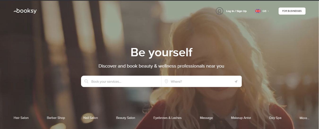
According to CEO and Co-founder of successful scheduling app, Booksy “The key to success is a precise understanding of both merchant and customer needs. While the interface is simple, understanding the nuances and building this technology that works for either side of the market (consumer and merchant) is extremely complicated.” As we can see, even the already successful boss of the scheduling app admits that it is a bumpy road.
Designing a schedule app
It is not enough to just design the app layout. You need a lot of other things in order for your scheduling app design to work well.
– Clearly define what you want the user to do with every screen and button on it
– Make sure only relevant information is included on each screen (i.e., avoid redundancy)
– Provide only the features that are most important and that will be used the most
– Communicate your design to everyone in the company before it is finalized
– Conduct usability tests on early versions of your app to see how people react, what they like, etc. Philipp Wolf, CEO of Custify, says that “it’s essential that we distinguish between user expectations and their goals. As a customer success SaaS, many come to us with the goal of reducing churn or automating tasks but their expectations vary widely. Some want simple solutions that “magically” work and some expect to put in further effort.” This only confirms the need to conduct tests on every step to make it perfect for future users.
All these factors should be considered when designing a schedule app. It may seem daunting at first, but if you follow these tips you will be able to create an app that is both beautiful and practical.
What are the features of a good schedule app
Perfectly designed scheduling app is a balance of beauty and practicality. It should be easy to use, provide necessary functionality for a user’s tasks, look great on all devices (screens), and have an intuitive design that mirrors the user experience to some degree.
Another important part of the design are colours. Make sure to choose colours that will be easy on the eyes and make it look professional. Colour coding is a great way to avoid chaos as it helps users to see what they are looking for more easily.
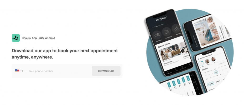
As mentioned above, functionality on all devices is essential since one can never be sure what size a user will access the app from. It should integrate with mobile devices as well as computer desktops.
How to design an easy-to-navigate and intuitive interface
Interface is the central part of an app and it should be designed in a way that is easy for the user to navigate. A good interface will guide users through the app by using clear and concise language, prompting them with helpful tips if they get lost or provide contextual help when needed.
It is better to bet on easier design, but increased transparency. Designing an app should not be a guessing game. Designers need to define the purpose of their product and what it is meant to accomplish, so they can go about designing accordingly. This will help them determine which features are necessary for the design and also what would be better left out altogether.
The best idea in the process of designing an app is to ask their future users what they would like to have. It is an efficient way of understanding their needs and what makes them happy, which in the end will make for a better app design.
Common mistakes made when designing apps – don’t make these!
The worst mistake scheduling app designers can make is designing an app that is not consistent with the company’s brand and values. It can be tricky to ensure consistency with so many variables, but it remains a priority because your customers will associate your app’s design with you as their business owner: this is one of those things that they’ll see every day. The scheduling app for beauty salons can’t look like one for restaurants, for example.
Another mistake is to make the app too complicated. That means not making it easy to use or understand, which is a problem for those with limited experience using apps. Many places like hairdressers switch to scheduling apps, but not all of their customers are young and experienced with technology.
Badly chosen colours are the next big no-no. Lack of contrast can make an app unable to use on the darker screen. On the other hand, too bright contrast can make it hard to look at and disturbing while using it.
Conclusion
Designing scheduling apps can be a riddle, but it is possible to make a design that will be convenient and easy-to-use for the customer.
Using colours well, making apps simple and understandable are some of the important ways. The biggest no-no when designing scheduling apps should be avoiding mistakes like using too many features or forgetting about limitations of mobile screens capacity.

What Is WooCommerce Product Slider and Why Your Store Needs It
Why Do Product Images Matter So Much in Online Stores? When someone visits an online store the…
0 Comments9 Minutes

How to Streamline Your Customers’ Shopping Experience?
The goal for any online store is to make shopping as smooth as possible. When visitors move…
0 Comments8 Minutes

Strengthening Brand-Customer Relationships Through Gamified Loyalty Programs
Creating lasting connections with customers has become increasingly vital as the marketplace grows…
0 Comments6 Minutes

How to Use SEO and SEA Together in Search Engine Marketing
In digital marketing, search engine marketing (SEM) plays a critical role in improving online…
0 Comments10 Minutes

Content Marketing Growth Hacks: Real Shortcuts to Drive Traffic
Are you still lagging in content marketing? Sticking to these old strategies seems…
0 Comments10 Minutes

How to Build a Strong Local Following Using Social Media Marketing
In the days of likes, shares, and stories, local businesses have a golden opportunity to create…
0 Comments9 Minutes

Why WooCommerce is the Best Choice for Your Online Store?
WooCommerce stands out as a top option for anyone looking to build an online store. This platform…
0 Comments8 Minutes

How to Use AI-Powered SEO Tools for WordPress eCommerce
SEO is a critical factor in the success of any e-commerce WordPress store. As competition…
0 Comments11 Minutes