
How to Avoid These 6 Common Mistakes Brands Make with Their Homepages
We all know that first impressions are crucial, and your homepage is the virtual handshake that can make or break your brand’s image. But unfortunately, too many brands shift into the wrong gear and design cringe-worthy homepages.
Quick Links
If you don’t want to join their club, you’ve landed at the right spot. Here, we’ll delve into six common mistakes brands make and teach you how to give your brand’s homepage a much-needed upgrade.
By the time you’ve finished reading this article, you’ll learn how to effortlessly dodge some common pitfalls and arm yourself with the secret sauce necessary to transform your homepage into a dazzling, customer-converting machine.
So, without further ado, let’s dive into the world of homepage hacks.
Present Your Product Early and Clearly
You see, the problem with many homepages is that they take too long to get to the point, leaving visitors scrolling and clicking around in a futile quest to understand the product or service. This is a rookie mistake that can send potential customers running (or clicking) for the hills.
The antidote to this common issue is simple: put your product front and center. Ditch the lengthy intros and get straight to the heart of what you offer.
This means crafting a punchy headline, followed by a subheading that succinctly explains your product’s key benefits. And don’t forget visuals! An eye-catching image or video can work wonders for grabbing attention and making your message stick.
By presenting your product early and clearly, you’ll be setting the stage for a delightful user experience, making your visitors feel like they’ve struck gold in the vast digital desert.
Take a look at the image below to see how it’s done. Vivion, a supplier of high-quality ingredients, explicitly states its main value proposition in their top header, letting its prospects know they’ve potentially discovered just the right product that they’ve been looking for. That’s precisely the kind of first impression you need to make with your homepage.

Source: Vivion.com
Build for Speed
A fast homepage is synonymous with a great user experience, and trust us, nothing puts a damper on potential conversions like a slow-loading website. In this day and age, visitors won’t stick around if your homepage takes forever to load.
So, if your goal is a lightning-fast homepage, make sure to do the following:
- Optimize images. Large images are the prime culprits behind slow-loading pages. Use tools like ImageOptim or TinyPNG to compress your images without sacrificing quality.
- Minify your code. Keep your HTML, CSS, and JavaScript lean and clean by minifying your code. Tools like UglifyJS and CSSNano can do the heavy lifting for you.
- Leverage browser caching. Use browser caching to store static files like images, scripts, and CSS. This will speed up page load times for repeat visitors.
- Use a Content Delivery Network (CDN). A CDN can distribute your content across multiple servers, reducing the distance between your website and visitors, thereby improving load times.
- Prioritize above-the-fold content. Ensure your most crucial content loads first, keeping your visitors engaged while the rest of the page loads in the background.
Google’s PageSpeed Insights and GTmetrix are great resources for regularly checking your site’s speed and fixing even the most complex issues.
Show Sufficient Social Proof
We humans are a skeptical bunch, especially when it comes to online purchases. Many brands fail to address this inherent wariness, leaving potential customers hesitant to engage.
Enter social proof, the solution to this common problem.
Social proof is all about showcasing your brand’s trust and credibility by leveraging others’ positive experiences. By employing this tactic, you’re sending a clear message: “Hey, these people loved us, and you will too!”
- Testimonials: Share glowing quotes from satisfied customers. Add a name, title, and photo to make it even more convincing.
- Case studies: Highlight a few success stories that showcase how your product or service has made a tangible difference for clients.
- Ratings and reviews: Display aggregated ratings from trusted review platforms like Trustpilot or Google Reviews.
- Client logos: If you’ve worked with well-known clients or partners, showcase their logos to lend your brand some extra street cred.
You can also follow the approach from ShopSolarKits.com. This solar power systems supplier has about six different types of reviews/ratings/testimonials on their home page. However, the user-generated content (UGC) at the bottom of the page stands out as real proof of how their happy customers use their products.

Source: Shopsolarkits.com
Take Mobile Browsing Seriously
With the majority of web traffic now coming from mobile devices, a common problem brands face is delivering a subpar mobile experience. Ignoring mobile users is like turning your back on a treasure trove of potential customers.
Take mobile browsing seriously by implementing these best practices:
- Responsive design: Ensure your website adjusts seamlessly to different screen sizes and orientations. Google’s Mobile-Friendly Test can help you assess your site’s mobile-readiness.
- Touch-friendly navigation: Create large, easy-to-tap buttons and links that cater to users’ fingers instead of mouse pointers.
- Legible text: Choose a readable font size and maintain sufficient contrast between text and background.
- Prioritize speed: As mentioned earlier, speed is crucial, especially for mobile users.
- Simplify forms: Keep forms short and simple, and use mobile-optimized input types for a smoother experience.
For more insights on mobile site design, check out resources like Adobe’s Mobile Design Best Practices guide. By taking mobile browsing seriously, you’ll capture the hearts (and thumbs) of your on-the-go audience.
Check out Headspace – a meditation and mindfulness tool. Their mobile website follows the company’s branding and all of the tips for a great mobile user experience. It’s fast, captivating, and doesn’t overwhelm the user with unnecessary elements that might scare them off.
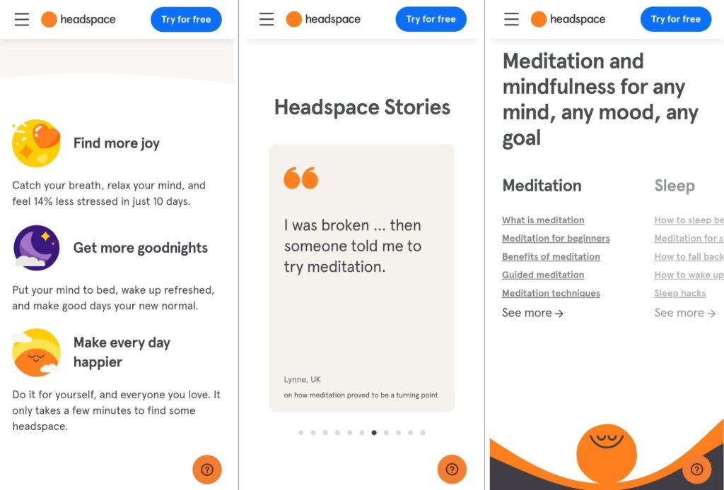
Source: Headspace.com
Strike a Good Balance When Discussing Your Product in Detail
Meet the classic homepage conundrum: too much information and jargon that overwhelm and confuse. On the other hand, there are those with too little that leave potential customers scratching their heads. Both are obviously very wrong.
As a growing, aspirational brand, striking the perfect balance between detail and simplicity is critical.
To achieve that, keep your product descriptions clear, concise, and focused on the most essential benefits. Avoid saturating your homepage with a barrage of technical terms, but do provide enough information to provoke interest and encourage further exploration.
Highlighting the main features and benefits of your product, along with a few key selling points, is the sweet spot. This approach keeps your homepage informative and engaging without overwhelming or underwhelming your audience.
In the following example, Trustshoring does that perfectly. This agency that outsources software developers provides just the right amount of information without being overly salesy. By striking this balance, they create an inviting environment that encourages potential customers to learn more about their offerings.
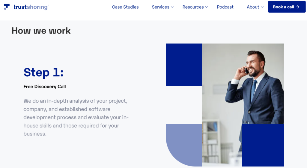
Source: Trustshoring.com
Be Bold With Your CTAs
Many brands are being too timid with their calls-to-action (CTAs), leading to missed conversion opportunities. You should respond to that weakness by being bold with your CTAs, making it easy for visitors to take the next step.
To achieve this, strategically place clear, eye-catching CTAs throughout your homepage. This could include buttons for signing up, scheduling a demo, or downloading a free resource. As visitors interact with different elements on your homepage, you want to ensure they always have an easy path to conversion.
Remember, your CTAs should be attention-grabbing and straightforward. Use compelling, action-oriented language and make your buttons stand out with contrasting colors. Prominent CTAs create a smooth user journey and make it incredibly simple for visitors to take the plunge and engage with your content.
Let’s take a look at how SellerPlex does it. They manage finances, operations, and supply chains for online businesses, so it’s a smart idea to give their visitors a way to quickly jump into the process of trying out their services. Notice how they have two easily-noticeable CTAs right on their homepage’s first loading screen.

Source: Sellerplex.com
Final Thoughts
By following these tips, you’ll elevate your homepage game and create a delightful user experience that keeps your audience coming back for more.
Remember, the key to success lies in balancing clarity, speed, social proof, mobile-friendliness, and bold CTAs, all while providing just the right amount of product detail.
So, go ahead, give your homepage the makeover it deserves, and watch your business flourish in the digital landscape.

What Is WooCommerce Product Slider and Why Your Store Needs It
Why Do Product Images Matter So Much in Online Stores? When someone visits an online store the…
0 Comments9 Minutes

How to Streamline Your Customers’ Shopping Experience?
The goal for any online store is to make shopping as smooth as possible. When visitors move…
0 Comments8 Minutes

Strengthening Brand-Customer Relationships Through Gamified Loyalty Programs
Creating lasting connections with customers has become increasingly vital as the marketplace grows…
0 Comments6 Minutes

How to Use SEO and SEA Together in Search Engine Marketing
In digital marketing, search engine marketing (SEM) plays a critical role in improving online…
0 Comments10 Minutes

Content Marketing Growth Hacks: Real Shortcuts to Drive Traffic
Are you still lagging in content marketing? Sticking to these old strategies seems…
0 Comments10 Minutes

How to Build a Strong Local Following Using Social Media Marketing
In the days of likes, shares, and stories, local businesses have a golden opportunity to create…
0 Comments9 Minutes

Why WooCommerce is the Best Choice for Your Online Store?
WooCommerce stands out as a top option for anyone looking to build an online store. This platform…
0 Comments8 Minutes

How to Use AI-Powered SEO Tools for WordPress eCommerce
SEO is a critical factor in the success of any e-commerce WordPress store. As competition…
0 Comments11 Minutes