
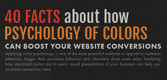
The latest research on color psychology compiled by DesignAdvisor comes in the form of an infographic, shines a light on the basic knowledge every website owner should have to make smart color choices. It also helps explain why color has become such a valuable technical tool used by web designers.
Color psychology guides designers by providing them with knowledge on the most common associations that people draw from certain colors. The infographic goes through these findings for different colors, detailing their most popular associations, lists of industries in which the color is mainly used, and even some concrete examples of brands that use them. Read also a comprehensive guide to picking the best website color schemes in the Ramotion blog.
For instance, red is considered to be one of the most emotional colors. So much so, in fact, that it’s shown a tendency to increase observers’ heart rates and create a sense of urgency. It should come as no surprise that red is used in clearance sales and fast food services. Brands use insights like these to accentuate their branding and brand story, which, in turn, helps with brand recognizability and customer satisfaction.
However, color is also a powerful tool for more technical operations, such as drawing attention to specific design elements, increasing conversions and driving engagement. By understanding how people engage with different colors, web designers can now use color to their advantage, making design elements pop through contrast, or even encourage clicks by making small changes in color schemes.
The infographic, which comes packed with these types of insights, also draws from industry experience, by detailing several illustrative case studies. All in all, if you’re looking to stay on top of the color game, this graphic is a great place to start.