
The user interface of any given website can be a source of great frustration if it’s designed badly. If designed well, however, it may operate so smoothly that the user won’t even realize they’re interfacing at all. Clever UI design can make a visitor’s journey through the pages seem completely natural.
Quick Links
It’s like “organic” UI, and it’s a matter of designing the interface to lead from one point of contact to another.
It isn’t easy to do, but it isn’t impossible, either.
Here are eight elements that should be present on any web page to facilitate a great UI experience.
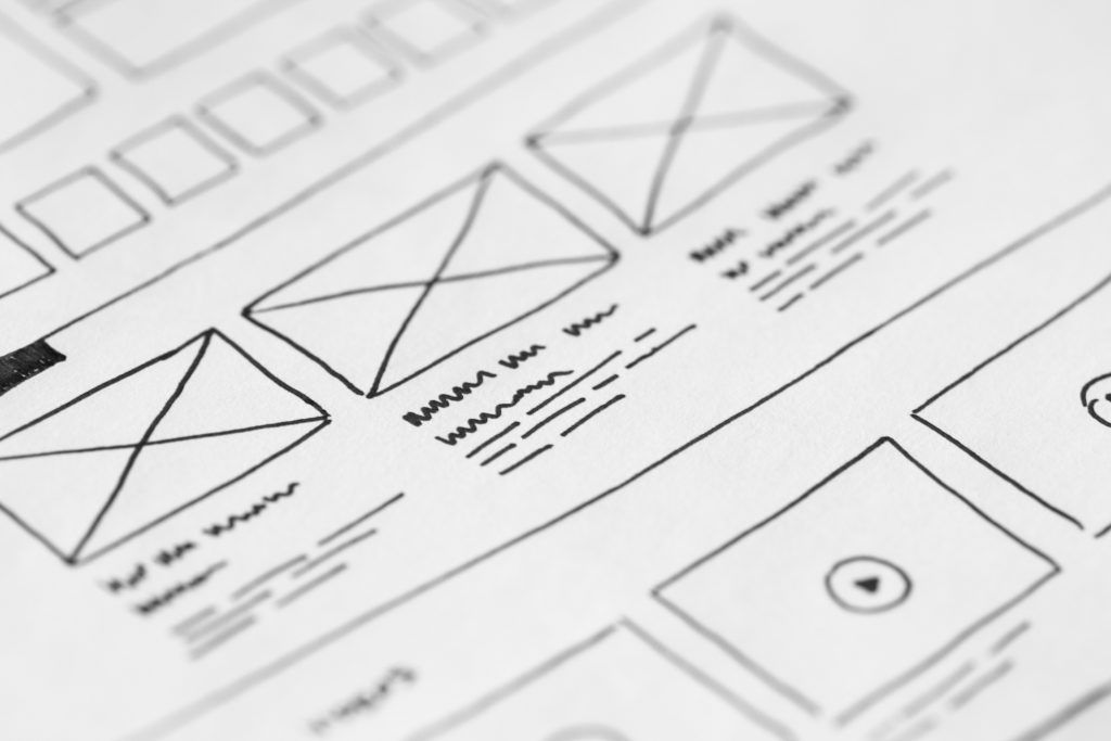
Landing Page
Landing pages are in common usage for websites with products or services to sell, and for a good reason. They’re the perfect kick-off to the buyer’s journey, allowing an introduction, a starting point, and an enticement all in one before the visitor even makes it to the web page proper.
As an example of the usefulness of this, long form landing pages can increase generation of leads by up to 220%.
Your landing page is the first chance for your UI to shine. It should be functional, attractive, and intriguing, and clearly lead the visitor to the next step.
Call To Action
CTAs are almost always found on the landing page, but that doesn’t mean that they should only be used in that one area. CTAs can be used to great effect throughout the web page.
How does a CTA enhance UI experience?
People often visit sites purely for information, to help them make a decision as to whether they will pursue a purchase. A well-deployed CTA helps the visitor think in terms of the next step: committing.
And sometimes that’s really what we need. CTAs function as a guide, an impetus, and a quick key to a decision. Removing the waffling from the decision-making process can be invaluable to a visitor — all they really need, sometimes, is to be reminded why taking action is a good thing to do, and what benefits they will get from it.
Easily Navigable Menus
I don’t know how many times I’ve run across a poorly designed website which evidently thought it was being clever and avant garde by making me have to search for the menu. I’ve wanted to learn more, or contact someone at the company, or even to take a closer look at the products they had for sale — but the main page was all about photo sliders and testimonials.
It gets very frustrating not to know where to go, and I’ve ended up backing out of sites because of that very frustration.
Having a visitor leave your site because they run up against a wall caused by poor design is a definite sign of UI fail.
Invitation To Engage
I always appreciate it when I feel like someone in a store actually wants to talk to me. I don’t mean just the policy mandated greeting. I mean the actual invitation to come and speak with someone who wants to help me find what I’m looking for.
It’s a good feeling.
Including invitations to engage within your UI gives your visitors that feeling, too.
These can show up in a few different places. There’s always the “Contact Us” section, but that’s sort of static. A good option, if it’s possible for your site, is to include a live chat box. If there isn’t anyone available 24/7 for a livechat, then at least making that box available to send a message gives more of an impression that you want to hear from your visitors, and you want to help them.
In fact, 73% of consumers think that a live chat is the most satisfying way to engage with a business. And statistics indicate that the addition of live chat software to a site increases the chances of conversion by 8-20%. Those who use the chat are more than twice as likely to convert.
So not only the availability of a live chat box, but also a proactive chat is a good idea, one which reaches out to the visitor to let them know that there is help available.
Of course, conversely, chatbot help tends to be really annoying, really quickly. And it’s often easy to tell when you’re speaking with a chatbot versus a real person. (Although I did once accuse an Amazon rep of being a bot. I had to apologize once I found out for certain she was real.)
So try to make it simple for your visitor to reach a real person. The invitation to engage is much more appealing if you know that there’s an actual person to engage with on the other side.
Loading Speed
Web page loading speed is important in terms of UI and marketing for a variety of reasons. For one thing, it’s one of the ranking factors for Google.
For another, everyone expects it.
For a third, not only do they expect it, but the loading speed makes a huge difference in whether or not a visitor stays onsite or backs out. Approximately 53% of visitors will bounce if a page takes longer than three seconds; Google’s ranking depends on a load speed of two seconds or less.
Obviously, the best UI in the world is pointless without a fast loading time.
Optimized Content And Filler-free Articles
A lot is written about the importance of SEO, and it’s true that it is important. But SEO needs support from the surrounding content, too, in order to follow through on a good user experience.
Why do I say that?
Well, consider this. If your website is full of fluff, will people notice?
Yes. Yes, they will.
Not everyone, and not all the time, and maybe even not right away — but people generally go searching the internet for a particular reason. If they click on your site expecting to find the answer to their question, and encounter a lot of meaningless filler centered around the searchword, they’re not going to be very satisfied with your site. And they’re not going to share it with others, because they’ve found it misleading and frustrating.
So SEO keywords are important, but they are not the only consideration when it comes to content.
Task Usefulness
The usability of a UI is broken down into five qualities: learnability, efficiency, memorability, error recovery, and satisfaction.
Basically what that boils down to for a UI is:
- Is it easy to use?
- Is it efficient?
- Does it do what it needs to and enable the visitor to do what they need to?
- Is it attractive and appealing to use?
Task usability and usefulness means that UI plays a helping role for the user, enabling them to get done what they need to get done, to accomplish what they want to accomplish. This sounds like a statement of the obvious, but it’s a fact that poorly designed UIs are counterintuitive — rather than signposting and leading the visitor through their journey, they just get in the way.
Aesthetically Appealing
This is the last of the eight elements simply because it’s so subjective. And really, almost anything that is truly well designed is beautiful in and of itself. But UI incorporates a lot of other extant elements of graphic design, from the adaptive logo design, to the branded marketing materials, to the blog.
An aesthetically designed UI will draw people in, will make people want to continue to interact with the site.
And with all the other usability aspects covered for a functional, well-designed UI, the look of the site is really just the crowning glory.